The Money Flow Index, by the textbook
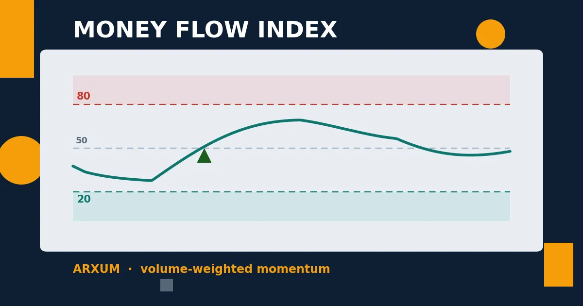
Here is the thing you came to see. This is the Money Flow Index, the way every chart draws it.
The Money Flow Index sits in a panel under your chart, swinging between 0 and 100. Two lines matter: 80 up top and 20 down the bottom. Above 80, buying pressure is stretched and the market is called overbought. Below 20, selling has run hot and it is oversold.
If that sounds like RSI, it is, with one change that matters. RSI counts how far price moved. MFI counts how far price moved and how much volume came with it.
The math is simple enough to picture. Take the typical price of each bar, the average of its high, low and close. Multiply that by the bar’s volume. That is the “money flow” for the bar: positive when price ticked up, negative when it ticked down.
Then sum the positive flow and the negative flow over the last 14 bars, take the ratio, and squeeze it onto a 0 to 100 scale. A run of up-closes on fat volume drives MFI toward 100. The same run on quiet volume leaves it stuck in the middle.
So the Money Flow Index is RSI with a volume filter baked in. That is the whole pitch, and it is why the bands sit wider than RSI’s 70 and 30. The volume weighting makes it spikier, so it reaches the extremes more readily.
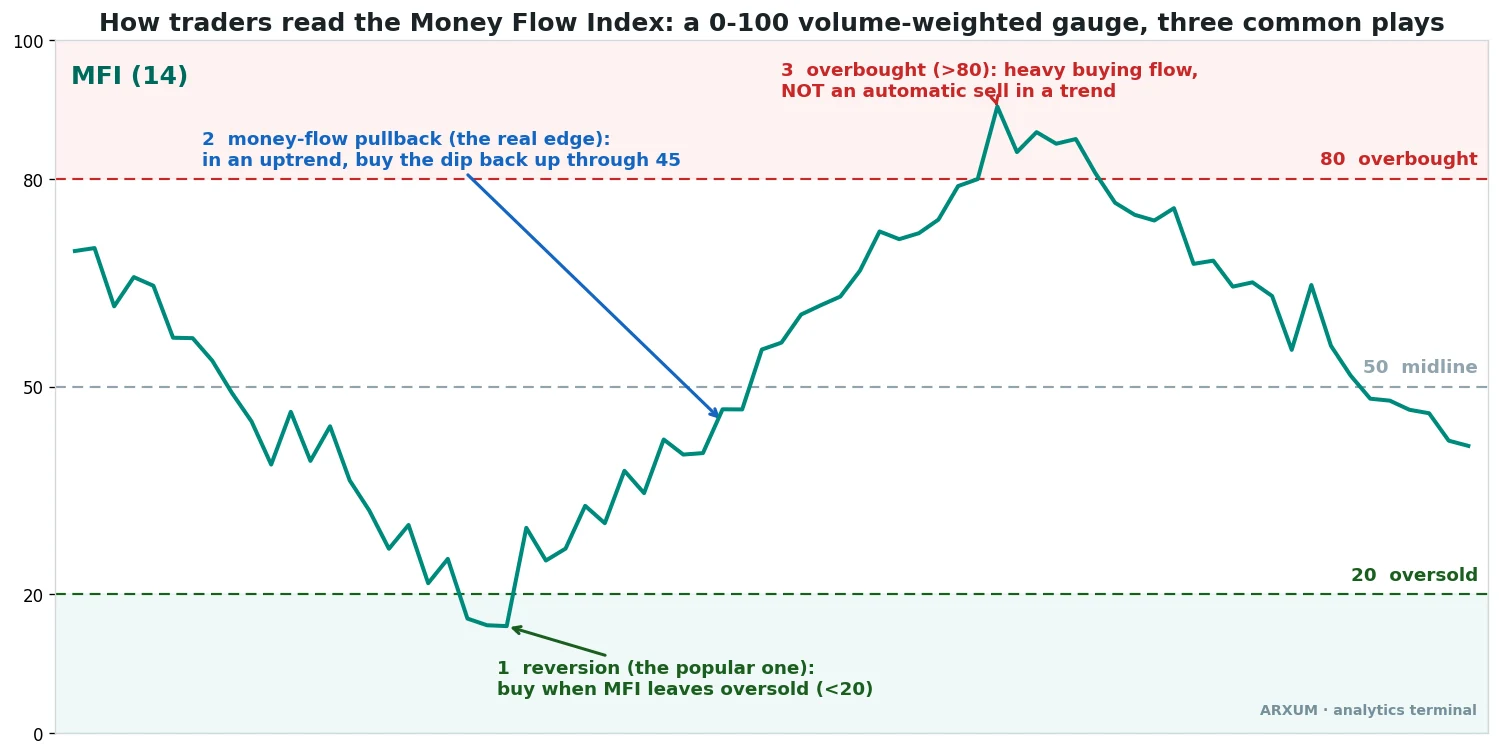
There are three common ways traders use it, and the picture above marks all three:
- Reversion: buy when MFI leaves oversold, crossing back up through 20. The classic bounce play.
- The money-flow pullback: in an uptrend, buy the dip when MFI turns back up through 45. The one that actually travels, as you will see.
- Overbought as caution, not a sell: above 80 means heavy buying, not an automatic short. In a strong trend MFI can sit overbought for weeks.
The promise of the indicator is that the volume weighting tells you whether a move is backed by real money or running on fumes. Good idea. We pointed the engine at it to find out where that promise holds up and where it quietly breaks. The answer is the rest of this guide, and it is not uniform.
(One note before the numbers. “Money flow index strategy” results below all use the standard 14-period setting. We did not tune it. Changing the period mostly just trades signal for noise.)
The setup that pays: the money-flow pullback
Skip the bounce-buying for a moment, because the strongest result was the pullback. The rule is plain.
Price has to be above its 200-period EMA, which is how we define an uptrend: above a rising 200-EMA is up, below a falling one is down. Inside that uptrend, you wait for the Money Flow Index to dip under 45 and then cross back up through 45, and you buy that turn.
You are buying a pause, not a bottom, with the trend still pointing up and money starting to flow back in.
Here is one of those trades on spot gold (XAU/USD), daily chart.
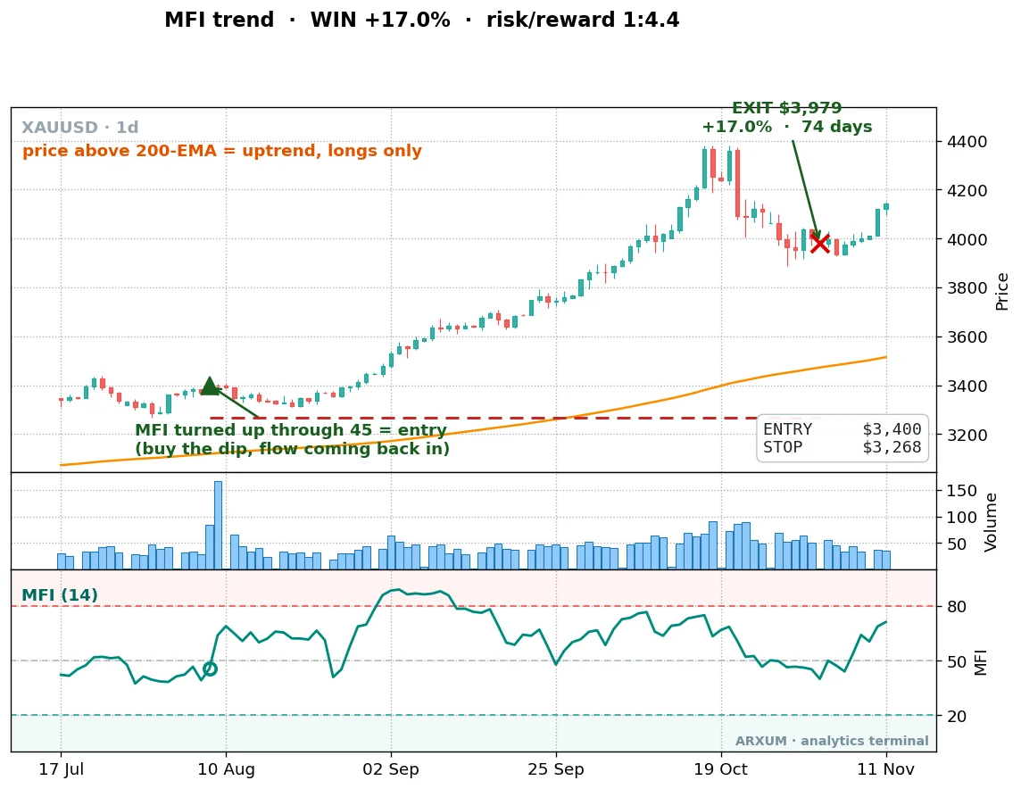
Price was riding above the orange 200-EMA, the regime was up, and the MFI line in the lower panel had dipped toward the midline and turned. The entry went in near 3,400.
From there gold did what trending gold did through 2025, and the trade rode it to 3,979 before the exit. That is a 17% gain on a single position. The reward-to-risk came in at 1:4.4: for every dollar risked from entry to stop, the trade made back about four and a half.
That number, written 1:X, is the per-trade ratio. The 1 is your risk, the distance from entry to the stop. The X is the reward, how many times that risk the trade earned. A 1:4.4 winner is the kind that carries a strategy, because you can lose three of them in a row and a single win pays you back.
And you do lose plenty. Over eight years on gold, the money-flow pullback won only 41% of its trades. Under half.
The edge is not in being right. It is in the size of the winners against the size of the losers. Here is the full trade history, the equity curve first and the numbers under it.
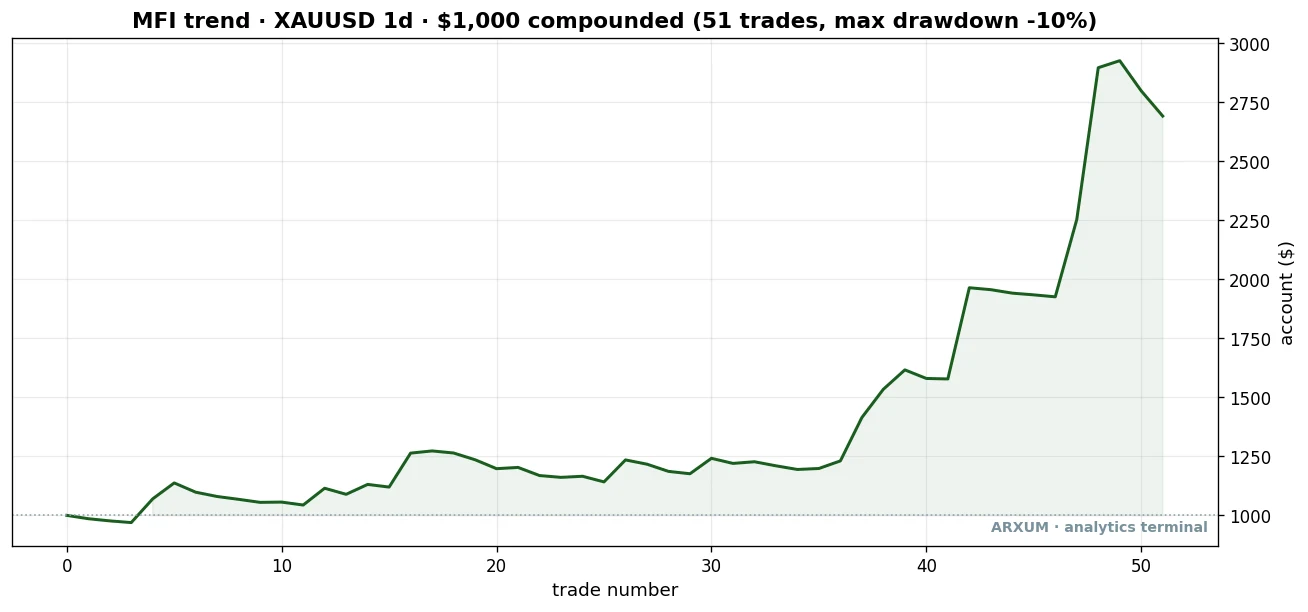
| Trades | 51 |
| Win rate | 41% |
| Reward-to-risk | 1:4.7 |
| Profit factor | 3.29 |
| Net return on $1,000 | +$1,691 |
Look at the shape of that curve. The account sits near flat for thirty-odd trades, chopping a little, going nowhere fast. Then the back half of the window, when gold’s run really got going, a few large winners drag the line up to $2,691.
That is what trading an edge actually feels like: long stretches of nothing, paid for by the rare trade that runs. The worst peak-to-trough dip was 10%, which is shallow for a return of that size.
Profit factor is the whole strategy’s report card: every dollar it won divided by every dollar it lost. Above 1.0 it makes money. At 3.29, the gold pullback made $3.29 for every dollar it gave back. That is a strong number for a setup that is wrong most of the time.
It is not a gold fluke: silver and Bitcoin
One asset proves nothing. The honest question is whether the same rule pays somewhere it was not cherry-picked. It does.
On silver (XAG/USD), daily, the pullback returned a 2.29 profit factor over 54 trades and held up on data it had never seen. Silver had its own move higher, and the setup caught it the same way.
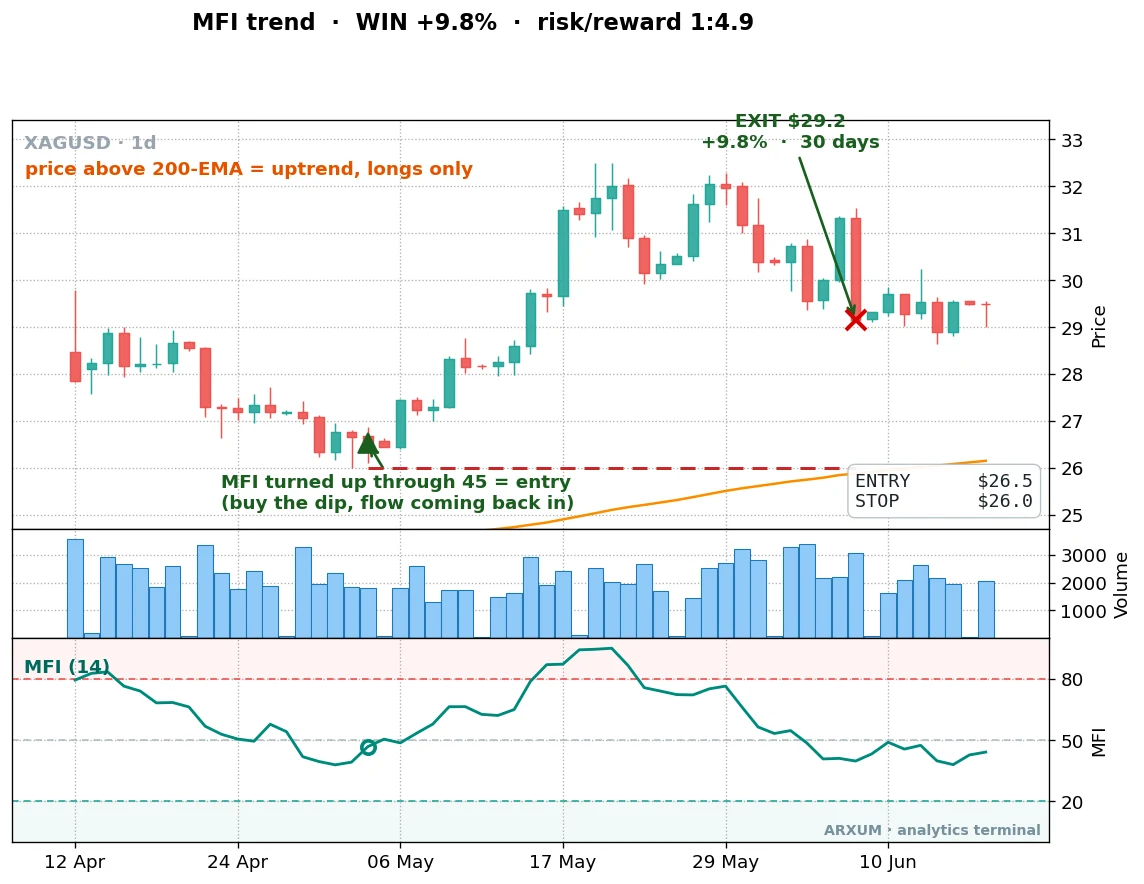
Same picture, different metal. Price above the 200-EMA, MFI dipping and turning, entry on the turn, then a 30-day hold for a 9.8% gain at 1:4.9.
The full silver trade history, curve then numbers:
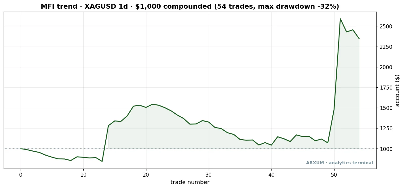
| Trades | 54 |
| Win rate | 35% |
| Reward-to-risk | 1:4.2 |
| Profit factor | 2.29 |
| Net return on $1,000 | +$1,347 |
Silver is the rowdier cousin. Same edge, a lower win rate, and a deeper 32% drawdown to sit through. Worth knowing before you trade it: the metal moves harder in both directions.
Now Bitcoin, on the 4-hour chart, and here the Money Flow Index gets to use the one thing it was built for: real volume. Crypto exchanges report actual traded volume. That matters, and we will come back to why it is the centre of this whole article.
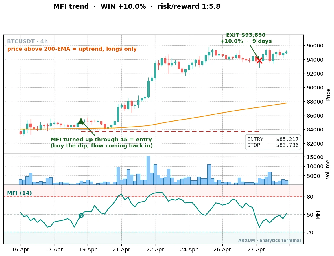
The volume bars under that entry were heavy. That is the tell that separates a backed move from a drift, and on real-volume crypto the tell is worth money.
The Bitcoin record runs longer, with far more trades:
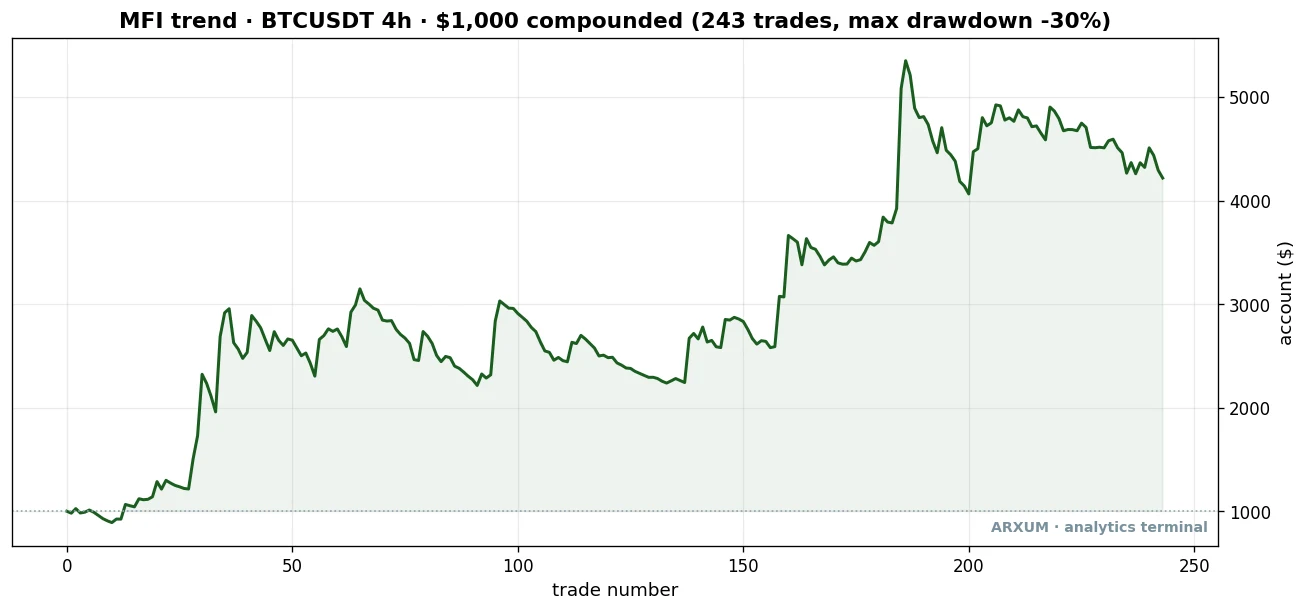
| Trades | 243 |
| Win rate | 35% |
| Reward-to-risk | 1:3.0 |
| Profit factor | 1.59 |
| Net return on $1,000 | +$3,218 |
Lower profit factor than the metals, but 243 trades instead of 50-odd, and it held up out-of-sample. A lower edge you can take five times as often is its own kind of strong.
Here is how the pullback stacks across all four markets, against the two other common MFI plays.
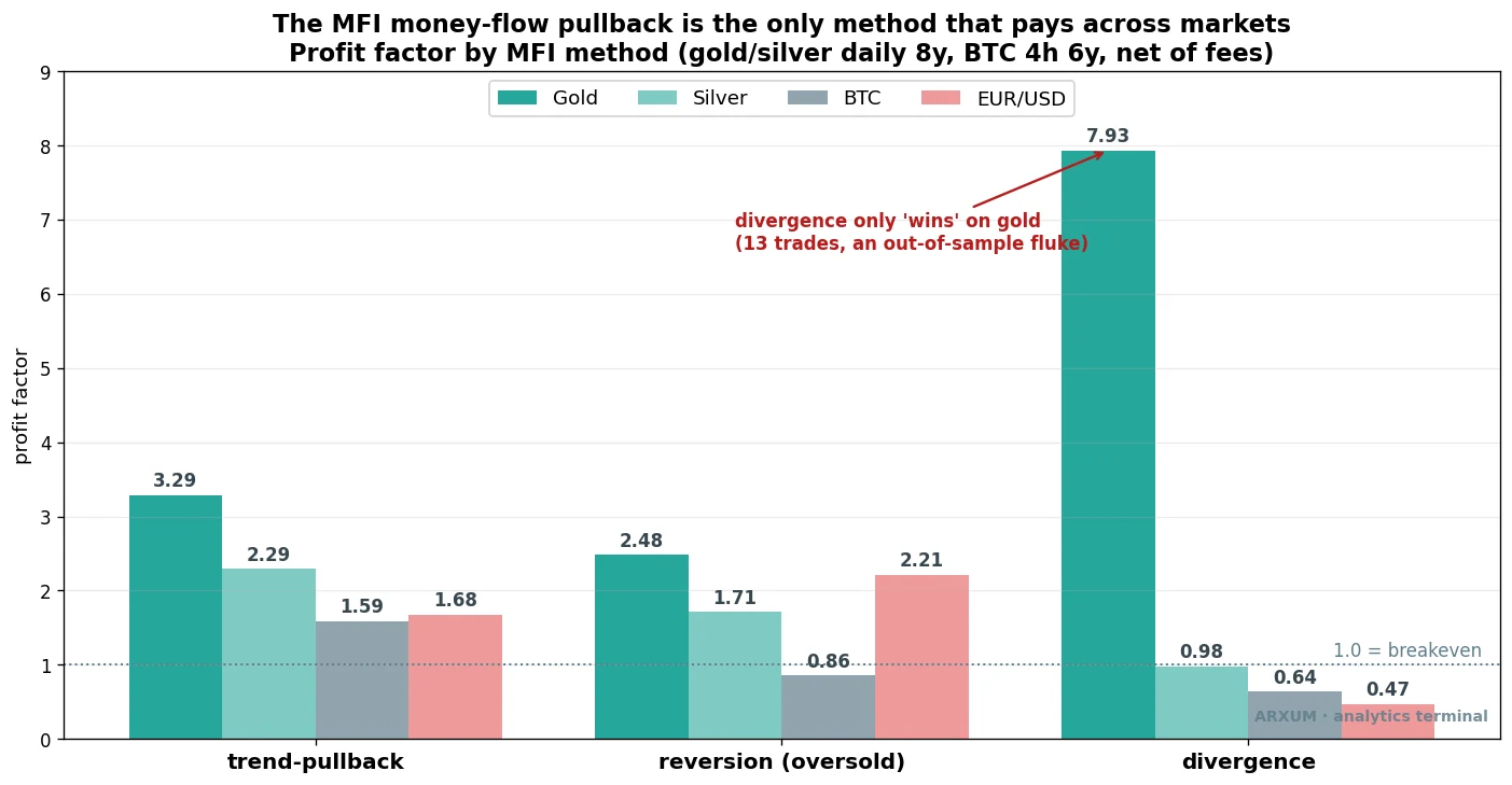
Read the trend-pullback group on the left first. Gold 3.29, silver 2.29, BTC 1.59, EUR/USD 1.68. Every bar clears 1.0. No other method does that, and one of the other two is a trap dressed up as a winner.
Why the volume in MFI only counts when it is real
This is the part worth the read, and it is the honest core of the Money Flow Index. The indicator’s whole selling point is volume. So a fair test is simple: does adding a heavy-volume requirement to the pullback actually help? Only take the trade when the bar that triggers it comes on volume at least 1.5 times the recent average.
The answer depends entirely on where the volume comes from.
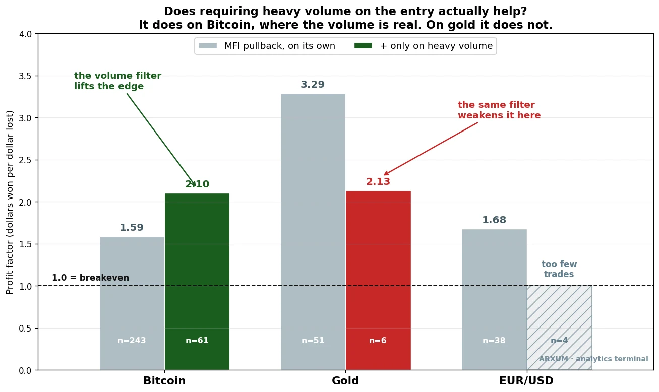
On Bitcoin, where the exchange reports real traded volume, demanding heavy volume on the trigger lifted the profit factor from 1.59 to 2.10. That is the Money Flow Index doing its job. Real money behind the turn, confirmed, and the edge improves.
On gold, the same filter dropped the profit factor from 3.29 to 2.13, and it ran on just six trades. It did not help. It hurt.
The reason is buried in how charts get their data. Forex and metals do not trade on one central exchange, so most platforms show tick volume: a count of how many times the price changed during the bar, not how many contracts or ounces changed hands.
It is a rough stand-in for activity. On a calm pair it correlates loosely with real volume; in a fast market it can lie. Feed a volume-weighted indicator a fake volume number and you get a volume-weighted indicator running on noise.
So the practical rule for the Money Flow Index is uncomfortable but clear:
- On crypto, the volume in MFI is real. Use it. Heavy volume on the pullback trigger is a genuine confirmation, and the numbers reward it.
- On forex and metals, the volume in MFI is a tick proxy. Treat the indicator as a slightly slower RSI and lean on the 200-EMA regime and the oscillator level, not the volume spike. The pullback still pays on gold and silver, but it pays because of the trend timing, not because the volume reading is telling you anything special.
That is the real finding. MFI is sold as a forex and stock tool as readily as a crypto one, and on forex the very feature that names it is the part you cannot trust. Knowing that is worth more than another setting to memorise.
The trap: MFI divergence
Every indicator with an oscillator panel attracts the same idea, and the Money Flow Index is no exception. Divergence. Price makes a lower low while the indicator makes a higher low, the two disagreeing, momentum supposedly turning under the surface. It has a magnetic appeal because the win rate looks great.
We built a strict detector, a genuine lower low in price against a clearly higher low in MFI with a real gap between the two readings, and let it trade. The result is the same lesson the RSI version teaches, and you can read the long form in our RSI divergence guide: a high hit rate hiding no edge.
On Bitcoin, MFI divergence ran a 0.64 profit factor: it lost money. On EUR/USD, 0.47. On silver, 0.84.
On gold it posted a flashy 7.93, but that came from just 13 trades and fell apart the moment you split the sample. Thirteen trades is not a strategy. It is a coincidence with a profit factor attached.
Part of the problem is mechanical. You do not buy at the divergence low. You wait for confirmation, a close back above the interim high, which means you enter well above where the signal formed.
You buy high on a bet the bottom is in, and when it is not, the loss is the full distance back down. High win rate, fat losers, thin winners. The trap bites the same way it does on RSI.
Use MFI divergence as a one-line heads-up, never as your entry. When you spot it, it is a reason to watch, not a reason to click buy.
When the trade is a loss
The pullback is not magic, and a guide that only shows winners is selling, not testing. Here is a clean loser on gold, taken by the exact same rule.
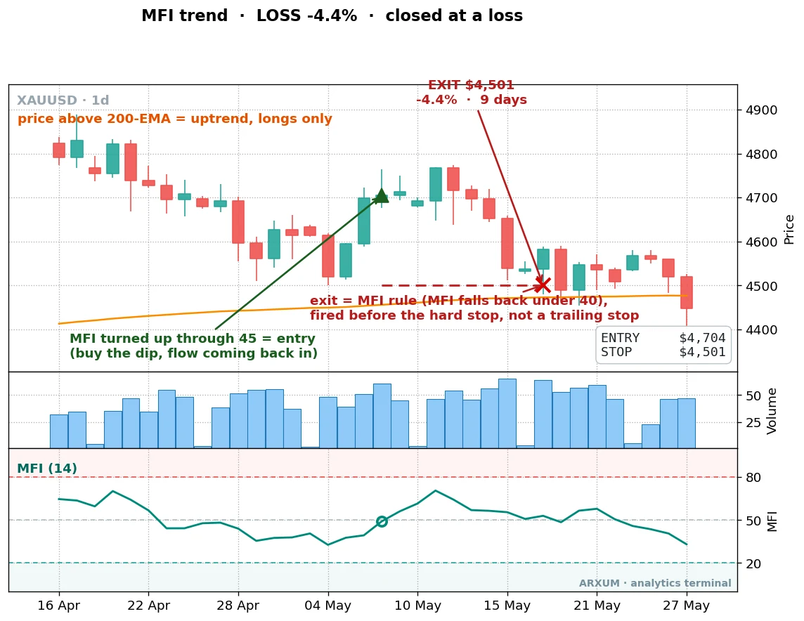
The setup looked identical to the winners. Price above the 200-EMA, MFI turning up through 45, entry on the turn. Then gold simply reversed.
The exit here is worth noting. It fired on the MFI rule, when the indicator fell back under 40, not at the hard stop line below. The strategy gets you out as the reason for the trade evaporates, before the full stop is hit. That capped the loss at 4.4% on a 9-day hold.
That is the rhythm. The winners run for weeks at 1:4 or better; the losers get cut fast and small. Win 41% of the time with that shape and you come out well ahead. Win 41% of the time with the divergence shape, tiny wins and full losses, and you bleed.
Profit factor is not reward-to-risk
Two numbers in this guide both look like “1.X” and beginners blur them. They answer different questions.
- Reward-to-risk (1:X) is one trade. It compares what a winner makes to what a loser costs. The gold pullback ran about 1:4.7: each winner, on average, made roughly four and a half times what a loser cost.
- Profit factor is the whole strategy. Total dollars won divided by total dollars lost, across every trade. Above 1.0 it makes money; 3.29 means $3.29 back for each dollar lost.
A setup can have a great reward-to-risk and a strong profit factor at the same time, which is the pullback. Or a great win rate and a weak profit factor, which is divergence. Read all three together, never one alone, and the divergence trap stops fooling you.
Direction is the whole game
The pullback only works long, in an uptrend, and that is not an accident. We tested the short mirror, selling MFI rallies in a downtrend, and on a trending bull asset like gold it lost: a 0.66 profit factor on the trend short, 0.73 on the reversion short. You cannot fade a strong uptrend with an oscillator. The trend runs you over.
This is the lesson that outlives any single indicator. Trade with the regime, not against it.
- Above a rising 200-EMA, the market is in an uptrend. Buy the MFI pullback. Ignore overbought; in a real trend MFI can sit above 80 for a long time.
- Below a falling 200-EMA, the market is in a downtrend. Now the short mirror is the right tool, and selling MFI rallies makes sense. On oil, which actually swings both ways, the short side paid where it failed on gold.
- In a flat, rangebound market, the bounce-buying reversion does better than either trend play, because price keeps returning to the middle. On EUR/USD, which went roughly nowhere over the eight years, MFI reversion posted a 2.21 profit factor while simply holding the pair made nothing.
That EUR/USD result is worth a beat. Holding the euro for eight years returned about nothing, yet the MFI reversion still pulled a profit out of it.
An edge that makes money on a market with no trend to ride is closer to real than one that just sat on a rally. It is thin, but it is honest alpha. The stochastic oscillator works the same way in ranges, if you want a second tool for that job.
How to size and place the trade
Say you want to trade the gold pullback. Here is the arithmetic, end to end, on a $1,000 account, risking 2% per trade.
- Account: $1,000.
- Risk budget: 2% of $1,000 = $20. That is the most you let this trade lose.
- Entry and stop: suppose price triggers at $3,400 and the recent swing low, where your stop goes, sits at $3,268. The distance is $3,400 − $3,268 = $132 per ounce of risk.
- Position size: $20 ÷ $132 = 0.15 ounces.
Here is the honest catch. Gold is sized in lots, not loose ounces: a standard lot is 100 ounces, a micro lot is 1 ounce. A position of 0.15 ounces is below even a micro lot. On a $1,000 account at 2% risk, the gold trade is too small for most brokers to take.
That is not a flaw to paper over. It is the reality of trading an expensive instrument on a small account. Your options are a broker offering fractional or cent-lot sizing, or a lower-priced market like the euro, where the dollar risk per unit is far smaller and 2% reaches a tradeable size.
Never widen the stop or oversize the position to force the trade in. The 2% rule is the thing keeping you in the game.
Once the size is set, the order is three fields:
- A buy order at or just above the trigger, $3,400.
- A stop-loss at the swing low, $3,268.
- An exit plan: close when MFI falls back under 40, or take it manually if the trend structure breaks.
The free tier of TradingView is enough to add the Money Flow Index, drop a 200 EMA on the chart, and read all of this off one screen.
Risk, and the discipline behind the numbers
The pullback wins 41% of the time. Sit with that.
It means you will lose more trades than you win, often several in a row. The account will spend long stretches going nowhere, exactly like that flat first half of the equity curve. That is normal. The edge lives in the few big winners, and you have to still be there, sized sanely, when one shows up.
A few things that matter more than the indicator:
- An edge is a long-run thing, not a per-trade promise. Expect losing streaks. The gold pullback’s worst drawdown was 10%, and that was while it was working.
- Do not chase or revenge-trade. After three or four losses the temptation is to size up and “win it back.” That is how a 10% drawdown becomes a 40% one. If you hit four to six losses in a row, step back for a week and check whether the trend regime actually changed, because sometimes it has.
- Only risk money you can afford to lose, and keep the 2% rule even when a setup looks certain. None of them are.
- Watch live versus the test, calmly. If your live results run far worse than these numbers over a real sample, the edge may be fading, but one bad week is just variance. Do not panic out of a working method, and do not cling to a broken one. Check conditions before you decide.
The honest gaps
A few things this test does not claim:
- It is mechanical. A real trader uses the structure of the chart too, and your eye is the last filter. The rules get you most of the way; experience covers the rest.
- The forex and metals numbers ride on tick volume. The pullback’s edge there comes from the trend timing, and the volume reading is the part to distrust, as the whole middle of this guide argued.
- Backtests are fragile by nature. These results held up out-of-sample on the metals and Bitcoin, which is the test that matters most, but no edge is permanent. Markets change and strategies decay.
What works, on a matchbox
If you remember five lines from this, make it these:
- The MFI money-flow pullback is the edge. Uptrend above the 200-EMA, buy when MFI turns back up through 45, exit when it drops under 40.
- Trade with the regime. Long in uptrends, short only in real downtrends, reversion in ranges.
- The volume in MFI is only real on crypto. Use the heavy-volume confirmation there; on forex treat MFI as a slower RSI.
- Divergence is a trap. High win rate, no edge. A heads-up, never an entry.
- Size at 2% and respect it, even when the math says the trade is too small to take.
Where to go from here
The Money Flow Index is one volume read among several. It works best as part of a stack, not alone.
A few guides to go deeper:
- VWAP indicator: the other price-times-volume tool, from a different angle.
- Donchian channel: a clean breakout trigger that pairs with the same 200-EMA regime filter used here.
- RSI indicator guide: the un-weighted cousin of MFI.
- Risk-reward ratio: the 1:X math that makes a 41% win rate profitable.
- Average true range: the volatility read that helped tune the gold pullback in our sweep.
FAQ
What is the Money Flow Index, in plain terms?
How is the MFI indicator different from RSI?
Does the Money Flow Index strategy actually work?
What are the best MFI settings?
What is the best timeframe for the Money Flow Index?
Does MFI work on forex, or just crypto?
Is MFI overbought above 80 a sell signal?
What does MFI divergence mean, and should I trade it?
Why does the strategy win only 41% of the time and still make money?
What is profit factor, and how is it different from reward-to-risk?
How much money do I need to start?
What do the key terms mean?
🌍 Our recommended brokers
Reader Reviews
Be the first to review this — tell other traders what actually helped, or where it fell short.
Leave a Review

Quant Researcher & Systems Builder
Quantitative researcher who builds the automated systems behind Arxum strategy testing. Works in Python and Pine Script, using AI alongside classic backtesting to validate strategies on years of real data.