
What an inside bar looks like
Before any numbers, here is the shape. A bullish breakout on the left, a bearish one on the right, the way a textbook draws them.
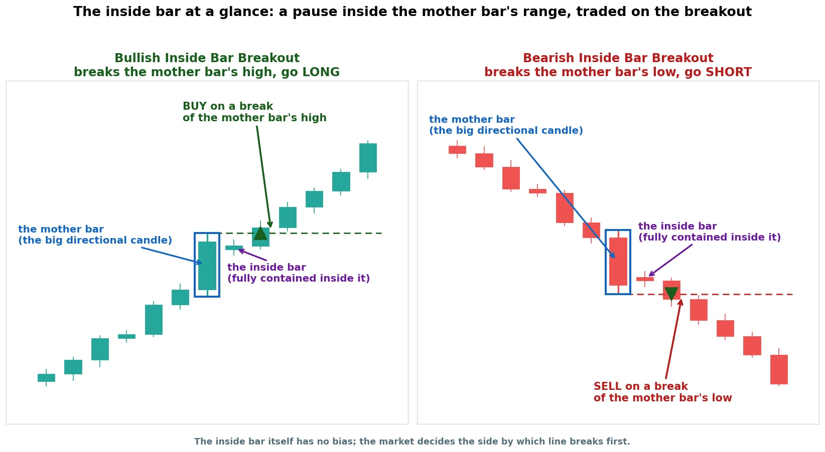
An inside bar is really two candles working together. The first is a big candle with a decent range and a clear direction, called the mother bar.
The second, the inside bar, is smaller, and the whole of it, high and low, sits inside the mother bar’s range. Price pushed hard, then went quiet and coiled up.
That coil is the signal. A market that just made a strong move and then pauses in a tight range is loading up for the next one.
You do not guess which way. You mark the mother bar’s high and its low, the support and resistance the coil sits between, and let price tell you.
A break above the high is a long, a break below the low is a short.
The inside bar itself has no built-in bias. It is a pause, not a forecast, and we tested both directions rather than assuming one.
The results, though, were not symmetric. In a market trending up, above its 200-day average, only the buy-stop above the high paid, so that is the side to place.
By the end of this you will have the one filter that turned this pause into a real, tested edge. Plus the markets it works on, and a trade you can size on a small account.
First the rules, then the honest numbers.
The rules, written down
Here is the inside bar breakout as a mechanical checklist. The long side, since gold leads this piece.
- The mother bar: a candle with a real range and a clear body. A tiny, indecisive mother bar has almost nothing to break out of, so it is worth skipping.
- The inside bar: the next candle fully contained. Its high sits at or below the mother bar’s high, its low at or above the mother bar’s low.
- Entry: a buy-stop just above the mother bar’s high. You are filled only if price actually breaks out.
- Stop: the mother bar’s low, the opposite side of the range. That distance, entry to stop, is your risk.
- Target: twice that risk. The mother bar’s own range gives you a natural measure, and we tested a fixed reward of two times risk across the board.
- Direction: long above the high, short below the low. We tested both and the results are not symmetric, which the piece gets to.
- Costs: real spread and fees per market come out of every trade.
Here is that whole checklist as one picture, the way a textbook draws it. This is the ideal the real charts further down are measured against.
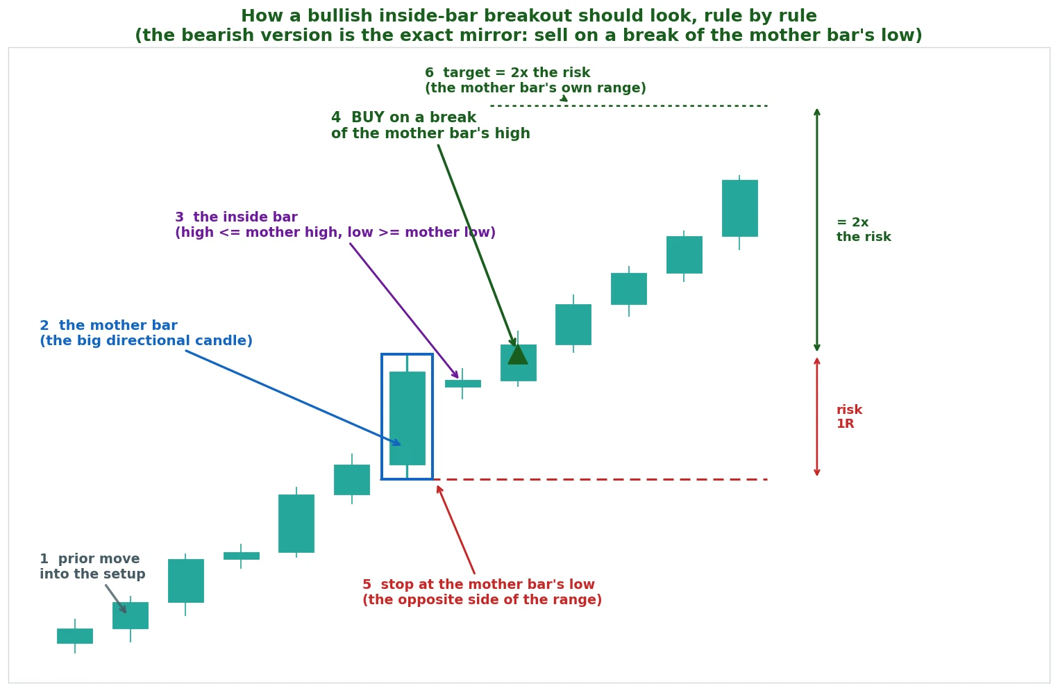
The short side is the exact mirror. A sell-stop below the mother bar’s low, the stop above the mother bar’s high, the target twice the risk down.
That is the whole system on paper. The interesting part is what eight years of candles did to it.
This pattern behaves differently from the single-candle setups most guides lump it in with.
Why the inside bar pattern holds up better than most
Most price-action patterns fall apart the second you put a number on them. A lone candle, taken on its own with no context, is usually a coin flip.
That is the honest baseline for most of them, and it is why the inside bar pattern surprised us in testing.
The inside bar is the exception, and it is worth being clear about why. You are not trading one candle.
You are trading a breakout from a defined range, and the stop is built into that same range. The structure keeps your losers small and lets a real move run, which is a sturdier idea than reading meaning into a single wick.
So instead of finding a raw coin flip, the test found the raw breakout already paying on the markets that trended:
- Spot gold (XAU/USD) on the daily chart posted a profit factor of 2.05 raw, no filter, taking every signal. Profit factor is the whole strategy in one number: every dollar won divided by every dollar lost. Above 1.0 it makes money, and 2.05 means you kept two dollars for every dollar you gave back.
- Silver (XAG/USD) came in at 1.73 raw, Bitcoin at 1.63, oil (WTI) at 1.41.
- EUR/USD was the flat one at 0.86, a genuine non-edge, and there is a good reason for it that the timeframe section explains.
Three or four markets making money raw is unusual. But raw is not the finished article.
The interesting question was whether one filter could lift all of them at once, or whether every market needed its own trick.
The one filter that travels: heavy volume on the breakout
We did not assume the usual volume-trend-RSI stack. The honest way to find what helps is to sweep a whole menu and keep only what the data rewards across markets.
Not what looks clever on one.
So the engine tagged every breakout with a wide set of candidates. That meant volume, the 200-day trend, trend strength, an RSI level, momentum, volatility, and the pattern’s own geometry checks.
Then it measured which one actually lifted the edge.
Most of them helped on one market and hurt on another. Trend strength lifted gold a touch but dragged Bitcoin and silver down.
The 200-day trend filter did the same, useful on gold, actively worse on silver. A filter that only works on the market you tuned it to is not a filter, it is a coincidence.
Oil is the cautionary tale here. Its trend-strength filter looked terrific on the first half of the data, a 2.03 profit factor, then collapsed to 0.75 on the unseen half.
That is exactly what an overfit filter looks like: great in the sample you tuned it on, useless on the data it never saw.
One held up everywhere.
The winner was heavy volume on the breakout. Only take it when the breakout bar’s volume is at least one and a half times its twenty-bar average.
In plain terms, you skip the quiet breakouts and keep the loud ones. A breakout on heavy volume is real buying or selling stepping in.
A breakout on thin volume is price drifting over the line with nobody behind it, and those are the ones that snap back.
This chart is the one the whole piece turns on. It scores the raw breakout against the volume-filtered version, across four markets.
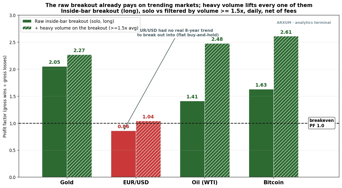
Read the lift market by market. Every hatched bar clears its raw bar.
- Gold went from 2.05 to 2.27. It barely needed the help, because it trended so hard that even quiet breakouts tended to pay, but the filter still added to it.
- Oil jumped from 1.41 to 2.48, and Bitcoin from 1.63 to 2.61. On these two the filter did real work, sorting the breakouts that meant it from the ones that did not.
- EUR/USD crept from 0.86 up to 1.04, over the breakeven line but only just. The filter helped, but it cannot manufacture a trend that was never there.
The one not on this chart is the loudest number in the whole test. On silver, the raw 1.73 became a 4.77 profit factor once you demanded heavy volume, at a 71% win rate.
Silver’s breakouts are noisy, so filtering out the quiet ones mattered more there than anywhere else.
Treat that 4.77 as the ceiling of what discipline adds, not a promise, because it comes from a smaller slice of trades.
You trade far less often with the filter on. But each breakout you do take is much more likely to be the real thing.
That is the trade-off worth taking on every market here.
How to read heavy volume off a chart
Volume is the simplest indicator to read, and it is free on every charting platform. It is the bar chart along the bottom of the screen, one bar per candle, taller when more changed hands.
Tools like on-balance volume build on that same raw reading.
To turn it into the filter, add a moving average of volume set to twenty. That is a single line that shows what normal volume looks like lately.
Then the rule is a glance. At the breakout candle, is the volume bar poking well above that line, at least half again as tall?
If yes, the breakout has backing. If the bar is short and stubby, the breakout is quiet, and you pass.
One honest caveat for the Forex and metals reader. Currencies and gold have no single exchange, so what your feed calls volume is really tick volume.
It counts how many times the price updated, not how much money changed hands.
It is a proxy. The good news is that it still works.
A burst of ticks at the breakout separates the busy moves from the dead ones, the same way true exchange volume does on Bitcoin. Just know it is a stand-in, not the real thing.
The filter paying off: two heavy-volume breakouts
The filter is only as good as the trades it picks. So here it is doing its job on the two markets where it mattered most.
Start with silver (XAG/USD), the market where the volume filter did the most work, lifting the raw 1.73 all the way to 4.77.
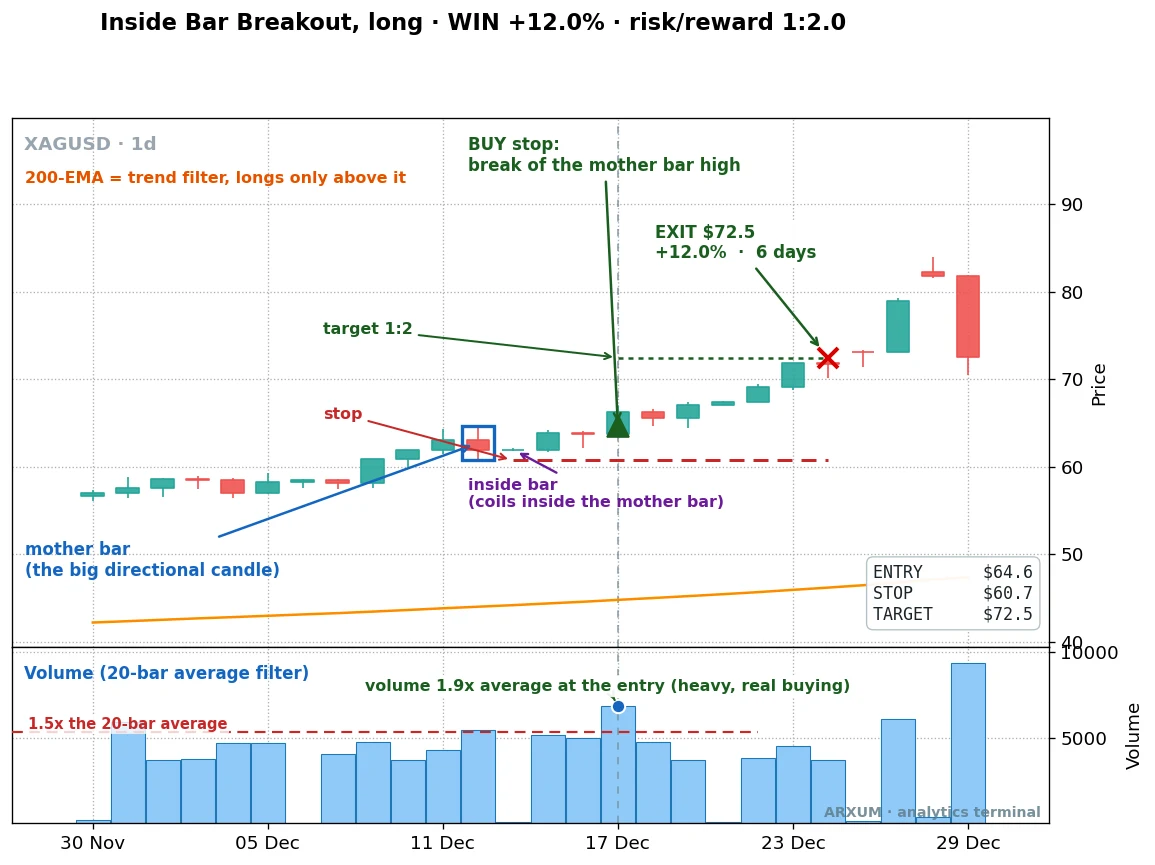
Read the volume panel underneath the price. At the breakout candle, the volume bar poked to 1.9 times its twenty-bar average, well above the line, real buying stepping in.
That is the filter’s whole job: this breakout had backing.
The entry came at $64.65 on the break of the mother bar’s high, the stop at $60.68. The target at $72.47 filled six days later for a 12.0% gain.
This is the kind of loud breakout silver’s 4.77 is built on.
The same read works on crypto, where the volume is true exchange volume, not a tick proxy. Here is Bitcoin.
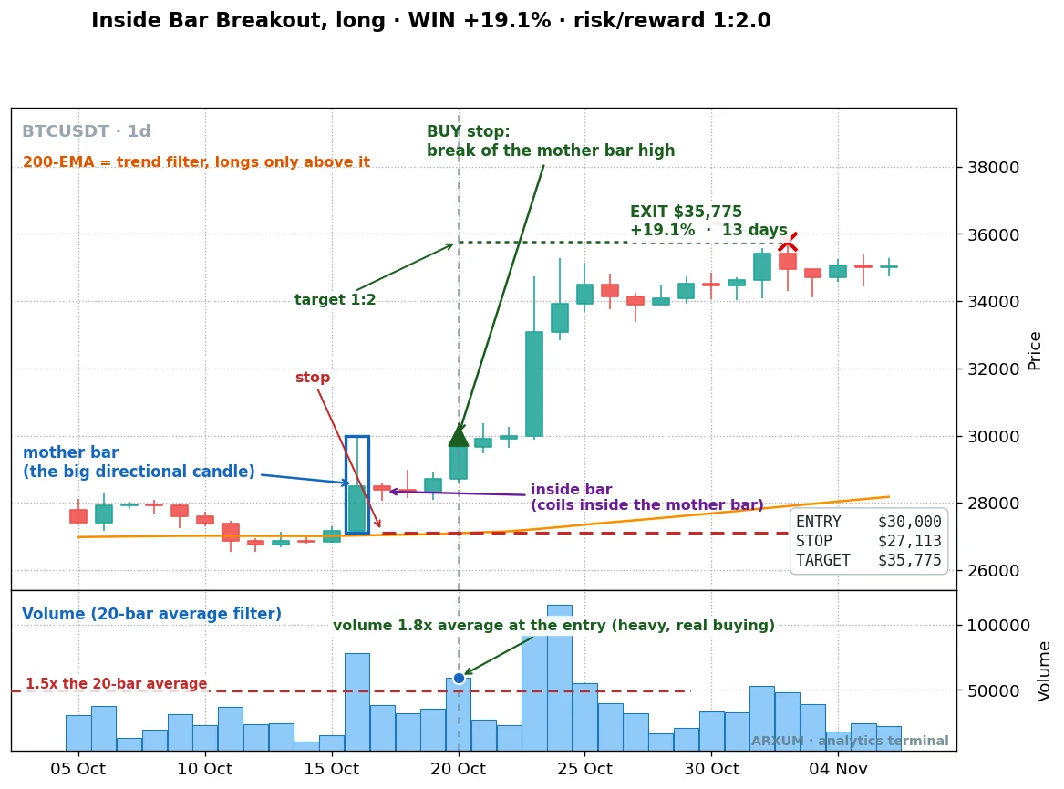
Same picture. The coil broke above the mother bar’s high, and the volume bar at the breakout read 1.8 times average.
The trade ran from an entry of $30,000, stop $27,113, to the $35,775 target over thirteen days, a 19.1% gain. On Bitcoin the volume filter took the raw 1.63 up to 2.61.
The rule of thumb here: the filter is at its most valuable on the noisier markets, silver and crypto, where quiet fakeout breakouts are common.
On a smooth trender like gold it adds a little. On a choppy one like silver it is the difference between a decent edge and a strong one.
The method on gold
Gold is the cleanest home for this pattern, so it leads. Spot gold (XAU/USD) spent most of the test period grinding higher, and the inside bar loves a trending market.
You buy the coils that break upward and let the trend carry them.
Here is a recent one.
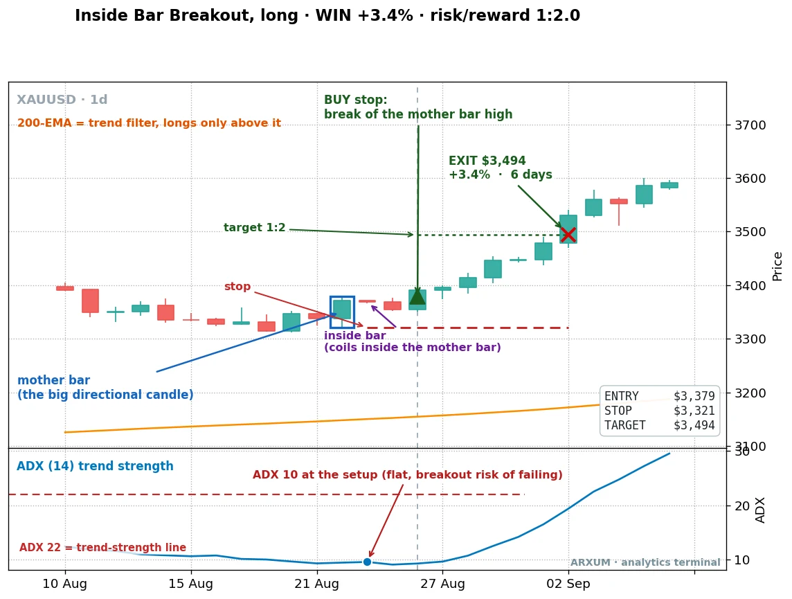
Read it left to right. Gold had a strong candle, the mother bar, then coiled into a tight inside bar that sat entirely within it.
The buy-stop went just above the mother bar’s high. When price broke out, the trade was live.
- Entry: $3,379, on the break of the mother bar’s high.
- Stop: $3,321, the mother bar’s low. The gap down to it is your risk on the trade.
- Target: $3,494, twice that risk above entry.
- Result: target hit six days later, a 3.4% gain, a reward-to-risk of 1:2: two dollars back for every dollar the stop risked.
There is a detail on this chart worth pausing on. The panel underneath is ADX, a trend-strength gauge, and at the breakout it read only 10, a flat, going-nowhere market.
That is a breakout with a real chance of failing, and I have left it on the chart honestly.
It won anyway. That is the point of the next section: the filter that reliably helps is volume, not a trend-strength reading.
A quiet market did not stop this one, but it is exactly the kind of setup you want volume to vouch for.
Here is a second gold breakout, from a more clearly trending stretch.
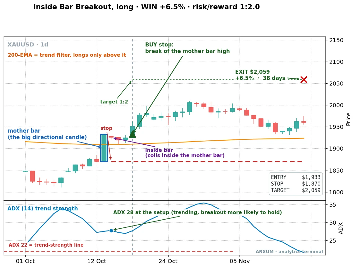
Same rules, a bigger payoff. The entry came at $1,933 on the break of the mother bar’s high, the stop sat at $1,870.
The target at $2,059 filled about five weeks later for a 6.5% gain.
This breakout fired with ADX at 28, a market that was genuinely trending, and the move had room to run. The slow ones like this are the pattern’s bread and butter: not flashy, just repeatable.
Now the proof it pays over time, not on two cherry-picked charts. Here is what every raw gold breakout did across the full eight years, compounding a $1,000 account at 2% risk per trade.
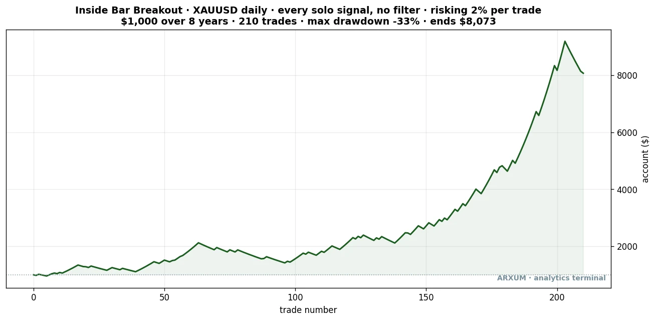
A balance curve is just your account over time, one step per trade, so read it as a story rather than a number. This is what the raw gold method did: every inside bar breakout, no filter, $1,000 to start, risking 2% a trade over eight years.
Notice the shape. It grinds sideways for the first third, dips, chops, then compounds hard in the back half as gold’s trend really got going.
That jaggedness and the roughly 33% drawdown in the middle are the losing stretches you have to sit through.
The line ends near $8,073 across 210 trades. Here are the numbers behind it.
| Trades | 210 |
| Win rate | 51% |
| Reward-to-risk | 1:2.0 |
| Profit factor | 2.05 |
| Max drawdown | −33% |
| Net return on $1,000 | +707% |
Two things to be honest about here. That +707% is the raw pattern over eight years on a market that ran up hard.
So a good chunk of it is gold’s own trend, not the pattern’s cleverness.
And a 33% drawdown is real pain, a third of the account gone at the worst point.
This is a rough, mechanical system that pays over a long horizon, not a smooth line. The volume filter is what trims the noise; the raw curve is here to show you the honest baseline first.
Does the edge survive on data it never saw?
A backtest can fit itself to the past. The check that matters is out of sample, which just means testing the rule on data it was never built on.
So we split the eight years in half and built the picture on the first stretch. Then we ran it on the second stretch the rule had no way to know.
On gold the pattern did something rare. The first half ran a profit factor of 1.46, and the second half, the unseen data, came in higher at 2.72.
An edge that survives data it was never fit to is one you can trust, and one that strengthens is rarer still.
I would not promise the jump repeats. But it is the opposite of a setup that only looks good on the exact stretch of history it was fitted to.
That single result, an out-of-sample profit factor above the in-sample one, is the most dependable number in this whole study. It is the main reason gold leads.
The timeframe changes the answer
Timeframe is not a detail you set and forget. It is a real variable, and on this pattern it flips at least one market’s verdict.
Take EUR/USD. On the daily chart it was the flat one, a 0.86 profit factor, a genuine non-edge.
The reason is simple and worth stating. EUR/USD had no real directional trend to break out into over these eight years.
Buy-and-hold on the pair was roughly flat for the whole window. A breakout pattern needs a market that goes somewhere after the breakout, and the daily euro just did not.
Drop to the 4-hour chart, though, and EUR/USD turns positive: a 1.64 profit factor raw over a recent two-year window. Same pattern, same rules, a different and more honest answer at a faster timeframe.
The shorter window catches the smaller intraday swings the daily chart smooths away.
The sample is thinner there, only 56 trades, so treat it as promising rather than proven.
But it is a real finding: on this pair, the timeframe decides whether the pattern has anything to trade.
Gold tells the same story, more strongly. Here is the gold 4-hour record.
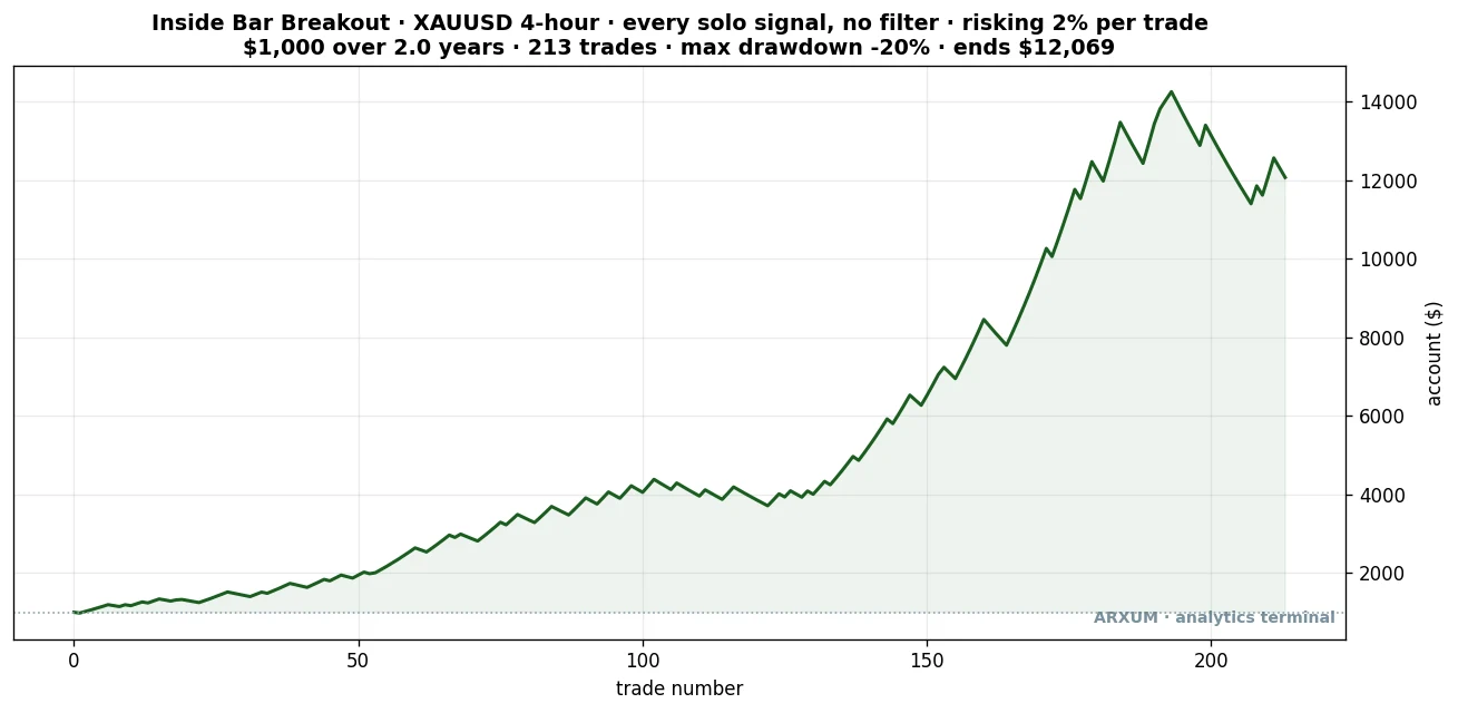
Read this the same way as the daily curve: every raw 4-hour breakout on gold, $1,000 risking 2% a trade, over a recent two-year window. The climb is steadier than the daily, the deepest dip about 20% instead of 33%, and it ends near $12,069.
| Trades | 213 |
| Win rate | 55% |
| Reward-to-risk | 1:2.0 |
| Profit factor | 2.41 |
| Max drawdown | −20% |
| Net return on $1,000 | +1,107% |
The gold 4-hour is the sturdier of the two. Its profit factor is higher, its drawdown shallower, and it held up out of sample just as well.
That was a 2.36 on the build half and 2.44 on the unseen half.
If you want the pattern in the current market rather than only across a long history, the 4-hour gold breakout is the strongest place to look.
The lesson is general: before you write a market off, check another timeframe. A pattern that looks dead on the daily can be alive on the 4-hour, and the other way round.
The short side, honestly: it fights the trend and loses
Here is the question every guide ducks. The long breakout works.
Does the short breakout, selling below the mother bar’s low, work too?
Mostly, no, and the reason is worth understanding because it recurs across every reversal-flavoured pattern we test. Over these eight years, gold, silver and Bitcoin all spent the period climbing.
A short breakout on a market in a bull run is a bet against the tide, and the tide won.
The numbers are blunt. Both short sides lost, and silver’s was the worst result in the entire study.
- Gold short: a 0.66 profit factor, a clear loser, at a 26% win rate.
- Silver short: a 0.50 profit factor, and it got worse on unseen data, dropping to 0.31 out of sample.
Selling coils in a market that mostly wanted to go up simply did not pay.
And it was not a case of picking the wrong context. Here is a gold short that was genuinely with the trend, price below a falling 200-day line, and it still lost.
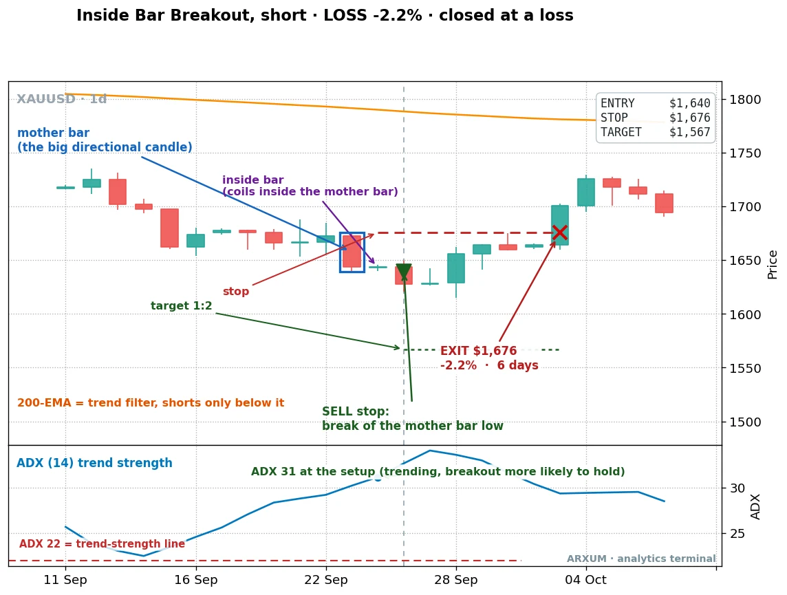
This one did everything right on paper. Price was under a falling 200-day line, so the trend filter said the downside was fair game.
ADX read 31, a market with real momentum.
The sell-stop triggered below the mother bar’s low. Then price simply turned back up, ran through the stop, and closed the trade at a 2.2% loss over six days.
The takeaway is not “the pattern is broken.” It is that a trend filter helps but never guarantees, especially when you are shorting a market whose deeper habit is to reverse back up.
Gold spent the era finding reasons to climb. Fighting that with a short, even a technically valid one, is leaning against the dominant force in the market.
There is one short-side result worth a mention: Bitcoin’s short breakout with the volume filter reached a 3.75 profit factor. But that came from only seventeen trades, far too few to build on, so I flag it as a curiosity rather than a setup.
The honest headline for the short side is plain: this is a long pattern in the markets we tested, because those markets trended up.
When a clean breakout still loses
Honesty cuts both ways, so here is a long breakout, on gold, that looked fine and still lost.
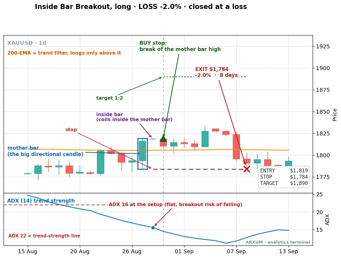
This was one of the cleanest-looking coils in the whole gold list, a tidy inside bar tucked inside a solid mother bar.
The buy-stop triggered at $1,819, the trade went in, and then it just stalled. Price drifted, rolled over, and clipped the stop at $1,784 eight days later for a small loss.
Look at the ADX panel: it read 16 at the setup, a flat market. No trend behind the breakout, no fuel for the move.
That is the honest wrinkle. A clean shape is a good entry, never a promise, and the ones that fire in a dead market are the most likely to fizzle.
The stop below the mother bar is what keeps a fizzle like this to one small loss instead of a problem.
You cannot avoid the odd loser. You can make sure it stays small.
Train your eye: spot the coil
Recognising an inside bar quickly is half the skill. So here is a wall of real ones across the markets we tested, to calibrate your eye.
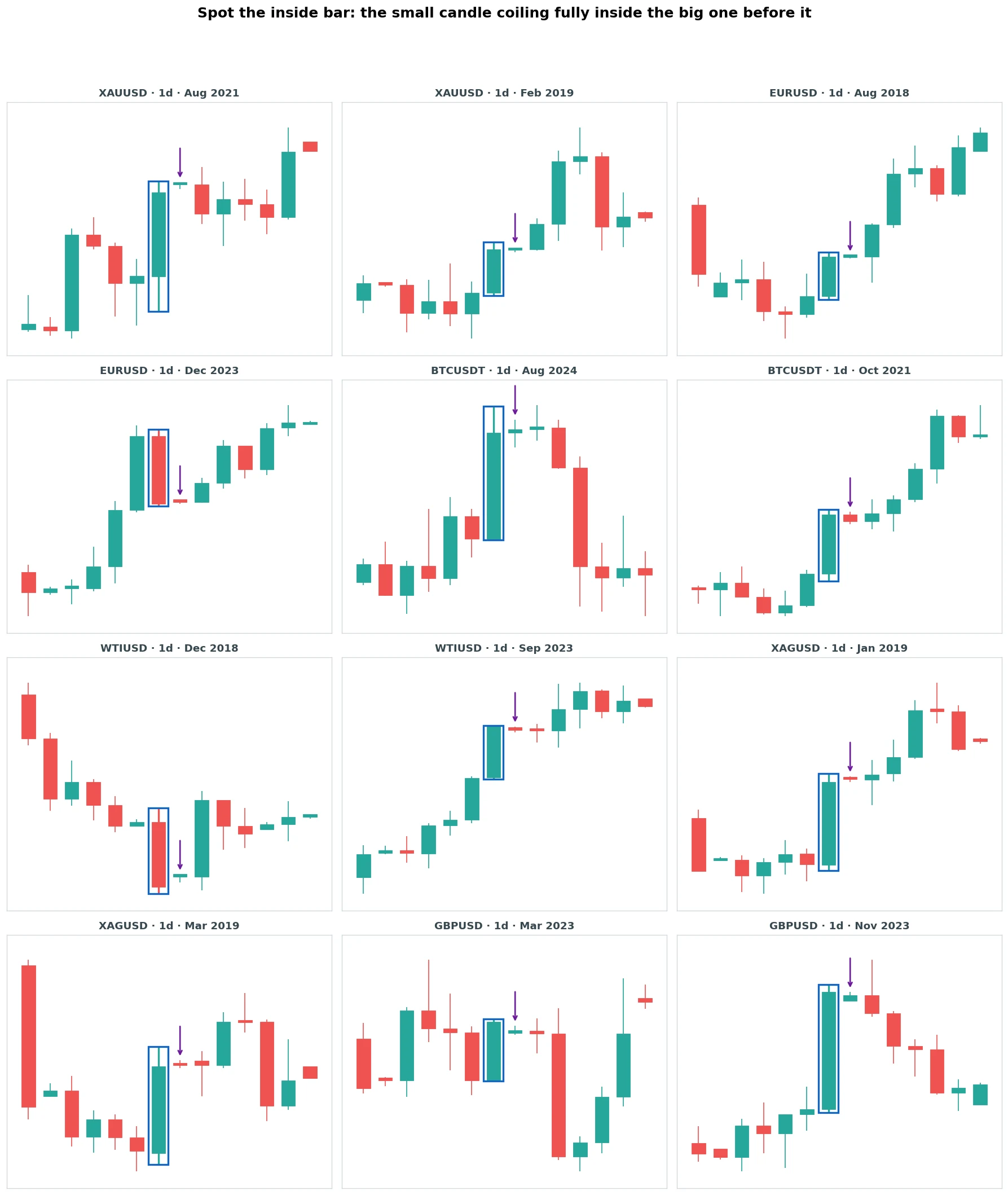
Look for the same thing every time: a candle with a real range, then a smaller candle whose whole body and wicks fit inside it. That is it.
Some sit inside uptrends, some inside downtrends, some at turning points. The inside bar pattern does not change its shape from market to market, which is what makes it worth learning once and using everywhere.
One thing the gallery teaches at a glance: the best coils are tight and sit after a decisive mother bar. A mother bar that is itself small and indecisive gives you almost nothing to break out of, and the test agreed, those setups underperformed.
Wait for a real range followed by a real pause.
Profit factor and reward-to-risk are not the same thing
Two numbers in this piece look similar and measure completely different things. A beginner blurs them constantly, so here they are side by side.
Reward-to-risk is a single trade. Written 1:X, the 1 is what you put at risk, entry to stop, and the X is what you stand to make, entry to target.
Every trade here was set to 1:2, so a winner makes two dollars for every dollar a loser costs. The risk-reward ratio guide covers how to read that figure on any trade.
Profit factor is the whole strategy: every dollar won divided by every dollar lost across all the trades, so above 1.0 the system makes money. Gold’s raw 2.05 means the pattern kept two dollars for every dollar it gave back over all 210 trades.
The two answer different questions. Reward-to-risk tells you the shape of one trade.
Profit factor tells you whether the strategy as a whole comes out ahead.
A setup can have a modest reward-to-risk and a strong profit factor if it wins often enough. Or a high reward-to-risk and a weak profit factor if it rarely wins.
Know which one you are reading.
Position sizing, in plain dollars
Knowing the setup is half of it. Sizing it so one bad run does not wreck you is the other half.
The rule is simple. Risk a fixed slice of the account on each trade, and let the distance to your stop decide how big the position is.
Use 2% per trade. On a $1,000 account that is $20 of risk.
You trade these markets in lots, not loose ounces or barrels, so a quick word on lot sizes first.
A standard lot is the full contract, a mini lot is a tenth of it. A micro lot is a hundredth, the smallest most brokers let you click.
On gold a micro lot is one ounce. On a Forex major like EUR/USD a micro lot is 1,000 units, where one pip, a 0.0001 move, is worth about ten cents.
Now walk the recent gold breakout from earlier, in dollars:
- Account $1,000, risk budget at 2% is $20.
- Entry $3,379, stop $3,321. Risk per ounce: $3,379 − $3,321 = $58 an ounce.
- Size: $20 ÷ $58 = 0.34 ounces, which is below even one micro lot.
That is the honest snag with gold on a small account. At true 2% risk, the position lands below the smallest lot a normal broker offers, because gold is expensive and its dollar stops are wide.
Do not solve that by widening the stop or oversizing. Two clean options here.
Use a broker that offers fractional or cent-sized lots so you can hold close to your real 0.34-ounce size. Or wait until the balance is larger.
Either way the risk stays $20, because the size bends to the risk, never the other way.
So here is the trade a $1,000 account can actually place. It is the same pattern on EUR/USD, the cheapest, most accessible market for a small account.
This one is sized off a real breakout on the 4-hour chart where the euro’s inside bars pay.
- Account $1,000, risk budget at 2% is $20.
- Say the mother bar’s high is at 1.0850 and its low at 1.0790. You buy the break of the high at 1.0850, stop at 1.0790.
- Risk: 1.0850 − 1.0790 = 0.0060, which is 60 pips.
- At about $0.10 per pip on a micro lot, one micro lot risks 60 × $0.10 = $6.
- Size: $20 ÷ $6 = about 3 micro lots. That puts $18 of the $20 budget at risk and fills easily on any micro-lot account.
- Target at twice the risk, 120 pips above entry at 1.0970. If it hits, 3 micro lots make about 3 × 120 × $0.10 = $36, a clean 1:2 against the $18 risked.
That is a real, placeable trade for a $1,000 account. The lesson is the one gold keeps teaching: pick a market your account can afford.
A Forex major, sized in micro lots, is where a small account should learn this pattern.
How to place the trade
Once you have a valid inside bar and a size, the order is three fields on the ticket. For the long breakout:
- Buy-stop just above the mother bar’s high, so you only fill if price actually breaks out.
- Stop-loss at the mother bar’s low.
- Take-profit at twice the risk above your entry.
Set all three at once and leave it. Do this whenever the market is trending up, price above its 200-day average, which is where the long side earned its keep.
The short version flips it: a sell-stop below the mother bar’s low, the stop above the mother bar’s high, the target twice the risk down.
Reserve that for a market genuinely trending down. As the short section showed, even then it rarely paid in these markets, so a small account should default to long-only.
Most charting tools, including the free tier of TradingView, let you drag these three levels onto the chart and read the reward-to-risk before you commit.
The discipline that keeps you in the game
Any inside bar strategy lives or dies on how you handle the losing stretches, so this part matters as much as the entry.
The gold equity curve gave back a third of the account at its worst point. A 51% win rate means nearly half your trades lose.
That is the shape of the edge, not a flaw, so plan for it.
- Expect losers in clusters. At a 51% win rate, four or five losses in a row is ordinary variance, not a broken system. The stop at the mother bar’s low keeps each one small.
- Do not chase or revenge-trade. After a run of stops the urge is to widen the next stop or double the size. Or grab the first coil you see to win it back. Take the next valid breakout at the same 2% risk and let the sample play out. After a big winner, the opposite trap: do not get euphoric and oversize the next one.
- Watch the regime, because that is what powers the long edge. These markets paid on the long side because they trended up. Watch for six losses in a row, more than the pattern usually gives, or a burst of far more signals than usual. That is the tell the market may have stopped trending and slipped into a chop. Step back and check before the next trade.
- Only risk money you can afford to lose, and keep each trade small enough that a normal losing run is boring rather than frightening. A third-of-the-account drawdown is survivable on a sensible risk setting and ruinous on a reckless one.
And keep a calm eye on whether live results track the test. One quiet stretch is just variance, so do not panic-quit on a bad week.
But do not ignore a sustained gap either.
If the pattern runs materially worse than its trade history over a real run of trades, treat that as the tell to check. It is not noise to wave away.
The bottom line
Here is the whole thing on a matchbox:
- Trade the breakout of the mother bar’s range, buy-stop above the high or sell-stop below the low, stop at the opposite side, target twice the risk.
- Take only the loud breakouts. Volume at least one and a half times its twenty-bar average is the one filter that lifted every market. Gold went to 2.27, oil to 2.48, Bitcoin to 2.61, silver all the way to 4.77.
- Lead long, on a trending market. Gold was the strongest and steadiest, on the daily and even more on the 4-hour. The short side fought the bull run and lost.
- Check the timeframe before writing a market off. EUR/USD was flat on the daily and positive on the 4-hour. Same pattern, different answer.
- Risk 2% per trade, size for a market you can afford, and respect the losing streaks.
The inside bar pattern is not magic, but it is sturdier than the single candles it gets grouped with. You are trading a defined breakout with the stop built in.
The raw pattern already pays on a trending market, and heavy volume makes it better on every one. The whole edge is on the long side.
Match it to the right market, in the right direction, and a quiet two-candle pause becomes a slow, honest edge.
Where to go from here
If you want to use this yourself, the natural next steps are the markets and math the method leans on. Gold led this whole study.
How to trade gold covers the trending metal the long side works best on.
And to make sure your 1:2 targets are doing the work, the risk-reward ratio guide explains the math the whole strategy rests on.
FAQ
What is an inside bar, in plain terms?
Does the inside bar pattern actually work?
What is the best confirmation to add to an inside bar breakout?
Is the inside bar a breakout or a continuation signal?
Which way do you trade an inside bar?
What is the win rate of the inside bar strategy?
Why does the short side fail?
Which markets and timeframes work best for inside bars?
What is the difference between an inside bar and an engulfing candle?
How do I place an inside bar trade?
How much money do I need to start?
How many losses in a row should I expect?
What do the key terms mean?

Quant Researcher & Systems Builder
Quantitative researcher who builds the automated systems behind Arxum strategy testing. Works in Python and Pine Script, using AI alongside classic backtesting to validate strategies on years of real data.