The CCI indicator, by the textbook
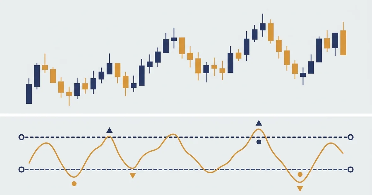
Here is the thing you came to see. This is the commodity channel index, the way every chart draws it.
The CCI indicator sits in a panel under your chart. It swings around a center line at zero. Two levels frame it: +100 up top and -100 down the bottom. Inside that band, price is behaving normally. Outside it, price has stretched unusually far from its own average.
Donald Lambert built it in 1980 for commodities, hence the name. It works on anything that trends, which is most markets.
The math is simpler than it looks. Three steps:
- Take the typical price of each bar, the average of high, low and close.
- Compare it to a 20-bar average of that typical price, then divide by how scattered the recent prices have been.
- Scale it. The 0.015 constant in the formula just sizes the result so that, most of the time, readings land between -100 and +100.
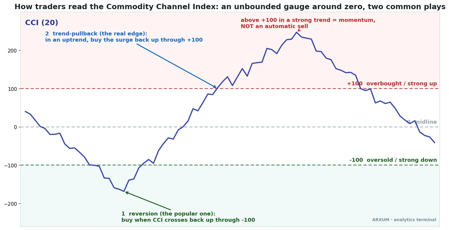
One detail matters more than any other. CCI has no ceiling. RSI stops at 100; the commodity channel index can run to +250 or +300 in a strong move. That single fact decides everything about how you trade it, because the same +100 reading means a very different thing in a quiet range than in a roaring trend.
There are two common ways traders use it, and the picture above marks both:
- Reversion: buy when CCI crosses back up through -100, the classic oversold bounce. Sell the mirror at +100.
- The trend-pullback: in an uptrend, buy when CCI surges back up through +100 after a dip below zero. Momentum re-igniting with the trend.
Those two instincts pull in opposite directions. One says +100 is a place to sell. The other says +100 is a place to buy. The data has a clear opinion about which is right, and it is not the popular one.
What the data says: the popular play is a coin flip
Start with the setup most beginners are taught. Price drops, CCI plunges below -100 into oversold, then ticks back up through it. You buy the bounce. It feels safe because you are buying low.
We ran that on gold daily across eight years, net of fees, meaning the broker’s cut is already subtracted from every result. The verdict: 74 trades, a 58% win rate, and a profit factor of 1.36.
Before that number means anything, here is what profit factor is. It is the whole strategy’s dollars won divided by dollars lost. Above 1.0 you made money; 1.36 means roughly $1.36 came back for every dollar the losers cost. It is not huge, but it is positive.
So reversion on gold is not a disaster. It is just thin. And on the markets where it matters, it gets worse.
On Bitcoin’s 4-hour chart, across 479 trades, the same oversold-bounce play came in at a 0.97 profit factor. That is below breakeven. You would have slowly bled money buying every dip back through -100.
The reason is the one detail from the textbook section. CCI is unbounded. In a real downtrend, price keeps making CCI plunge past -100 again and again, and each “oversold bounce” is just a pause before the next leg down. You are catching a falling knife and calling it a signal.
The takeaway: fading the -100 line treats a momentum gauge like a rubber band. In a calm range it sometimes snaps back. In a trend it does not, and trends are where the money is.
The setup that pays: buy the surge, do not fade it
Now flip the instinct. Instead of buying when CCI leaves oversold, you wait for the trend to assert itself.
The rules are short:
- Regime first. Only take longs when price is above its 200-period EMA, the long-term average that traces the trend. By “the trend” I mean exactly that line: above a rising 200-EMA is an uptrend, below a falling one is a downtrend. This filters out everything fighting the dominant move.
- The dip. Inside that uptrend, wait for CCI to dip below zero. The trend is pausing, pulling back.
- The trigger. Buy when CCI surges back up through +100. Momentum has re-ignited in the trend’s direction.
- The stop. Below the recent swing low.
- The exit. When CCI falls back under -100, momentum has given out.
You are not buying weakness. You are buying the moment strength returns. That is the difference, and the numbers reflect it.
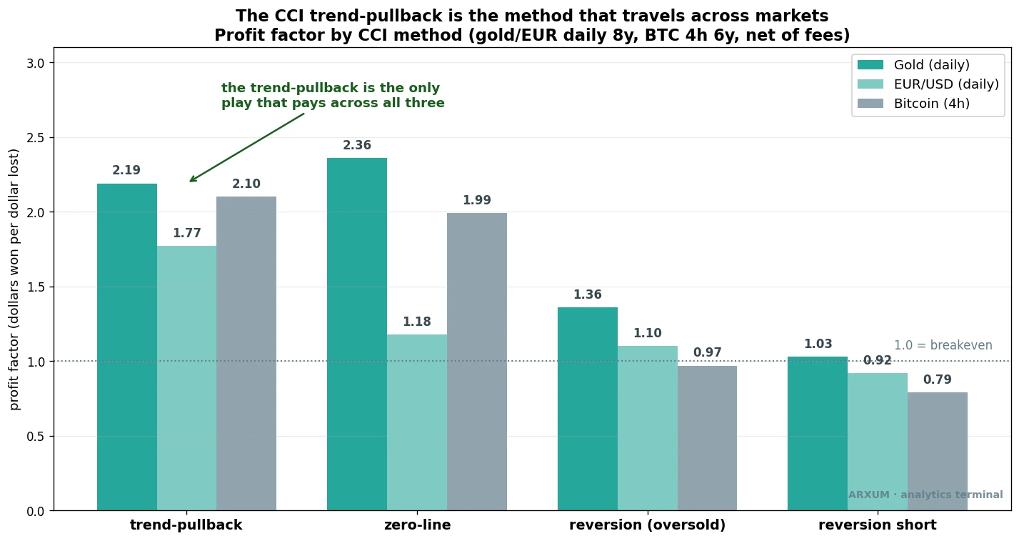
Look across the four method groups. The trend-pullback clears 1.0 on all three markets: 2.19 on gold daily, 1.77 on EUR/USD daily, 2.10 on Bitcoin’s 4-hour chart. The zero-line variant pays on gold and Bitcoin but stumbles on EUR/USD. Reversion limps along near breakeven. The short versions, fading rallies, lose almost everywhere.
That consistency is the point. A setup that works on one market and one timeframe is usually luck. A setup that pays on a metal, a currency and a crypto, on two different timeframes, is more likely a real edge.
The matchbox version: trade with the 200-EMA, wait for the dip below zero, buy the surge back through +100, stop under the swing low, exit under -100.
Gold: the trend-pullback in the clear
Gold is where this setup shines right now, because gold has been trending hard. Spot gold (XAU/USD) ran from under $2,000 to north of $4,000 over the test window. A momentum-continuation tool loves that kind of market.
Here is one of those trades, from the entry to the exit.
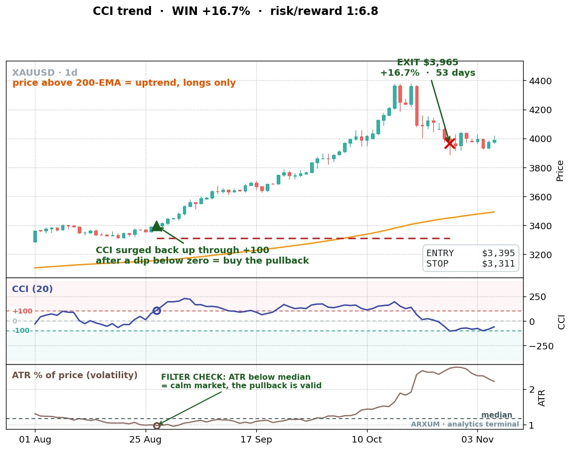
Price had been grinding higher above the 200-EMA, the orange line. In late August 2025 it paused, CCI dipped under zero, then snapped back up through +100. That was the entry, the green triangle. The stop went under the recent swing low, $84 below entry. Over the next 53 days gold extended its run and the trade closed for +16.7%.
That phrase risk/reward 1:6.8 is worth a slow read. The 1 is your risk, the distance from entry to stop. The X is the reward, how many times that risk the trade made back. So 1:6.8 means this winner returned about 6.8 times what it would have lost if stopped. (Our explainer on the risk/reward ratio walks through this in full.)
Quick note so two numbers do not blur. Reward-to-risk (1:6.8) is about this one trade. Profit factor (2.19 earlier) is about the whole strategy across every trade. We unpack the difference properly later; for now, just know they measure different things.
That asymmetry is the engine of the whole strategy. Look at the win rate over the full gold sample: just 36%. The trend-pullback loses nearly two trades out of three. It survives, and thrives, because the winners are so much bigger than the losers. A handful of 1:5 and 1:7 runners pay for a long string of small stops.
Here is the same setup, same market, a different trade.
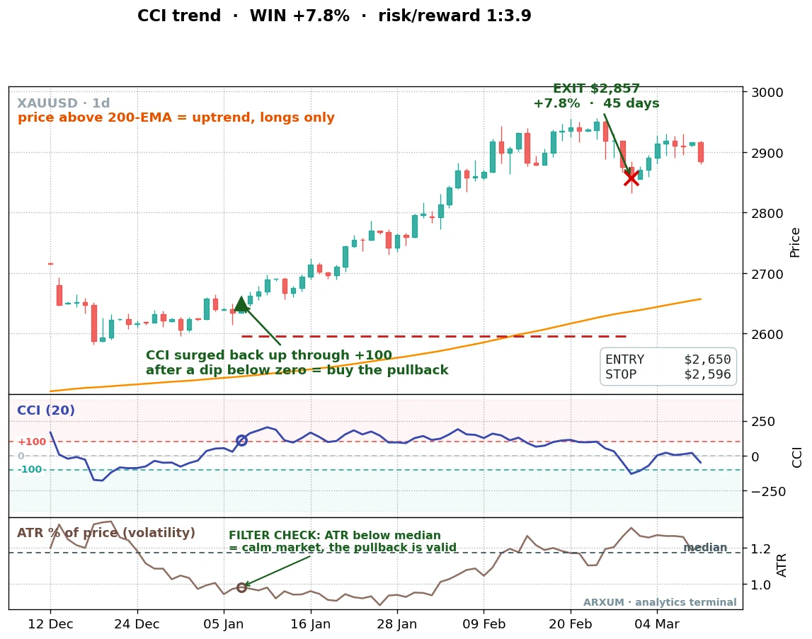
Same shape, smaller payoff. CCI dipped, surged back through +100 above the 200-EMA, and the trade rode the trend for 45 days to +7.8% at 1:3.9. Not every winner is a monster. Most are modest. The strategy works because you keep taking the setup and let the rare big ones do the heavy lifting.
Below each price chart, the CCI panel shows the indicator crossing +100 at entry. The bottom panel is the one that earns this article its edge, and we come to it next.
The full trade history looks like this. Note the trend-pullback fires far less often than the reversion play, just 33 times in eight years against the reversion’s 74, because waiting for a dip-then-surge in an uptrend is a pickier condition.
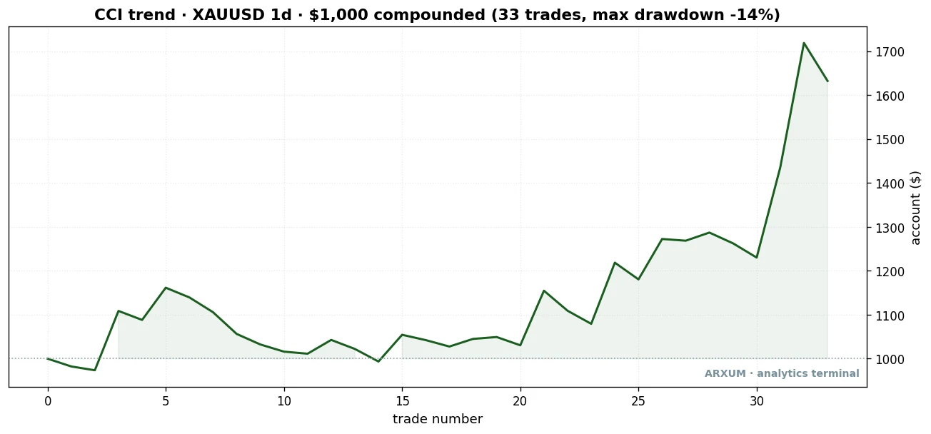
| Trades | 33 |
| Win rate | 36% |
| Reward-to-risk | 1:3.8 avg |
| Profit factor | 2.19 |
| Max drawdown | −14% |
| Net return on $1,000 | +63% |
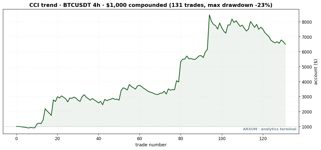
Read the curve honestly. It is not a smooth climb. There are flat stretches and small drawdowns where stop after stop fires. Then a trend shows up and the account jumps. That lumpy shape is what a real momentum edge looks like. Anyone selling you a strategy with a straight diagonal line is selling you a curve fit.
A fair worry, when a few winners do the heavy lifting, is that the whole edge is two lucky trades. So we removed them. Drop the two biggest gold winners and the profit factor still clears 1.41; drop the top three and it is still 1.12, above breakeven. The edge does not live or die on one runner, which is what you want to see.
The filter that more than doubles the edge: a calm market
This is the part the textbook never tells you, and it is the single most useful thing in the test.
We swept the trade history by the market’s volatility at entry, measured with the average true range as a percent of price. (The average true range is just the size of a typical bar; high ATR means wide, violent candles, low ATR means tight, quiet ones.) Then we split the trades in half: the calm entries below the median, the violent entries above it.
The split is dramatic.
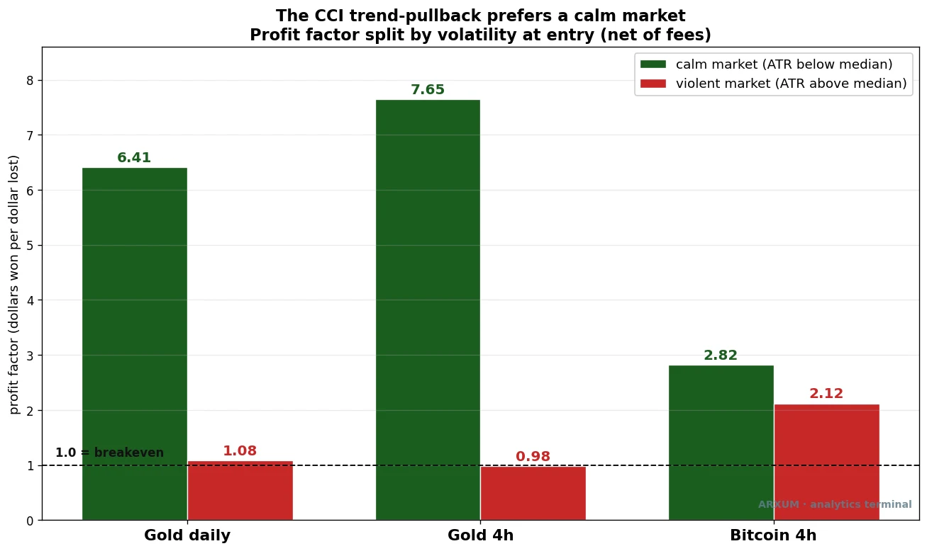
On gold daily, the calm-market trades ran a 6.41 profit factor. The violent-market trades: 1.08, barely breakeven. On gold’s 4-hour chart the gap is even wider, 7.65 against 0.98. Bitcoin shows the same lean, milder because crypto is rarely calm.
Think about why. The trend-pullback wants an orderly dip into the trend, a quiet pause before momentum resumes. When volatility is high, that “dip” is often a violent shakeout, the start of a real reversal rather than a pause. The +100 surge that follows is a false dawn.
How do you read this off a live chart, without running a backtest? Two ways:
- Watch the candle ranges. When bars are shrinking, the range tightening, the market is calm. That is your green light.
- Watch ATR if your platform shows it. If the ATR line is below its own recent average, conditions are quiet. If it is spiking, skip the signal.
This is the filter to actually use: take the CCI trend-pullback when the market is calm, and pass when it is wild. That one rule does more for the strategy than any tweak to the CCI period.
When it fails: a violent market
Honesty matters more than a clean story, so here is a loss, and it is the same setup that won above.
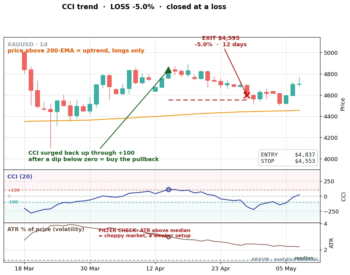
In April 2026 gold was above its 200-EMA, CCI dipped and surged back through +100, every box ticked. The entry fired. But look at the bottom panel: ATR was sitting well above its median. The market was violent, not calm. The “pullback” was actually the top of an overheated run, and price rolled over within 12 days for a 5% loss.
This is the filter doing its job in reverse. The setup looked identical to the winners. The only tell was the volatility, and it was flashing red. A trader watching ATR would have stood aside.
The lesson: the CCI signal is necessary but not sufficient. The market’s character at the moment of entry decides whether the same pattern pays or fails.
Does it travel? EUR/USD and Bitcoin
Gold is the easy case because it trended so cleanly. The harder question is whether the edge survives on markets that behave differently.
EUR/USD is the honest stress test. The euro spent the test window mostly chopping sideways, the opposite of gold’s bull run. The trend-pullback still cleared breakeven: 23 trades, a 1.77 profit factor, +9.1% total. Modest, but real. And it was the cleanest result in the entire study for a different reason. We split it into the first four years and the last four years, and the profit factor was 1.76 on the data the rules were built around and 1.78 on the four years they had never seen.
That out-of-sample match is the number that matters. An edge that performs the same on data it was never fit to is one you can trust. A backtest that only works on the years you tuned it on is a curve fit wearing a strategy’s clothes.
Bitcoin is the other end of the spectrum: real exchange volume, huge moves, frequent violence. On the 4-hour chart the trend-pullback ran a 2.10 profit factor across 131 trades.
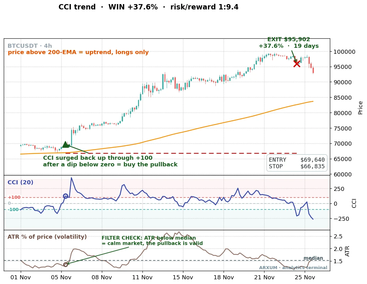
In November 2024 Bitcoin broke out above its 200-EMA, CCI dipped and surged back through +100, and the trade caught a 19-day run to +37.6% at 1:9.4. The ATR panel confirms it was a relatively calm entry, exactly the condition the filter wants.
| Trades | 131 |
| Win rate | 42% |
| Reward-to-risk | 1:2.9 avg |
| Profit factor | 2.10 |
| Max drawdown | −23% |
| Net return on $1,000 | +550% |
A caveat sits under every forex and metals number here, and it is fair to say plainly: those tests use tick volume, a count of price changes, because the spot forex market has no central volume feed. Bitcoin’s numbers use real exchange volume. CCI itself does not use volume in its formula, so this matters less for the commodity channel index than it would for a volume tool, but it is why the cross-asset table is the proof, not any single market.
Profit factor is not reward-to-risk
Two numbers in this article both look like “1-point-something,” and beginners blur them constantly. They answer different questions.
- Reward-to-risk (1:X) is about a single trade. It is how many dollars a winner makes for every dollar a loser costs. A 1:6.8 trade returned 6.8 times its risk.
- Profit factor is about the whole strategy. Total dollars won divided by total dollars lost across every trade. A 2.19 profit factor means the system, end to end, made $2.19 for every dollar it lost.
You can have a high reward-to-risk on individual trades and still lose overall if you win rarely enough. The trend-pullback wins only 36% of the time, so it leans entirely on big reward-to-risk to carry a profit factor above 2. Both numbers have to be healthy together. Watch one without the other and you will fool yourself.
Which timeframe, and which settings
The default 20-period CCI is the right starting point, and the test backs that up. We re-ran the gold strategy at 14, 20 and 30 periods. The trend-pullback profit factor was 1.93, 2.19 and 3.54 across those settings. It holds across the whole neighbourhood, which is what you want. A setup that only works at one exact number is fitted to the past, not built on anything real.
On timeframe, both the daily and the 4-hour chart paid for the trend-pullback. The daily gives you fewer, cleaner signals and is easier to manage around a job. The 4-hour gives you more trades and demands more screen time. Gold’s 4-hour trade history over a recent two-year window turned $1,000 into roughly $1,387 with the same calm-market lean.
Lower than that, on a 1-hour chart, the signal count climbs and the noise climbs with it. If you find yourself taking far more CCI signals than usual, that is often the tell that you have dropped to a timeframe where the edge has thinned out.
Sizing the trade, and placing it
Say you have a $1,000 account and you risk 2% per trade, the standard most desks use. That is $20 of risk on this trade, no more.
Take the gold winner from earlier. Entry was $3,395, the stop $3,311, so the risk was $84 per ounce. The position size is one division:
- Risk budget: $20
- Risk per ounce: $84
- Position size: $20 ÷ $84 = 0.24 ounces
Here is the honest problem that division exposes. The smallest gold lot most brokers offer is one micro lot, which is one ounce. Your math says 0.24 ounces. On a $1,000 account at honest 2% risk, you simply cannot take this gold trade at a standard broker, because the position is smaller than the minimum size.
That is not a flaw in the strategy. It is the reality of trading an expensive instrument on a small account. What you must never do is widen the stop or oversize the position to “make it fit.” That is how a 2% plan quietly becomes a 10% plan.
So here is the same math on a market a small account can actually trade: EUR/USD, the euro against the dollar. Forex is sized in lots and measured in pips, the fourth decimal place of the price. On a standard micro lot, each pip is worth about $0.10.
Take a real EUR/USD trade from the test, on the 4-hour chart where the stops are tighter. Entry near 1.0850, stop 88 pips away. Same $1,000 account, same 2% rule, so $20 of risk:
- Risk budget: $20
- Risk per pip on one micro lot: $0.10
- Risk you can take: $20 ÷ 88 pips = $0.23 per pip
- Position size: $0.23 ÷ $0.10 = about 2 micro lots (0.02 lots)
That works. Two micro lots on EUR/USD is a normal, affordable position on any standard account. The lesson is not “avoid gold forever,” it is that a small account belongs on a cheaper instrument or a faster timeframe where the dollar stop is small enough to size honestly. For gold itself, you would need a broker offering fractional or cent-lot sizing.
Once your size is set, placing the order is three fields:
- Entry: a buy order at the price where CCI crosses +100 (or buy at market on the close that confirms it).
- Stop-loss: in the stop field, at your swing low ($3,311 in the example).
- Take-profit: optional. Many traders skip a fixed target and exit on the CCI rule instead, when it falls back under -100, to let winners run.
You can chart and test all of this on a free TradingView account before risking a cent.
The discipline this strategy actually needs
The risk talk here is not boilerplate, because this strategy has a specific shape you have to make peace with.
You will lose most of your trades. A 36% win rate means roughly two losses for every win. If you cannot sit through a string of five or six small stops without abandoning the plan, this setup will break you, not because it stopped working but because you stopped following it. The edge lives entirely in the few big winners, and you have no idea in advance which trade will be one.
So a few concrete habits:
- Risk the same 2% every time. Do not size up after a loss to win it back, and do not size up after a win out of euphoria. The math only works if every trade is the same fraction of the account.
- Use the circuit-breaker. If you take 5 or 6 losses in a row, the regime may have changed, gold may have stopped trending, the market may have turned choppy. Pause for a week and check conditions before the next trade.
- Run a calm live-versus-test check. If your live results drift far below the backtest over a meaningful number of trades, do not panic-quit on one bad week, that is just variance. But a sustained, large gap is a real signal. Step back and look at whether the market still suits the tool.
No mechanical setup is permanent. This one is a tool for trending, calm markets. When the market changes character, the tool changes with it, and your job is to notice. Only risk money you can afford to lose, and treat the strategy as a way to read the market, not a money machine.
Common mistakes
- Fading every +100. The single biggest error, and the one the textbook encourages. In a trend, +100 is a buy signal, not a sell signal. Selling strength into an uptrend is how shorts get run over.
- Ignoring the regime. Taking longs below the 200-EMA, or shorts above it, throws away the filter that does the most work. Direction is decided by the trend, not by the oscillator.
- Trading the signal in a violent market. The setup that wins in calm conditions loses in chaos. Check the volatility before you check anything else.
- Dropping to a noisy timeframe. The 1-hour chart floods you with signals that look the same but pay far less. More signals is not more edge.
Where to go from here
The commodity channel index is one momentum tool among several, and they teach each other. If you want to see how a bounded oscillator handles the same job, our RSI indicator guide covers the closest cousin, and the stochastic oscillator guide shows a third take on overbought and oversold. To go deeper on the volatility filter that powered this whole article, the average true range explainer is the place to start. And if the regime idea is new, the exponential moving average guide explains the 200-EMA line that decides direction.
The honest bottom line: the CCI indicator is not the reversion tool it is usually sold as. Fade the extremes and you are fighting trends. Buy the surge back through +100 in a calm uptrend and you have a setup that paid on gold, the euro and Bitcoin alike. The signal gets you in the door; the calm-market filter is what makes it worth trading.
FAQ
What is the CCI indicator, in plain terms?
Does the CCI indicator actually work?
What are the best CCI indicator settings?
What do +100 and -100 mean on the commodity channel index?
Is CCI better than RSI?
Which markets does the CCI indicator work best on?
What timeframe is best for the CCI indicator?
How much money do I need to start with the CCI indicator?
Why does the CCI indicator work better in a calm market?
Can I use the CCI indicator to short?
What are the key terms in this guide?
🌍 Our recommended brokers
Reader Reviews
Be the first to review this — tell other traders what actually helped, or where it fell short.
Leave a Review

Quant Researcher & Systems Builder
Quantitative researcher who builds the automated systems behind Arxum strategy testing. Works in Python and Pine Script, using AI alongside classic backtesting to validate strategies on years of real data.