
The accumulation/distribution indicator, by the textbook
Here is the thing you came to see. This is what the accumulation/distribution indicator is built to catch: money moving in before price does.
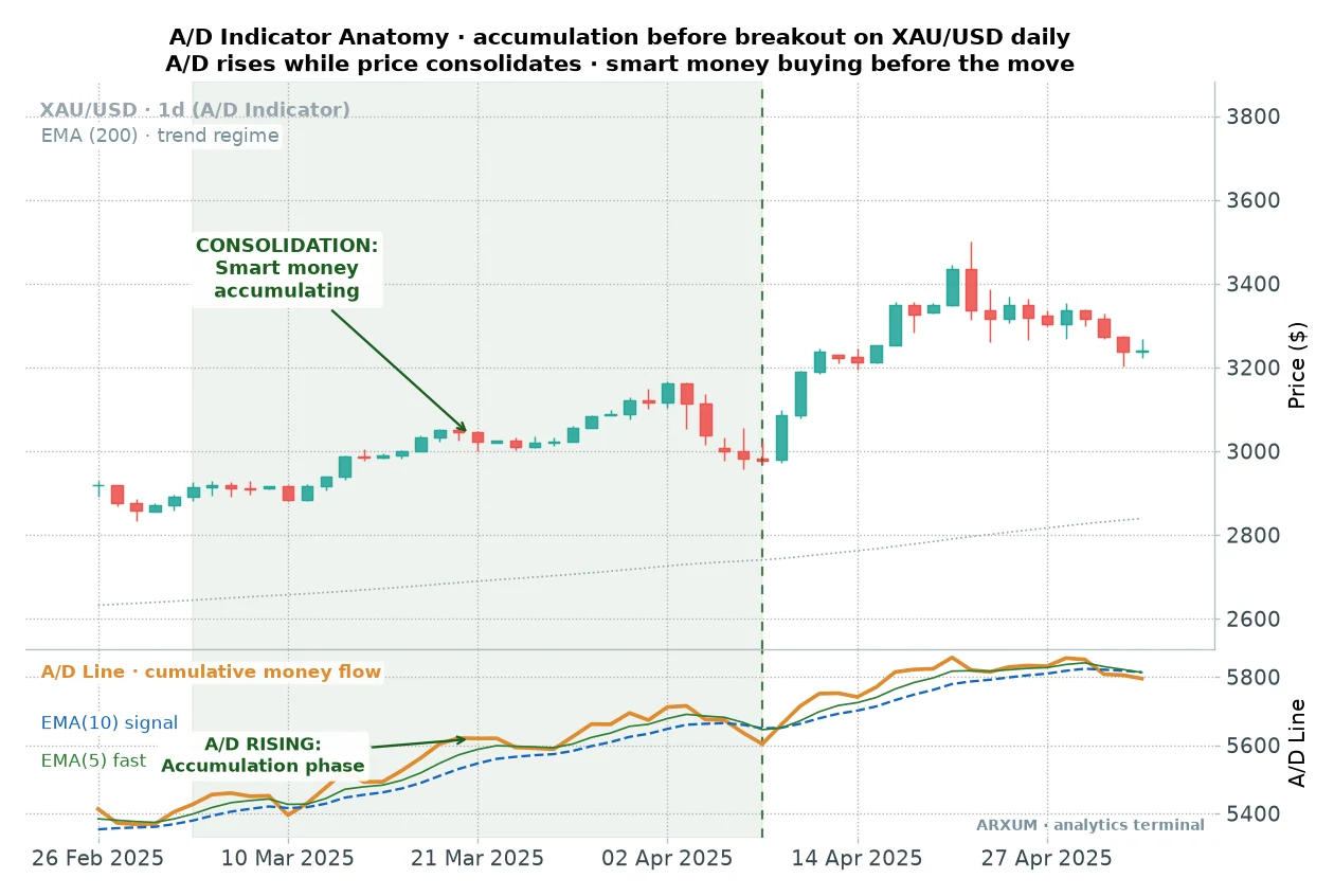
Look at the panel under price. While the candles went sideways, the A/D line kept grinding higher.
That gap is the tell. Someone was buying into a flat market, and a flat chart hides that.
The A/D line does not.
After eight years watching institutional flow on a desk, the idea that volume leads price was never news to me. The useful part was measuring how much of that lead a simple, mechanical cross can actually capture.
So we built the A/D line into a real strategy on spot gold (XAU/USD) and ran it across an eight-year daily window. The numbers below are what came back.
What the A/D line actually measures
The math is friendlier than the name. Every bar gets a score for where it closed inside its own range, called the close location value.
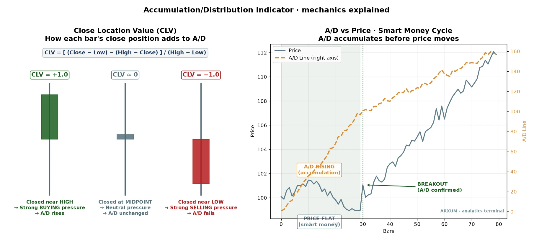
- Close near the high of the bar, and the score is close to plus one. Buyers won the bar.
- Close near the low, and it is near minus one. Sellers won it.
- Close in the middle, and it is near zero. A draw.
That score is then multiplied by the bar’s volume, so a strong close on heavy volume counts for far more than the same close on a quiet day. The A/D line adds up that volume-weighted flow, bar after bar, into one running total.
Marc Chaikin built it in the 1980s to answer a question price alone hides. Is the crowd behind this move, or is price drifting on thin participation?
The line itself has no fixed levels. What matters is its slope: rising means accumulation, buyers in control, and falling means distribution.
For the strategy we put two moving averages on the A/D line: a fast 5-day one and a slow 10-day one. When the fast crosses above the slow, money flow has just turned up.
That cross is the signal we trade.
If you want the same money-flow idea packaged differently, the chaikin money flow and on balance volume guides run the two other classic volume tools through this same engine.
The setup the data likes
Most guides stop at “A/D up is bullish.” We ran that idea properly, and one version earned its keep on gold. It is long-only, and it leans on a trend filter.
A long is simply a buy, a trade that profits when price rises. Here are the rules, on the daily chart.
- Regime first. Only take longs when price is above its 200-day average, the exponential moving average that traces the long-term trend. Above a rising 200-EMA is an uptrend, and that is the only place these longs are allowed.
- The trigger. Buy when the fast A/D average (5-day) crosses up through the slow one (10-day). Money flow has just turned up inside a confirmed uptrend.
- The stop. Under the recent swing low, the lowest low of the last ten bars. The gap from your entry down to that stop is your risk, the 1 in every risk/reward figure here.
- The target. A fixed 2R, twice that risk. Risk a dollar, aim for two.
- The backstop exit. If neither stop nor target is hit, close after 30 days. The A/D cross is a momentum read, and a signal that has not paid in a month has usually gone stale.
The one-line version: trade with the 200-day trend, buy the fast A/D cross up through the slow, stop under the swing low, aim for twice your risk.
A winning trade, start to finish
Here is one from the study, from the entry to the exit.
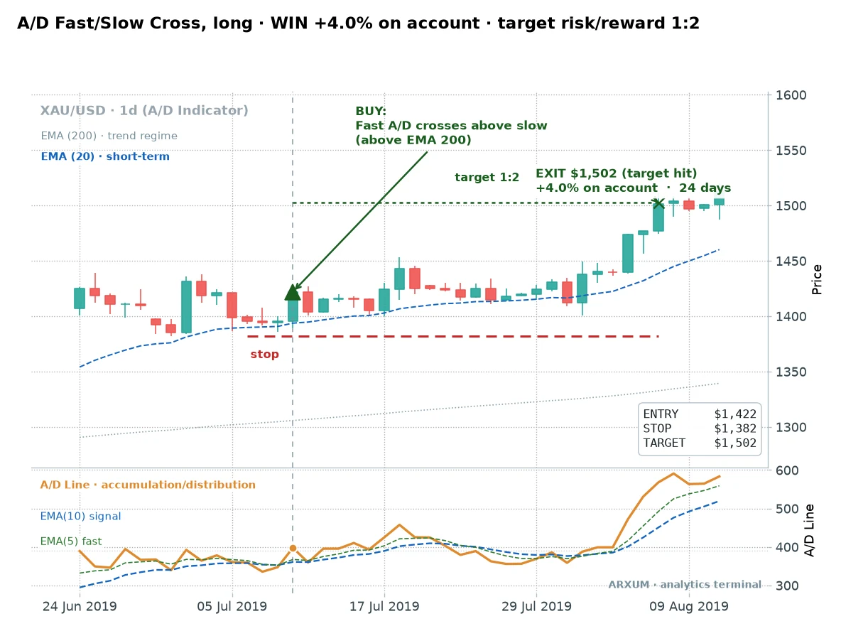
One thing to name on the price panel first. The blue dashed line marked “EMA (20)” is a short 20-day average of price, there only as a visual guide to the near-term drift.
It plays no part in the rules, so do not enter or exit off it. The signal is the A/D cross in the lower panel, taken while price holds above the 200-day line.
You will see that same blue guide line on the next two trade charts too.
Gold was grinding higher above its 200-day line. The A/D averages had been flat, then the fast one crossed up through the slow, the green triangle.
That is the entry, at $1,422. The stop went under the swing low at $1,382, so the risk was $40 an ounce.
So how much gold does that actually buy? Work it backwards from the risk.
On a $1,000 account, a 2% risk is $20. The stop sits $40 an ounce below entry, so $20 divided by $40 is half an ounce of gold.
That half-ounce is your position size.
A quick word on lots, because brokers price size that way. One standard lot of gold is 100 ounces, a mini lot is 10 ounces, and a micro lot is a single ounce, the smallest most brokers allow.
Half an ounce is half a micro lot, so on a small account you need a broker that offers fractional or cent-sized lots to place this trade cleanly.
Half an ounce at $1,422 is about $711 of gold controlled on a $1,000 balance, so your real market exposure is under one times the account. Any bigger leverage the broker offers is just margin headroom, room to open the position, not extra risk you take on.
Your risk stays fixed at that $20. That figure is the entry-to-stop distance times your size, and the leverage number on the account does not change it.
The target sat twice that distance away at $1,502, and price reached it 24 days later. On an account risking a steady 2% per trade, that clean 1:2 winner added about 4%.
That phrase risk/reward 1:2 is worth a slow read. The 1 is your risk, the entry-to-stop distance, and the 2 is the reward, twice that.
Our risk/reward ratio guide walks it through in full.
A second trade: the less glamorous outcome
One clean winner is an anecdote. Here is a more honest one, where the cross was right but the trade never really got going.
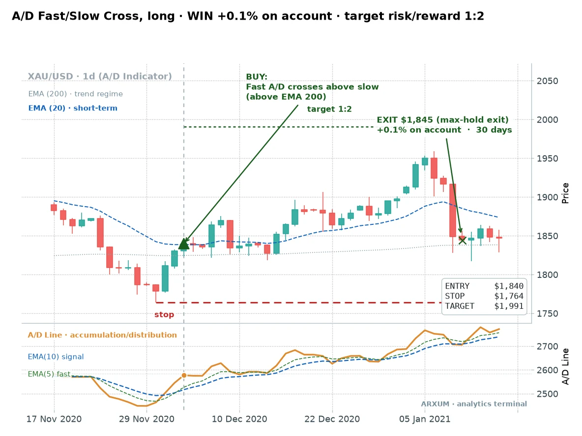
Every rule was met. Price was above the 200-day line, and the fast A/D average crossed up at $1,840.
Then the market went nowhere. Price wandered, never reached the $1,991 target above or the $1,764 stop below, and the 30-day backstop closed it flat.
This is the outcome the pretty charts skip. Most winners hit the 2R target, some time out near breakeven like this one, and the losers stay capped at the stop.
The math works because of that shape, not because every cross runs.
When it fails, and why I’m showing you
On the desk we never trusted a setup until we had seen it lose. Here is one that did.
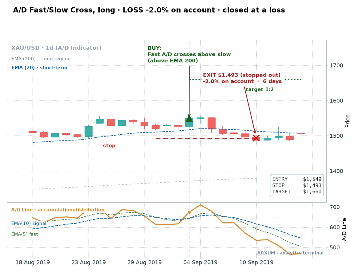
The cross fired cleanly at $1,549, above the 200-day line. It looked identical to the winners.
Six days later price had rolled over and clipped the stop at $1,493, a full 2% loss on the account.
Here is the honest part, and it matters more than a clean story. A filter improves your odds, it does not hand you certainty.
The A/D cross wins a good deal more than half the time on gold, but it still loses regularly, and the trend it was riding simply ran out here.
Your only job on a loser is to keep it near that 1 you risked. The swing-low stop does exactly that.
Does it pay over time, or is it a few lucky trades?
Two charts prove nothing on their own. The real test is the full grind, so here is every trade stacked into an account curve.
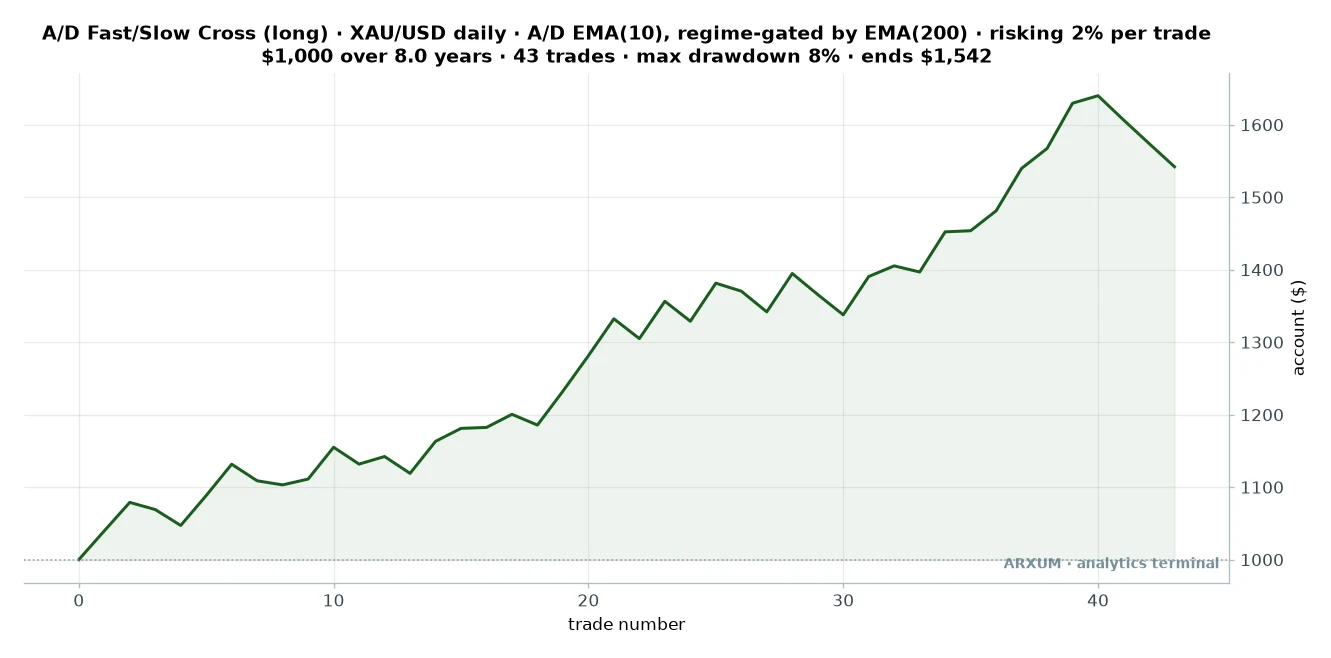
| Trades | 43 |
| Win rate | 61% |
| Reward-to-risk | 1:2 target |
| Profit factor | 2.22 |
| Max drawdown | −8% |
| Avg hold | up to 30 days |
| Net return on $1,000 | +54% |
Two rows in that table deserve a plain word before you read on. Profit factor is the total dollars won divided by the total dollars lost, so 2.22 means the system made $2.22 for every $1 it gave back.
Max drawdown is the worst peak-to-trough dip in the account along the way, here about 8%.
Read the curve honestly. It is not a smooth climb.
There are flat stretches and small dips where stop after stop fires, then a trend shows up and the account steps higher. That lumpy shape is what a real momentum edge looks like.
The curve is built the way you would actually trade it. A $1,000 account, 2% of it risked on every trade, position sized to the stop, fees taken out.
A full stop-out costs 2% of the account, and a trade that hits its 2R target adds about 4%. The worst peak-to-trough drop across the whole eight years was only about 8%, which is a shallow ride for the return.
The filter that lifts the edge: trade the calm days
The single most useful thing we found is not another indicator stacked on top. It is knowing which crosses to skip.
Split every trade by how wild the day was, using average true range, and the difference is stark.
| A/D cross taken on… | Trades | Win rate | Profit factor |
|---|---|---|---|
| A calm day (low range) | 21 | 71% | 5.07 |
| Any day (no filter) | 43 | 61% | 2.22 |
| A wild day (high range) | 22 | 50% | 1.31 |
| A confirmed trend (ADX 22+) | 23 | 65% | 2.56 |
The calm-day cross is a different animal. It won more than seven times in ten, and its profit factor of 5.07 dwarfs the 1.31 you get on wild, gappy days.
That is a wide gap, a profit factor near five against one barely above one, and it makes sense. A cross on a quiet day is patient money accumulating.
A cross on a violent day is often just noise whipsawing the averages back and forth.
Average true range, or ATR, is a plain volatility gauge. It measures how far price typically travels in a day, and it is free on TradingView and built into MT4 and MT5.
You do not need the exact number to use this. On a live chart, calm looks like shrinking candles and a tightening range, and that is when the A/D cross is worth taking.
Fat, gappy bars are the ones to pass on.
One more filter earned a mention: only trading when ADX, a trend-strength gauge that runs from zero to about 60, reads above 22. That lifted the profit factor to 2.56.
And a warning, because it is counterintuitive: waiting for MACD to confirm the cross actually hurt, dropping it to 1.25. MACD lags the A/D line, so by the time it agrees the move is already old.
The rule to use: take the A/D cross on quiet days in a confirmed uptrend, and skip it when the market is wild.
The simpler cross, and what it costs you
There is a plainer version of this idea: buy when the A/D line crosses its own 10-day average, with no fast line and no calm-day pickiness. It fires far more often.
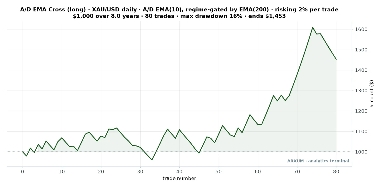
| Trades | 80 |
| Win rate | 46% |
| Reward-to-risk | 1:2 target |
| Profit factor | 1.49 |
| Max drawdown | −16% |
| Avg hold | up to 30 days |
| Net return on $1,000 | +45% |
The plain cross made money too, ending near $1,453. But look at what you pay for the extra signals.
It wins under half the time, its profit factor is a modest 1.49 against the fast cross’s 2.22, and its worst drawdown is twice as deep at 16%. More trades did not mean more edge here.
The fast-versus-slow cross, filtered to calm days, is the version worth trading. The plain cross is where beginners start, and then quietly wish they had been pickier.
Robustness: does the edge survive fresh data?
The single most useful test of any strategy is whether it holds up on data it was never built around. So we split the eight years down the middle.
- Built on the first four years: a 1.64 profit factor, positive but unremarkable.
- Run on the last four years it had never seen: a 2.74 profit factor, stronger.
- The honest read: the edge did not just survive out of sample, it improved, though gold’s powerful run in the later stretch deserves much of the credit.
Take that improvement with a pinch of salt, because a trending market flatters a trend tool. The point is not that it gets better every year.
It is that the setup did not collapse the moment it met new data, which is where most published strategies quietly die.
And a fair number to put next to it. Over these eight years, simply buying and holding gold returned far more on paper, well over 200%, against our 54%.
That is bull-market math, not a weakness. A timed long strategy will always trail raw buy-and-hold in a historic one-way run.
What it gave you instead was an 8% worst drawdown against buy-and-hold’s roughly 27%, plus a rule for when to step aside if gold stops trending. You gave up raw return for a far calmer ride.
Profit factor is not reward-to-risk
Two numbers in this guide both look like “point-something,” and beginners blur them constantly. They answer different questions.
- Reward-to-risk (1:2) is about a single trade. It is how many times its risk that one trade made back, so a 1:2 winner returned twice what it put at stake.
- Profit factor (2.22) is about the whole strategy. It is total dollars won divided by total dollars lost across every trade, so 2.22 means the system made $2.22 for every dollar it lost.
You can have a healthy reward-to-risk on individual trades and still lose overall if you win rarely enough. Watch one number without the other and you will fool yourself.
What about A/D divergence?
The other popular play is divergence: price makes a new high while the A/D line does not, hinting the move is running on empty. It is a genuine idea, and the wyckoff accumulation framework leans on the same logic.
Here is the honest problem. On daily gold, a clean A/D divergence fired only a handful of times across eight years, far too few to build a strategy on.
It may pay on shorter timeframes or with looser rules, but on the daily chart it is a rare bonus tell, not a system. The cross is what gave us enough trades to trust.
How to trade it, and the discipline it needs
You can chart and practice all of this on a free TradingView account before a cent is at risk. Type the ticker, click Indicators, and add “Accumulation/Distribution”, plus “Average True Range” and “Average Directional Index (ADX)”.
In MT4 or MT5 it is Insert, then Indicators, then Volumes for the A/D line.
One honest note on reproducing our exact chart. The built-in indicator gives you the raw A/D line.
The fast and slow averages we cross are two EMAs applied to that line, which is not a one-click default, so you either apply a moving average to the indicator where your platform allows it, or eyeball the line turning up on a calm day. Do not grab a random look-alike script and assume it matches.
Once your size is set, the order is three fields:
- Entry: a buy at market on the close that confirms the fast A/D cross, in a confirmed uptrend, on a calm day.
- Stop-loss: at your ten-bar swing low.
- Take-profit: at twice your risk from entry, or leave it off and exit on the 30-day rule if it stalls.
Those three fields map straight onto the winner from earlier: the buy at the confirmed cross, the stop under the swing low at $1,382, and the take-profit at $1,502, twice the risk.
The risk talk here is not boilerplate, because this setup has a shape you have to make peace with. You will lose a bit under four trades in ten on the fast cross, so runs of three or four small stops in a row are normal, not the tool breaking.
A few concrete habits, tied to these numbers.
- Risk the same 2% every time. Do not size up after a loss to win it back, and do not size up after a win out of euphoria. The math only holds if every trade is the same fraction of the account.
- Use a circuit-breaker. If you take five or six losses in a row, gold may have stopped trending. Pause, and check whether price is still making clean higher highs above the 200-day line before the next trade.
- Run a calm live-versus-data check. One bad week is just variance, so do not panic-quit. A sustained, wide gap between your live results and these numbers is worth a real look at whether the market still suits the tool.
Gold is an expensive instrument, so on a small account the daily stops can size below one micro lot at an honest 2% risk. If that is you, practise on a demo or use a broker offering fractional or cent-lot sizing rather than stretching your risk to force the trade.
Only risk money you can afford to lose, and treat the A/D line as a way to read who is buying, not a money machine.
Common mistakes
- Trading the raw line’s level. The A/D line has no fixed overbought or oversold value. Its slope is the message, not its height.
- Buying every cross. Without the trend regime and the calm-day filter, you are taking crosses in flat, wild markets where they are mostly noise. The filters are the edge.
- Adding MACD “to confirm”. It lags the A/D line and made the results worse in testing. More indicators did not mean more signal.
- Widening the stop. The swing-low stop is what keeps a loss near your 1. Move it to “give the trade room” and one loss can wipe out several winners.
- Trusting it on thin volume. Spot gold has no central volume feed, so the reading leans on tick volume, a count of how often price updated. It works, but confirm with price and the 200-day trend, not the A/D line alone.
Where to go from here, and three ready configs
The A/D line is one of a family of volume tools, and they teach each other. For the same money-flow idea packaged differently, the money flow index, chaikin money flow and on balance volume guides run the others through this same engine.
If you want to put the A/D cross to work, here are three configurations to lift straight off the page:
- Gold, daily, fast cross, calm days. Long above the 200-day line, buy the fast A/D cross up through the slow, but only when the range is quiet. Stop under the ten-bar swing low, target twice the risk. The strongest edge in the study.
- Gold, daily, fast cross, any day. Same rules without the calm filter. Fires more often, a lower profit factor, a fine place to learn the pattern.
- Gold, daily, plain EMA cross. The A/D line crossing its own 10-day average. Simple and frequent, but a modest edge and a deeper drawdown.
The bottom line: the accumulation/distribution indicator is not the buy-and-sell machine it is usually sold as. Read its slope, buy the cross in a confirmed uptrend on a calm day, and you have a setup that paid on gold with a shallow drawdown.
The cross gets you in the door. The trend and the calm-day filter are what make it worth trading.
FAQ
What is the accumulation/distribution indicator, in plain terms?
Does the accumulation/distribution indicator actually work?
What is the difference between the A/D line and Chaikin Money Flow?
What is the best setting for the accumulation/distribution indicator?
What does accumulation versus distribution mean?
Which markets and timeframe work best for the A/D indicator?
Does the A/D indicator work on Forex without real volume?
Can you use A/D line divergence to trade reversals?
How much money do I need to trade the A/D cross?
What are the key terms in this guide?
Real-time trade setups with entry, stop loss and take profit. Daily market analysis. No subscription, no complicated theory.
🌍 Our recommended brokers


Reader Reviews
Be the first to review this — tell other traders what actually helped, or where it fell short.
Leave a Review

Forex Analyst & Senior Trader
Former FX desk trader with 8 years in institutional forex. Works in multi-timeframe analysis and order flow, turning desk experience into systematic, testable rules across forex and metals.