Williams %R, by the textbook
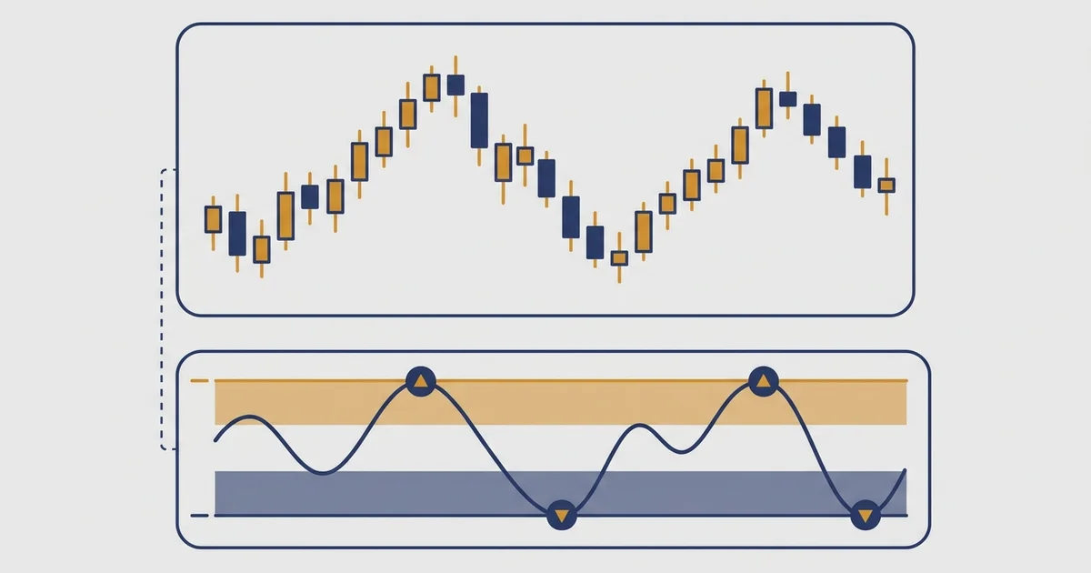
Here is the thing you came to see. This is Williams %R, drawn the way every platform draws it, with the two ways traders are taught to read it.
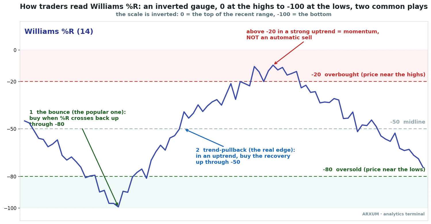
The first thing to get straight is the upside-down scale, because it trips up nearly everyone at the start. Williams %R does not run 0 to 100 like most indicators. It runs 0 to -100.
Zero, at the very top of the panel, means the close is glued to the high of the last 14 bars. Minus 100, at the bottom, means the close is glued to the low.
So a number near the top is strength, and a number near the bottom is weakness. That is backwards from how the eye usually reads a chart, and it is the single reason people misquote the levels.
Two lines matter. The -20 line near the top marks overbought, where price has been hugging its highs. The -80 line near the bottom marks oversold, where it has been hugging its lows. The -50 line in the middle is the dividing point between the two halves.
The math is short. Take the highest high and the lowest low of the last 14 bars. Measure where the current close sits inside that range, then flip the sign so the top reads zero.
That is the whole formula. It tells you, in one number, how close price is to the top or bottom of its recent swing.
If that sounds familiar, it should. Williams %R is the stochastic oscillator with the scale inverted. A stochastic reading of 20 and a Williams reading of -80 are the same bar. If you already know one, you know the other, which is worth keeping in mind when you read the rest of this.
There are two common ways traders use it, and the picture above marks both:
- The oversold bounce: buy when %R climbs back up through -80, leaving the oversold zone. The classic mean-reversion play, and by far the most taught.
- The trend-pullback: in an uptrend, wait for %R to dip oversold, then buy when it recovers up through the -50 midline. The quieter play, and the one the data likes.
The bounce is the headline. It is the reason most people pull up Williams %R in the first place: a clean, simple signal that says “the selling is exhausted, buy here.” So that is where we started.
The bounce wins most of the time, and still loses
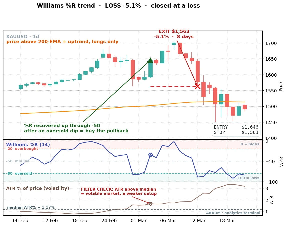
We took the oversold bounce exactly as the textbook describes it. Every time %R crossed back up through -80, buy. Stop under the recent swing low, exit when %R reached the midline. Gold, daily chart, eight years, net of fees.
Here is one of those trades, a clean bounce on spot gold (XAU/USD).
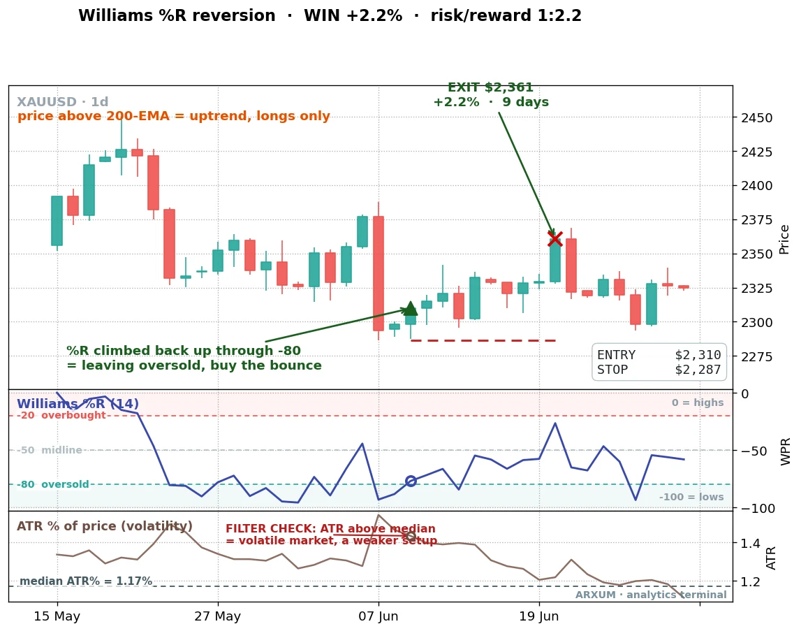
It works exactly as advertised here. Price had been sliding, %R sank into the oversold zone, then turned. The cross back up through -80 was the trigger. Nine days later the move was done and the trade closed up 2.16%, making more than twice what it risked.
And the win rate is genuinely high. Across the eight years, the gold bounce won 67% of its trades. Two out of every three. That is the kind of number that sells an indicator.
Two terms the table below leans on, defined up front. Profit factor is the whole strategy’s scorecard: every dollar it won divided by every dollar it lost, so above 1.0 means it makes money. Reward-to-risk, written 1:X, is a single trade: what the average winner makes against what the average loser costs, so 1:1 means the typical win and the typical loss are the same size. Both come up in every comparison from here on.
| Trades | 100 |
| Win rate | 67% |
| Reward-to-risk | 1:1.0 |
| Profit factor | 1.96 |
| Net return on $1,000 | +$537 |
A 67% win rate and a 1.96 profit factor on gold. If the story ended here, the bounce would be a fine little setup.
But one asset proves nothing, and a high win rate hides a problem. The bounce wins often, but its winners are small and its losers are about the same size. The reward-to-risk is 1:1, so the whole edge rests on being right more often than wrong.
That is a fragile place to stand. Take it to a market that does not hand you clean ranges and watch what happens.
Take it off gold and it falls apart
We ran the identical rule on EUR/USD and on Bitcoin. Same trigger, same stop, same exit. The win rate held up, hovering near half. The profit went away.
| Gold (daily) | 1.96 |
| EUR/USD (daily) | 0.75 |
| Bitcoin (4-hour) | 0.89 |
On EUR/USD the bounce posted a profit factor of 0.75, meaning it gave back $1.33 for every dollar it made. On Bitcoin, 0.89. Both lost money over the full window, and both kept losing on the recent half of the data.
The reason is plain once you see it. The oversold bounce is a range trade. It only pays when price is oscillating inside a band, dipping to the low and snapping back.
Gold over the last few years did a lot of that, dipping inside a long climb. The euro mostly drifted in one direction, and Bitcoin trended hard, so “oversold” kept getting more oversold while the bounce trader bought into a falling knife.
A high win rate, by itself, tells you nothing about whether a setup makes money. It tells you how often you are right, not how much you make when right versus how much you lose when wrong. The bounce is right two times in three on gold and still barely clears, because the math underneath is thin. On a trending market it is right half the time and the losers swallow the winners.
So the famous signal is a trap. Not useless, but not the edge people think it is. The good news is that the same indicator has a second reading, and that one travels.
The trend-pullback is the play that pays
Flip the logic. Instead of fading weakness, use Williams %R to time entries in the direction of the trend.
The rule is built around the 200-period EMA, the standard line for separating uptrend from downtrend. Above it, the market is rising and you only look for longs.
The setup: price is above the 200-EMA, %R dips into oversold on a pullback, then recovers and crosses back up through the -50 midline. That recovery is your entry. You are buying a dip inside an uptrend, not catching a falling market.
Here is one on gold.
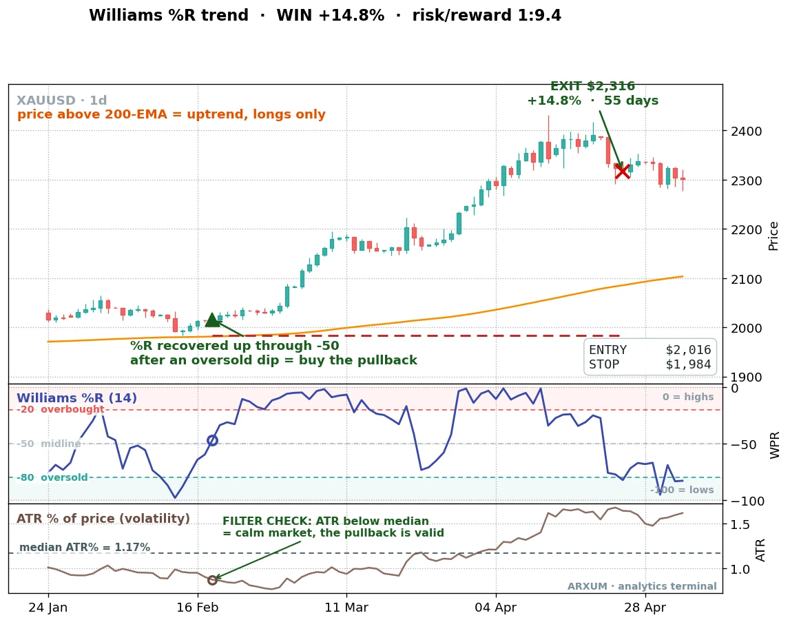
Price was clearly above the orange 200-EMA line, so the regime, meaning the prevailing trend direction, was up. Gold dipped, %R fell toward the lows, then turned and climbed back through -50. That cross was the buy. The trade then rode the trend for 55 days and closed up 14.84%, making more than nine times what it risked at the stop.
The bottom panel on that chart needs a word, because it does real work later. It tracks the average true range as a percentage of price, a plain read of how violently this market is moving. The dashed “median ATR%” line is simply the midpoint of that volatility across the whole eight years, roughly 1.2% of price on gold. When the entry dot sits below that line, the market is calmer than its own average, and as the numbers will show, a calm pullback is exactly where this setup pays.
That 14.84% gain is the real difference. The bounce risks a dollar to make a dollar. The trend-pullback risks a dollar to make several, because it lets a winner run with the trend instead of taking a quick reversion target.
Here is another, on gold’s record run to new highs.
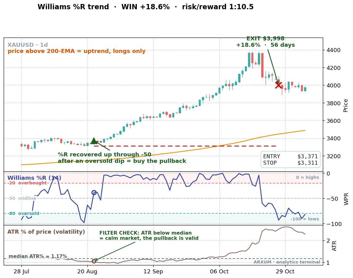
Same setup, same logic, a different stretch of the chart. Price above the 200-EMA, a pullback that pushed %R toward oversold, then the recovery through -50. The trade caught a chunk of gold’s run to new highs and closed up 18.56%.
These are not cherry-picked outliers, they are how the setup is meant to work: small, frequent losses paid for by the occasional trade that runs with the trend. The numbers across the full eight years bear that out.
| Trades | 52 |
| Win rate | 38% |
| Reward-to-risk | 1:2.8 |
| Profit factor | 1.74 |
| Net return on $1,000 | +$497 |
Notice the win rate: 38%. The trend-pullback is wrong nearly two times in three. That feels uncomfortable next to the bounce’s 67%.
But look at the reward-to-risk, 1:2.8, against the bounce’s 1:1. Each winner makes almost three times what a loser costs. You can lose four in a row and one runner pays you back, which is a far sturdier edge than being right often for small change.
The profit factor is the other half of the story. At 1.74, the trend-pullback made $1.74 for every dollar it gave back. The bounce’s 1.96 on gold looks higher, but the bounce collapses the moment you leave gold. The pullback does not, as the next section shows.
So the trend-pullback has both: a profit factor above 1.0 and a strong per-trade payoff. The bounce has a high win rate but a weak per-trade payoff, which is exactly how a setup can be “right” most of the time and still go nowhere. If the 1:X notation is new to you, the risk-reward ratio guide walks through it.
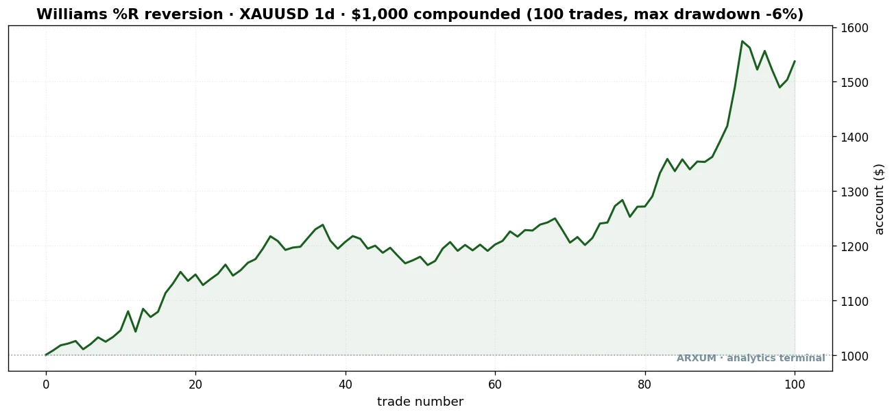
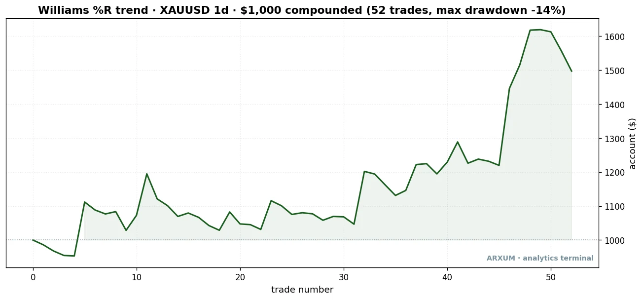
The grind, drawn out
That equity curve above the table is the part most guides skip, and it is the most honest thing in this article. Look at the shape. The account chops sideways for thirty-odd trades, going almost nowhere. Then the back half, as gold’s run got going, a handful of large winners drag the line up to about $1,497.
That is what trading an edge actually feels like, and it is worth sitting with. Most of the time it does nothing. The money comes from the rare trade that runs, and you have no way to know in advance which one that will be.
If you cannot stomach the flat stretches, you will quit right before the runner that pays for them. The worst peak-to-trough dip here was 14%, shallow for the return, but the boredom is the real test, not the drawdown.
Strip out the single best trade, the 18.56% runner, and the account still finishes in the green rather than collapsing. The edge does not hang on one lucky outlier, it leans on a handful of large winners, which is a sturdier thing to depend on than a lone jackpot.
It is not a gold fluke: EUR/USD and Bitcoin
One market proves nothing, the same way one trade does not. The honest question is whether the trend-pullback pays somewhere it was not handpicked. It does, on both of the other markets we tested.
| Gold (daily) | 1.74 (2.26) |
| EUR/USD (daily) | 1.06 (1.58) |
| Bitcoin (4-hour) | 1.53 (1.39) |
All three clear 1.0, and all three hold up on the out-of-sample half, the recent data the rule never saw when we picked it. That out-of-sample column matters more than the headline number, because an edge that survives data it was not fit to is an edge you can lean on. The bounce failed that test. The pullback passes it on every market.
Here is the EUR/USD trade, from a clean dollar-weakness run.
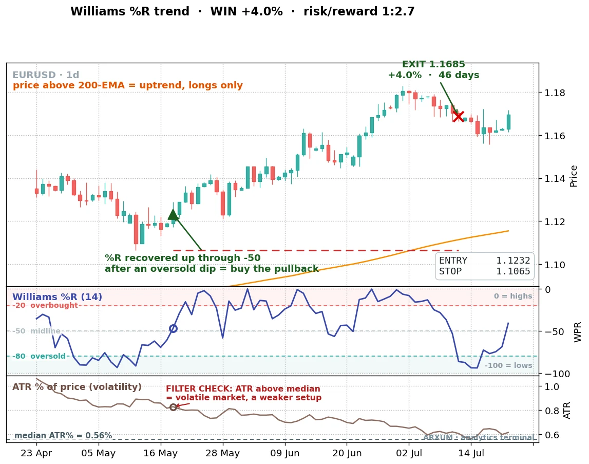
The setup reads the same on the euro as on gold: above the 200-EMA, a pullback, the %R recovery through -50, then the trend does the work. This one ran 46 days for 4.01%.
One thing to flag on this chart, because it teaches the next point. The ATR panel at the bottom marks this market as volatile, not calm.
On gold that would be a warning. On EUR/USD it is the opposite, exactly the condition you want. Which brings us to the filter.
The filter is not one recipe, it is discovered per market
Most indicator guides hand you a fixed checklist: add volume, add this, add that, the same three confirmations on every setup. We tested that idea directly by sweeping a whole menu of filters across each market, and the result was cleaner and stranger than a fixed recipe.
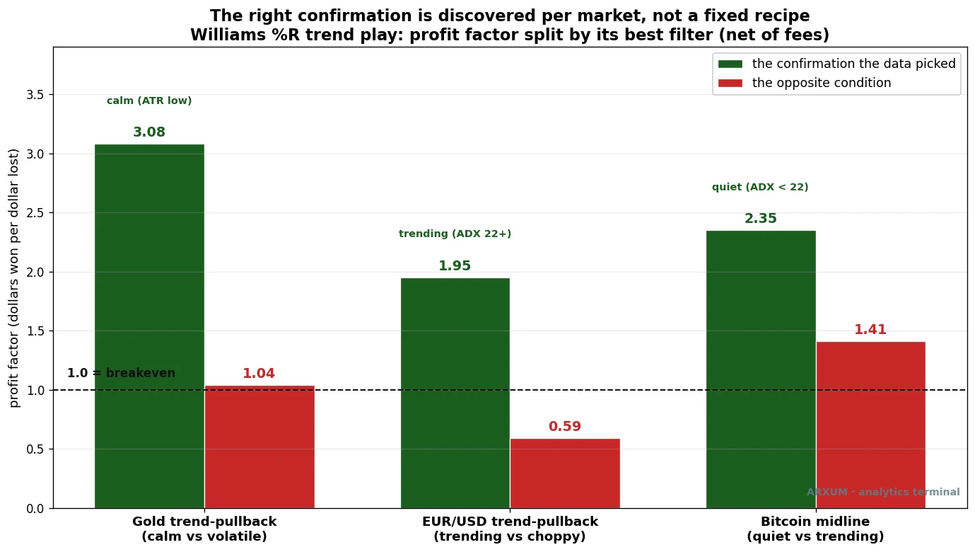
On gold, the trend-pullback prefers a calm market. Taking only the entries below that median ATR line lifted the profit factor from 1.74 to 3.08. The violent half barely broke even. A calm pullback inside a strong trend is orderly, and orderly is what pays here.
On EUR/USD, the opposite. The pullback wanted a trending market, with ADX above 22, which pushed it to 1.95, while the choppy half lost money. ADX, the Average Directional Index, is a standard measure of how strongly a market is trending: the higher the reading, the stronger the trend, regardless of direction. The euro’s good trades came in its directional runs, the volatile stretches, not the quiet drift.
On Bitcoin, the midline version of the play preferred the quiet stretches, ADX below 22, reaching 2.35.
The one thing all three markets agreed on: volume did not help. Adding a volume filter hurt the trend-pullback everywhere we tried it. So the honest answer is not “always add volume” or any other fixed trio. It is that the right confirmation depends on the market’s character, and you find it by testing, not by copying a checklist.
For gold, watch volatility: tight, shrinking candles mean the pullback is calm and valid. For a currency, lean on trend strength instead.
If you want to add a volatility read of your own, the average true range is the simplest one and it is what we used here.
Which method to use, side by side
Four ways to read Williams %R, three markets, one chart. This is the whole finding in a single picture.
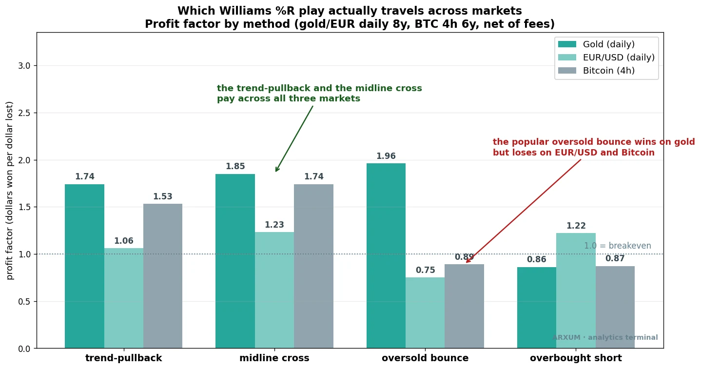
The trend-pullback and its faster cousin, the midline cross, are the two bars that stay above the 1.0 line on every market. The midline cross is the same idea with a looser trigger: in an uptrend, simply buy each time %R crosses up through -50, without waiting for a prior oversold dip. It fires more often and posts a slightly higher profit factor on gold (1.85) and Bitcoin (1.74), at the cost of a few more false starts.
The oversold bounce is the tall green bar on gold and the short bars everywhere else, which is the trap in one image. And the overbought short, selling when %R drops back under -20, mostly loses, because shorting an asset like gold during a bull run is fighting the regime.
That last point is the rule under all of it. Direction is the regime, and you trade with it. Long while price is above the 200-EMA, short only while it is below.
On forex and CFDs a short is just a sell order, no borrowing, no special mechanics, so the short side is available, it just rarely paid on these trending markets over this window. When a market does roll over and trend down, the mirror setup applies. The tool times the entry; the regime decides the direction.
When it fails, and why
Honest testing means showing the losers, not just the runners. Here is a trend-pullback that did everything right and still lost, on gold during the COVID crash.
The signal was textbook. Price above the 200-EMA, a pullback, %R recovering through -50. But this was the COVID crash, and the market was anything but calm.
The ATR panel at the bottom shows volatility well above its median. Price kept falling, the stop was hit eight days later, and the trade closed down 5.08%.
This is exactly the trade the calm filter is built to skip. The setup looked valid, but the violent conditions made it a coin toss, and the volatility reading would have kept you out.
The lesson is not that the pullback is broken. It is that the same signal means different things in a calm market and a chaotic one, and the filter is how you tell them apart.
How to place the trade
The mechanics, step by step, using the gold example so the numbers are concrete. Both tools you need, Williams %R and the 200-EMA, add to a chart in two clicks from the indicator menu on any free platform, such as TradingView.
- Confirm the regime. Price must be above the 200-period EMA on your chart. If it is below, you are looking for the mirror setup on the short side, not this one.
- Wait for the pullback. Williams %R should dip toward or into the oversold zone, below -80, as price eases back inside the uptrend.
- Enter on the recovery. When %R crosses back up through the -50 midline, place a market or buy order on that bar’s close. That cross is the trigger.
- Set the stop. Put your stop-loss just under the recent swing low, the lowest point of the pullback. On the gold trade above, entry was about $2,016 and the stop sat near $1,984, a risk of roughly $32 per ounce.
- Size the position. Risk a fixed slice of your account, 2% is a sensible cap. On a $1,000 account that is $20. Divide the risk budget by the per-unit risk to get your size: $20 ÷ $32 = 0.625, so about 0.6 of a single unit, well under one standard lot.
- Manage the exit. Either trail the stop under each new swing low as the trend climbs, or exit when %R falls back below -80, the signal that momentum has given out.
A note on that sizing, because it matters for small accounts. On gold, where one standard lot is 100 ounces, a $20 risk sized to a fraction of a unit, below a single micro lot. You would want a broker that allows fractional or cent-lot sizing, or a lower-priced market like the euro where the dollar stop per unit is smaller.
Never widen the stop or oversize the position to force a trade your account is too small to take cleanly. The trade has to fit the account, not the other way around.
Risk, and the discipline behind the numbers
The strategy is the main event. The discipline is what keeps you in the game long enough for the edge to show up, and it is shorter to state than most guides make it.
The trend-pullback is wrong about 62% of the time. That is not a flaw, it is the design, and it means losing streaks are normal. If your equity curve has long flat stretches, you are trading it correctly.
The danger is not the drawdown, it is your own patience running out before the runner arrives. Three to six losses in a row is within the normal range here, but it is also worth a pause to check whether the trend you were trading is still intact.
Keep the risk fixed at that 2% per trade and a four-loss streak costs you roughly 8%, recoverable with one good winner. Break that rule, double up to win it back after a loss, and a normal losing streak becomes the one that ends the account. The math only works if you let it work the same way every trade.
And watch the live results against the test, calmly. One bad week is noise, not a verdict.
A sustained gap between what you see live and what the numbers say, over a meaningful run of trades, is worth stepping back for, because no mechanical edge is permanent and markets do change character. The crash trade above is a small reminder of that. The point is to react to a real shift, not to a single loss.
The honest gaps
A few things this test does not claim, stated plainly.
- Tick volume on forex. The gold and EUR/USD data uses Dukascopy, whose volume is a tick count, not true traded volume. That is fine here, because the working setup does not use volume at all. But it is why we did not lean on any volume reading for the currency markets.
- One indicator, not a system. Williams %R times entries. It does not tell you when a trend is about to end, and it will keep you long right into a top. The 200-EMA regime filter is what protects you, not the oscillator.
- The short side is thin. Over this window the markets trended up, so the short setups had few trades and weak numbers. In a sustained downtrend the mirror logic should apply, but this data cannot prove it on a large sample.
What this gives you, in one line
The famous Williams %R bounce, buy at -80, is a high-win-rate trap: it wins two trades in three on gold and still loses money on EUR/USD and Bitcoin, because it is a range trade dressed up as a universal signal. The play that travels is the trend-pullback: above the 200-EMA, buy the %R recovery up through -50, and let the trend carry it.
Filter it to the condition that market rewards, calm for gold, trending for the euro, and you have a setup with a profit factor above 1.0 that holds up out-of-sample on every market we tried. The oscillator times the entry. The trend, and your discipline, do the rest.
Where to go from here
If you want to build on this, two natural next steps. Williams %R is the inverted twin of the stochastic oscillator, so the same trend-pullback logic ports straight across if you prefer the 0 to 100 scale. And because the real edge is momentum timing inside a trend, the RSI indicator and the mean-reversion family are worth reading next, to see where the same idea works and where it breaks. The tool matters less than the regime you apply it in.
FAQ
What is Williams %R, in plain terms?
Why is the Williams %R scale negative and upside down?
How is Williams %R different from the stochastic oscillator?
Does the Williams %R strategy actually work?
Is buying at -80 oversold a reliable signal?
What are the best Williams %R settings?
What is the best timeframe for Williams %R?
Should I trade Williams %R overbought above -20 as a sell?
What confirmation should I add to Williams %R?
Why does the trend-pullback win only 38% of the time and still make money?
What is profit factor, and how is it different from reward-to-risk?
How much money do I need to start trading this?
What do the key terms mean?
🌍 Our recommended brokers
Reader Reviews
Be the first to review this — tell other traders what actually helped, or where it fell short.
Leave a Review

Quant Researcher & Systems Builder
Quantitative researcher who builds the automated systems behind Arxum strategy testing. Works in Python and Pine Script, using AI alongside classic backtesting to validate strategies on years of real data.