
What the Sharpe ratio actually is
Raw return answers one question, how much did it make. The Sharpe ratio answers the one that matters more, how much did it make for the risk it put you through.
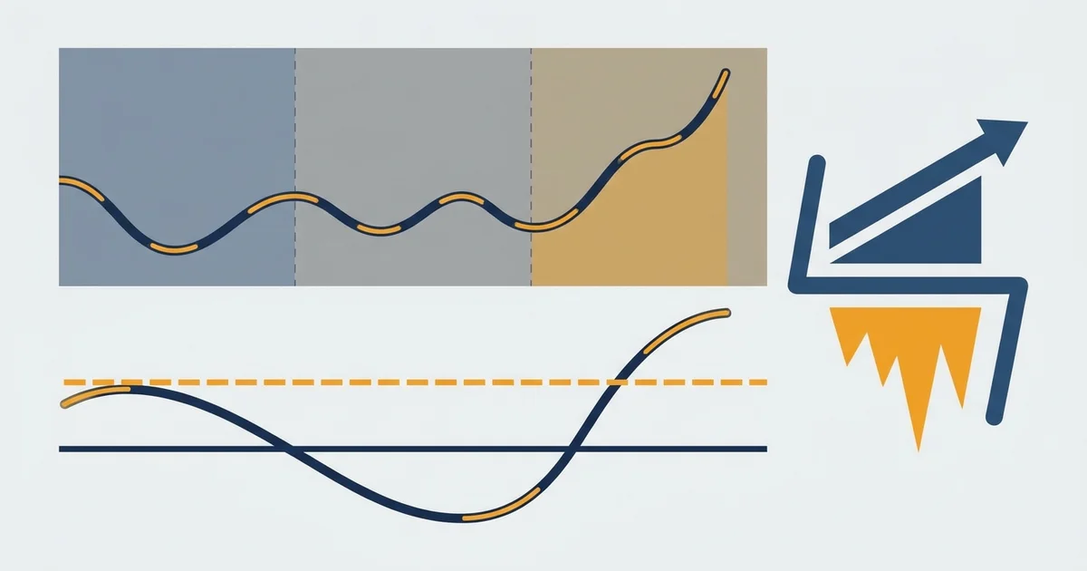
Here is the whole idea on one diagram, before we break it into parts.
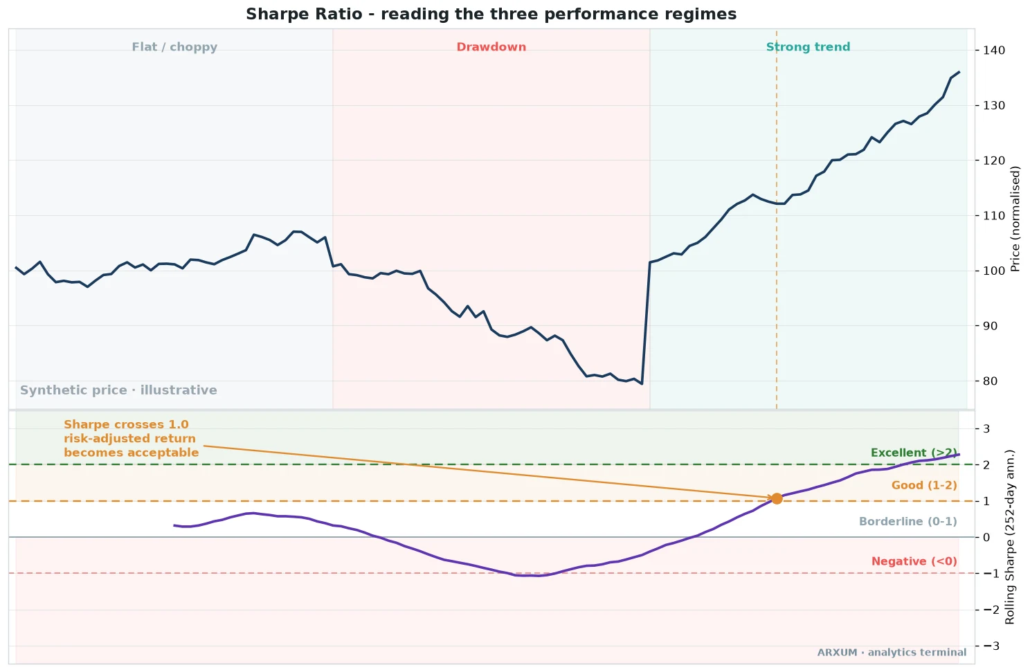
Read the diagram from top to bottom, price first, then the Sharpe line reacting to it.
- The top panel is a price path moving through three market moods: a flat chop, a sharp drawdown, then a clean rising trend.
- The lower panel is the Sharpe ratio measured on a rolling window, so it updates as the market changes rather than giving one lifetime number.
- The coloured bands grade the reading: red below zero, grey from zero to one, orange from one to two, green above two.
- The marked cross at 1.0 is the important line. Below it a strategy is barely paying you for the risk. Above it the return is starting to justify the ride.
- Note where the line is lowest. It bottoms during the drawdown, when losses and wild swings both hit at once, and it peaks in the smooth uptrend where gains come with less noise.
The one idea to hold on to: the Sharpe ratio rises when returns are both positive and steady, and it falls when they are negative or violent. Smoothness is rewarded, chaos is punished.
What counts as a good Sharpe ratio
There is a rough, widely used scale. It is not a hard law, but it is the language every fund, prop firm and strategy report speaks.
| Reading | Verdict | What it means in plain terms |
|---|---|---|
| Below 0 | Losing ground | You would have done better in cash, risk with no reward |
| 0 to 1 | Weak | Some return, but not much for the swings you sat through |
| 1 to 2 | Solid | The level most traders want before they trust a strategy |
| 2 to 3 | Excellent | Strong, steady return for the risk, rare to hold long term |
| Above 3 | Exceptional | Uncommon, often short-term or high-frequency, treat with doubt |
A few honest notes on that scale:
- One is the working threshold. Below it, a strategy is not clearly beating the risk-free alternative once you account for the swings.
- Two and up is genuinely good and hard to sustain across years and market regimes.
- Above three deserves suspicion, not applause. On a long track it usually points to a tiny sample, a fluke window, or a curve-fit backtest rather than a durable edge.
- The number is only as honest as the period behind it. A great Sharpe over three calm months tells you almost nothing.
The Sharpe ratio formula
The formula looks intimidating written out, but it is three plain pieces. This is the same maths whether you are grading a fund or your own trades.
| Piece | Symbol | What it is |
|---|---|---|
| Portfolio return | Rp | What the strategy actually made over the period |
| Risk-free rate | Rf | What safe cash, like short-term government bills, would have paid |
| Volatility | σp | Standard deviation, how much the returns bounced around the average |
Put together, the Sharpe ratio is:
- Sharpe = (Rp minus Rf) divided by σp.
- The top, Rp minus Rf, is the excess return, the reward you earned for taking risk instead of sitting in cash.
- The bottom, σp, is the risk itself, measured as the standard deviation of returns.
- Standard deviation is just a number for spread: a small one means returns clustered near the average, a big one means they swung far above and below it.
A worked example
Say a hypothetical strategy returns 12% over a year, safe cash pays 4%, and the strategy’s return volatility is 10%. The arithmetic is short.
| Step | Operation | Result |
|---|---|---|
| Excess return | 12% minus 4% | 8% |
| Divide by volatility | 8 divided by 10 | 0.8 |
| Read the scale | 0.8 sits in the 0 to 1 band | Weak, below the trust line |
Now keep the return the same but halve the volatility to 5%. The excess return of 8% divided by 5 gives 1.6, straight into the solid band.
Same profit, far less turbulence, a much better strategy. That single swap is the whole point of the ratio.
These figures are illustrative, chosen to show the arithmetic. They are not results from any test.
How to calculate it on your own returns
You do not need software to grasp it, though a spreadsheet does the heavy lifting. The steps are the same at any scale.
- List your returns per period. Daily, weekly or monthly, pick one and stay consistent.
- Find the average return across those periods.
- Work out the standard deviation of those returns, the spread around that average. A spreadsheet’s STDEV function does this in one step.
- Subtract the risk-free rate for the same period from your average return.
- Divide that excess by the standard deviation. That is the Sharpe for one period.
- Annualise so numbers are comparable. Multiply a daily Sharpe by the square root of 252, the roughly 252 trading days in a year. For monthly data, use the square root of 12.
| Your data | Periods per year | Multiply the raw Sharpe by |
|---|---|---|
| Daily returns | ~252 trading days | Square root of 252, about 15.9 |
| Weekly returns | 52 weeks | Square root of 52, about 7.2 |
| Monthly returns | 12 months | Square root of 12, about 3.5 |
Two things people trip on:
- Always annualise before you compare. A daily Sharpe and a monthly Sharpe are not the same scale, and comparing them raw is meaningless.
- The risk-free rate is not optional. In a high-rate world, ignoring it flatters every strategy, because cash was paying a real return you had to beat.
Reading a rolling Sharpe on real charts
A lifetime Sharpe is one number for a whole track. A rolling Sharpe recomputes it over a moving window, so you can watch risk-adjusted return rise and fall as the market shifts.
Both charts below use a 60-bar window, written w=60 on the panel.
Gold on the daily chart
On spot gold (XAU/USD), the daily Sharpe starts strong, then decays as the trend tires and swings widen.
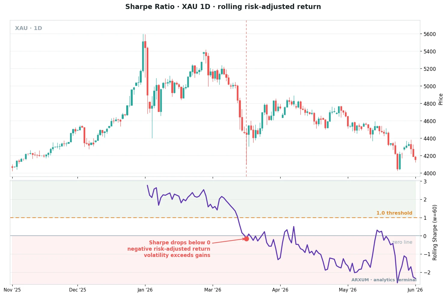
What the gold panel shows, read left to right:
- Early on the Sharpe is high, above 2, because gold climbs steadily with contained swings.
- As the trend flattens, each new high comes with bigger pullbacks, so the same-ish return now carries more risk and the Sharpe falls.
- The red marker is the cross below zero. Past that point the market is handing you risk with no net reward.
- The takeaway: a strong-looking market can still be posting a poor Sharpe once the moves get choppy. The price chart alone hides that, the Sharpe line surfaces it.
The daily window moves slowly, so the gold Sharpe drifts rather than jerks. That smoothness is exactly what you want when you use it to judge a swing strategy over weeks.
EUR/USD on the 4-hour chart
Drop to a faster timeframe and the same tool gets noisier. On EUR/USD at 4-hour, the rolling Sharpe whips between deeply negative and briefly excellent.
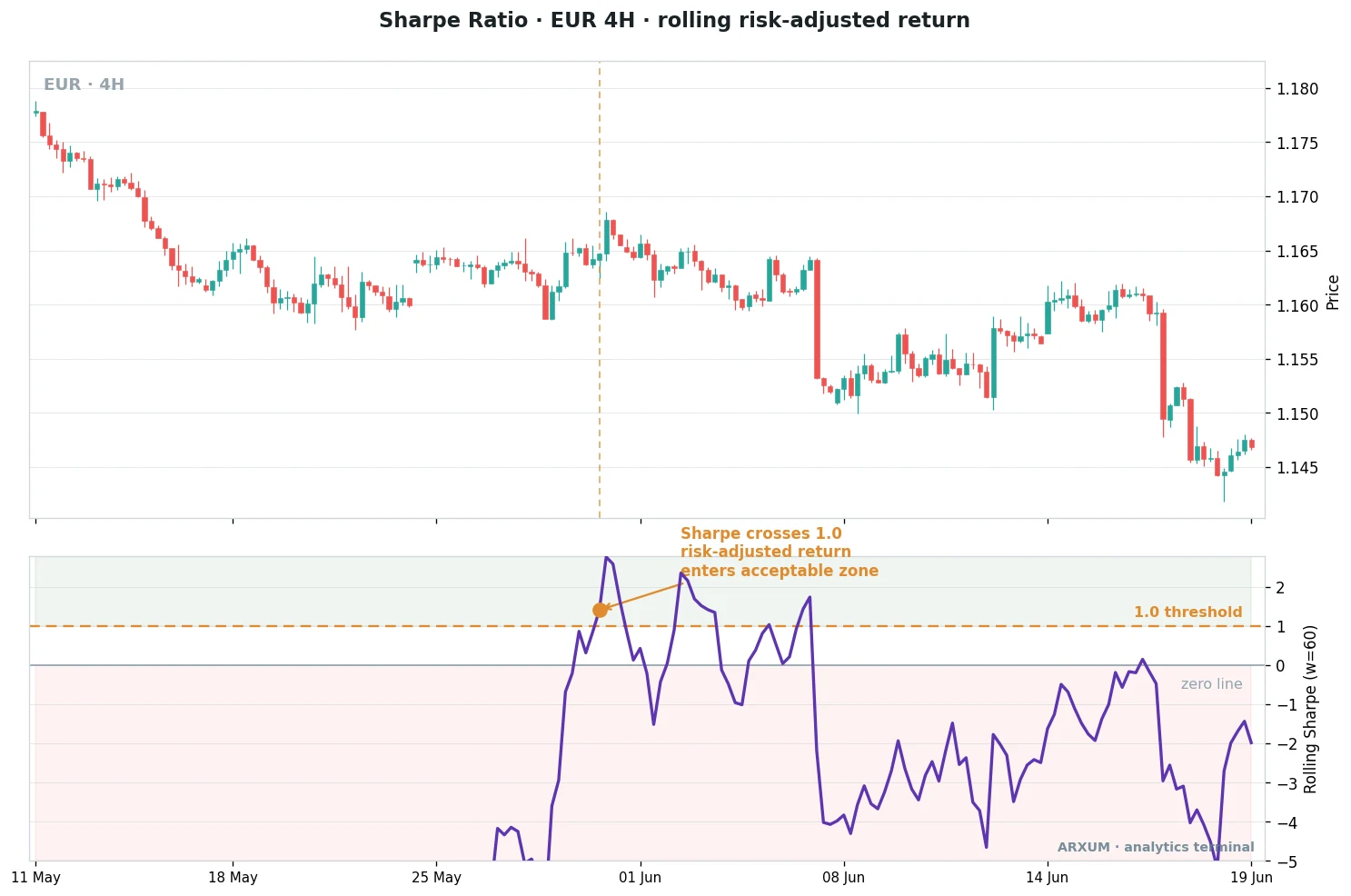
The EUR/USD panel makes the timeframe lesson obvious:
- The Sharpe swings hard, from below minus 4 to above 2 and back, over just a few weeks.
- The marked cross above 1.0 is a real but brief window where the pair trended cleanly enough to pay for its risk.
- Those windows do not last on a fast chart, they open and close as intraday noise dominates.
- The takeaway: a shorter window and a faster timeframe make the Sharpe jumpy. Read it as a mood gauge, not a precise score, when you go fast.
Put the two charts side by side and the point lands. The tool is identical, only the timeframe changed.
Slower charts give a steady, trustworthy Sharpe, faster charts give a twitchy one you should smooth in your head.
What the Sharpe ratio is actually for
The ratio is not an entry signal. It is an evaluation tool, and it earns its keep in a handful of specific jobs.
| Role | How you use it | Best read on |
|---|---|---|
| Compare strategies | Rank two systems by return per unit of risk, not raw profit | Annualised Sharpe over the same period |
| Judge a backtest | A high return with a low Sharpe warns of a fragile, jumpy curve | Full-sample Sharpe on the tested history |
| Track your own health | Watch a rolling Sharpe to see when your edge is fading | Rolling Sharpe, D1 window on swing systems |
| Size and allocate | Lean into strategies with steadier risk-adjusted return | Annualised Sharpe across your book |
| Benchmark vs holding | Check a timed strategy really beats buy and hold on risk | Sharpe of the strategy vs the asset itself |
A few rules of thumb from that table:
- Never compare on raw return alone. A strategy up 40% with a Sharpe of 0.5 is worse, and scarier to trade, than one up 20% with a Sharpe of 1.5.
- Use the Sharpe to vet a backtest. If you are grading a system, pair the Sharpe with the equity curve, since a strong number over a suspiciously smooth curve can flag an overfit. The guide on backtesting a trading strategy covers what else to check.
- A rolling Sharpe is an early-warning light. When your live Sharpe drifts steadily down, the market regime may have turned, well before your account tells you loudly.
Sharpe vs Sortino vs Calmar
The Sharpe ratio has two well-known cousins. Each fixes a specific blind spot, and knowing when to reach for which is half the skill.
| Ratio | Risk it measures | Best for |
|---|---|---|
| Sharpe | Total volatility, up and down swings alike | A general, standard, all-purpose score |
| Sortino | Downside volatility only | Strategies with big upside spikes you do not want punished |
| Calmar | The worst peak-to-trough drawdown | Judging pain, how deep the losses got |
The plain-English differences:
- Sharpe punishes all volatility. Here is its odd quirk: a huge winning month raises your volatility, so it can actually lower your Sharpe. It treats a violent gain as risk.
- Sortino fixes that. It only counts downside deviation, the swings below your target, so upside spikes no longer hurt your score. That suits an uneven, spiky return profile.
- Calmar takes a different angle. It divides return by the deepest drawdown, so it answers the question a real trader loses sleep over, how bad did it get.
- Use them together. Sharpe for the headline, Sortino when your upside is lumpy, Calmar when survivability and the worst loss matter most.
The limitations, stated plainly
The Sharpe ratio is useful, not perfect. Trust it more when you know where it lies to you.
- It assumes returns are normal. Real markets have fat tails, rare crashes and squeezes the maths under-weights, so a Sharpe can look calm right up to a blow-up.
- It penalises upside. As above, big winning swings raise volatility and can drag the number down, which feels backwards.
- It is easy to game with the window. Pick a smooth stretch and any strategy looks brilliant, so always ask what period is behind the number.
- It hides the drawdown. Two strategies can share a Sharpe while one had a shallow dip and the other a terrifying one. Read it alongside max drawdown, never alone.
- Leverage distorts comparison. Scaling a position up moves return and volatility together, so a raw number without context can mislead.
How to improve a strategy’s Sharpe
Because the ratio is return over risk, you lift it by raising the top, lowering the bottom, or both. The honest gains come from the bottom.
- Cut the volatility, not the return. Smoother equity is usually the faster win. Steadier position sizing does more than chasing a higher hit rate. The position sizing guide is the place to start.
- Trade the regime the tool suits. A trend system posts a better Sharpe in a clean trend and a worse one in chop, so a simple regime filter can lift the number honestly.
- Trim the fat-tail trades. A volatility gauge like the average true range can flag the wild conditions that wreck an equity curve.
- Do not overfit for it. A Sharpe tuned to perfection on past data is the classic trap, it collapses live. Improve the process, not the backtest number.
- Mind the difference from per-trade odds. The Sharpe grades the whole equity curve, while the risk-reward ratio grades a single trade. Both matter, they answer different questions.
Which metric to reach for, when
One table to hold the whole decision. Pick by the question you are actually asking.
| Your question | Reach for | Why |
|---|---|---|
| Return per unit of risk | Sharpe ratio | The standard, comparable across strategies |
| Am I punishing upside unfairly | Sortino ratio | Counts only downside swings |
| How deep did the pain get | Calmar ratio | Return against the worst drawdown |
| How good was this single trade | Risk-reward ratio | Per-trade reward against per-trade risk |
| Is my edge fading now | Rolling Sharpe | Updates as the market regime shifts |
What works: three things to remember
If you keep only three points from this guide, keep these.
- Return without risk context is half a story. The Sharpe ratio finishes the sentence by asking what you earned per unit of risk. Above one is the working line, above two is genuinely good.
- The window and the period are everything. A great Sharpe over a short, calm stretch means little. Annualise before you compare, and always ask how long the track is.
- Never read it alone. Pair it with the drawdown and the equity curve, and lean on Sortino or Calmar when upside spikes or worst-case pain are what you care about.
The Sharpe ratio will not tell you when to buy, and it flatters a smooth backtest that may not survive live. Used for what it is good at, comparing return against risk on a level field, it is the most useful single number you can put on a strategy.
Glossary: the key Sharpe ratio terms
- Sharpe ratio: excess return divided by volatility, the return earned per unit of total risk.
- Excess return: the return above the risk-free rate, the reward for taking risk over holding cash.
- Risk-free rate: what safe cash, like short-term government bills, would have paid over the same period.
- Volatility: the standard deviation of returns, a measure of how far they swing from the average.
- Standard deviation: a single number for spread, small means tightly clustered, large means widely scattered.
- Rolling Sharpe: the ratio recomputed over a moving window, so it changes as the market changes.
- Annualising: scaling a Sharpe from daily or monthly data to a yearly figure so numbers compare.
- Sortino ratio: a Sharpe variant that counts only downside volatility, not upside swings.
- Calmar ratio: return divided by the worst peak-to-trough drawdown.
FAQ
What is the Sharpe ratio, in plain terms?
What is a good Sharpe ratio?
What is a good Sharpe ratio for trading?
What is the Sharpe ratio formula?
How do you calculate the Sharpe ratio?
Can the Sharpe ratio be negative?
What is the difference between the Sharpe ratio and the Sortino ratio?
What timeframe or period should I use for the Sharpe ratio?
What are the main limitations of the Sharpe ratio?
Real-time trade setups with entry, stop loss and take profit. Daily market analysis. No subscription, no complicated theory.
🌍 Our recommended brokers


Reader Reviews
Be the first to review this — tell other traders what actually helped, or where it fell short.
Leave a Review

Quant Researcher & Systems Builder
Quantitative researcher who builds the automated systems behind Arxum strategy testing. Works in Python and Pine Script, using AI alongside classic backtesting to validate strategies on years of real data.