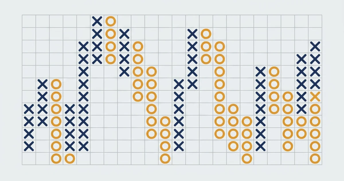

What a point and figure chart is
A point and figure chart, often shortened to P&F or PnF chart, throws out time and keeps only price. On a normal candlestick chart the x-axis is the clock, so a flat, boring week still eats up space.
On a P&F chart nothing gets drawn until price moves a full box, so a quiet week can be a single mark or nothing at all.
Here is the shape on a real chart before we name the parts.
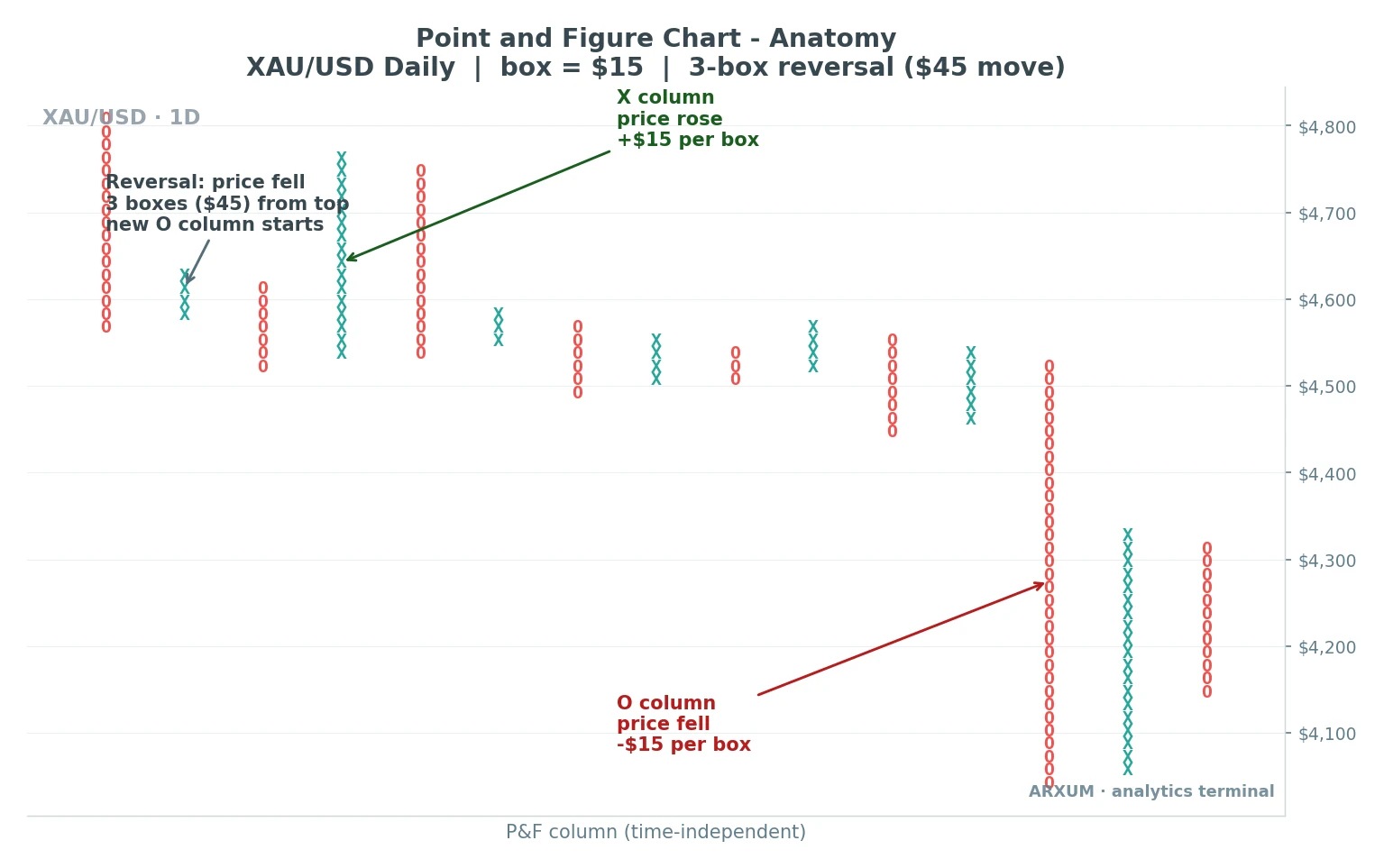
Now the picture is on screen, the pieces are easy to name.
- X column: a run of rising price. Each X sits one box above the last, and the column keeps growing as long as price keeps climbing.
- O column: a run of falling price. Each O sits one box below the last, and the column grows downward while price keeps dropping.
- The box size: the fixed price step each X or O represents. On the gold chart above it is $15, so nothing new is drawn until price moves a clean $15.
- The reversal: how far price must turn before a new column starts, most often three boxes. On gold that means a $45 move against the current column.
- The columns alternate: X, then O, then X. You never get two X columns side by side, because a switch of column IS the reversal.
- Time is gone: columns are spaced evenly no matter how long each move took. The bottom axis counts columns, not days.
That last point is the whole idea. A P&F chart answers one question, which way is price actually going, and refuses to draw anything that does not move the answer.
How to read a point and figure chart
Point and figure charting comes down to two numbers you set before you start: the box size and the reversal. Get those right and the chart builds itself.
| Setting | What it does | Common choice |
| Box size | The price move each X or O represents | Fixed amount, % of price, or ATR |
| Reversal amount | Boxes needed to flip to a new column | 3-box (classic) |
The reading rules, once those are set, are short:
- Price up by one box or more while you are in an X column: add another X on top.
- Price down by the reversal amount (three boxes) from the top of an X column: move one column right and start dropping O’s.
- Price down by one box or more while you are in an O column: add another O below.
- Price up by the reversal amount from the bottom of an O column: move one column right and start stacking X’s.
- Anything smaller than a full box is ignored. It is noise, and the chart is built to hide it.
A quick worked read, no maths tricks:
- Gold is in an X column topping near $4,780 with a $15 box. It needs to fall three boxes, $45, down to about $4,735 before an O column can begin.
- If it only dips $30 and turns back up, nothing changes. The X column just waits.
- Once it does drop the full $45, a fresh O column prints to the right, and the trend read has flipped to down.
Rule of thumb: the bigger your reversal setting, the fewer columns you get and the calmer the chart. The 3-box reversal is the classic middle ground that most charting platforms default to.
Point and figure patterns and the signals they give
Because P&F strips out noise, its patterns are clean and mechanical. A signal is almost always a column of X’s pushing one box past a prior X high (a buy) or a column of O’s pushing one box past a prior O low (a sell).
No candles, no wicks, no judgement calls.
| Pattern | What it looks like | Signal |
| Double top | X column tops one box above the prior X high | Buy (breakout) |
| Double bottom | O column drops one box below the prior O low | Sell (breakdown) |
| Triple top | X breaks above two earlier X columns at the same level | Stronger buy |
| Triple bottom | O breaks below two earlier O columns at the same level | Stronger sell |
| Ascending triple top | Three X tops, each higher than the last, then a break | Strong buy in an uptrend |
| Descending triple bottom | Three O bottoms, each lower, then a break | Strong sell in a downtrend |
| Fulcrum | A long base of X's and O's, then a decisive break out | Major reversal |
Two things carry across every one of them:
- A break of one box is enough. P&F does not wait for a big candle. One X above the old high, and the signal is on.
- The more times a level was tested, the bigger the break. A triple top means price hit the same ceiling more often than a double top, so clearing it means more.
The double-top breakout, the everyday buy signal
The double top is the P&F signal you will see most. Price makes an X column, pulls back into an O column, then a second X column climbs one box higher than the first.
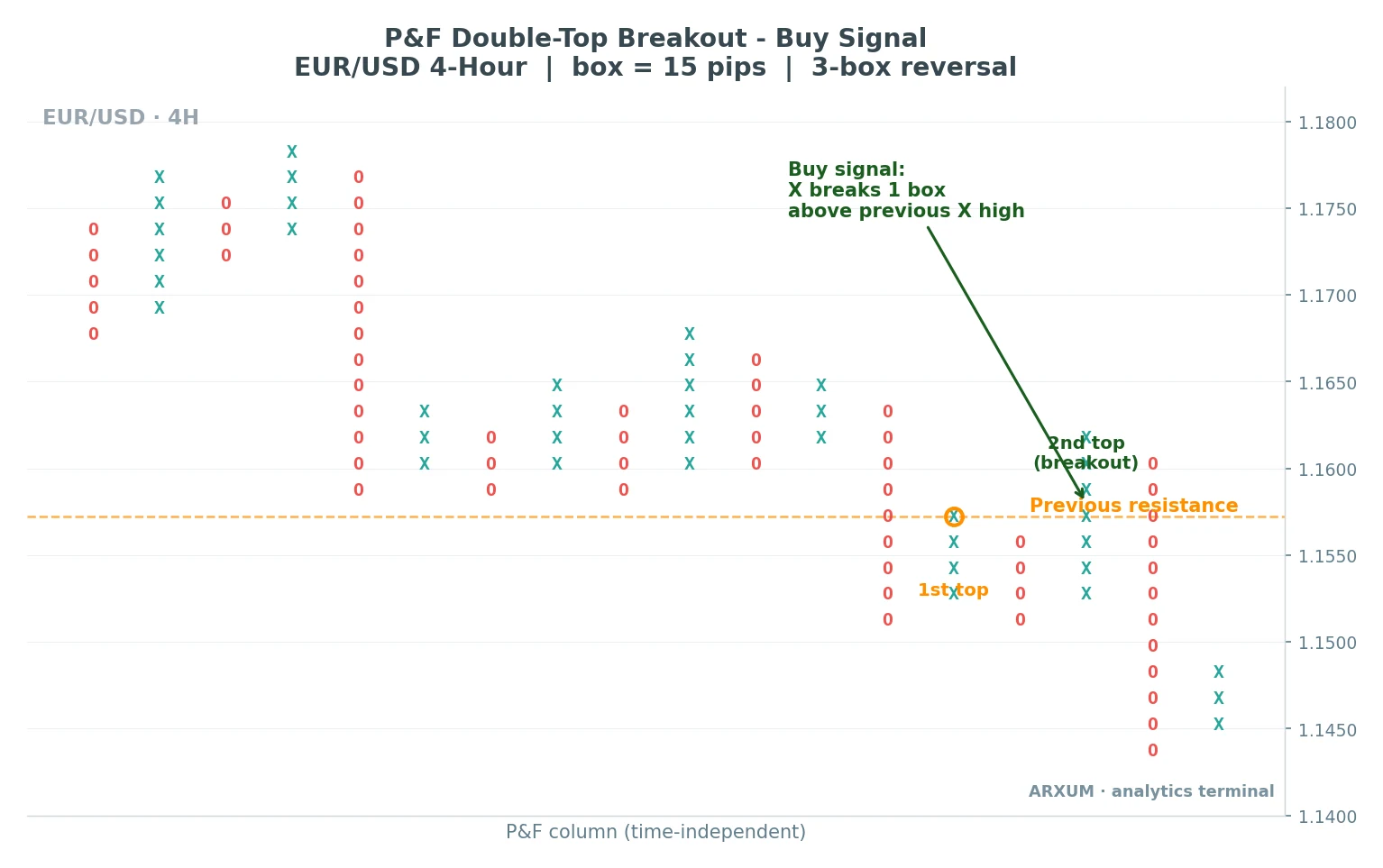
Reading that chart left to right:
- 1st top: the first X column runs up and stalls. That high becomes a resistance level, drawn as the dashed line.
- The pullback: an O column drops away as price reverses by the 3-box amount.
- 2nd top (breakout): a new X column climbs back and prints one box above the old high. That single box past resistance is the buy signal.
- Why it counts: buyers have now overcome a level that turned price away once already. The break says demand won the rematch.
Takeaway: on a P&F chart, “breakout” has an exact definition, one box past the prior column’s extreme. There is no arguing about whether it counts.
The triple-top breakout, the same idea with more weight
A triple top is a double top with an extra test. Price hits roughly the same ceiling more than twice before finally clearing it, so the break carries more meaning.
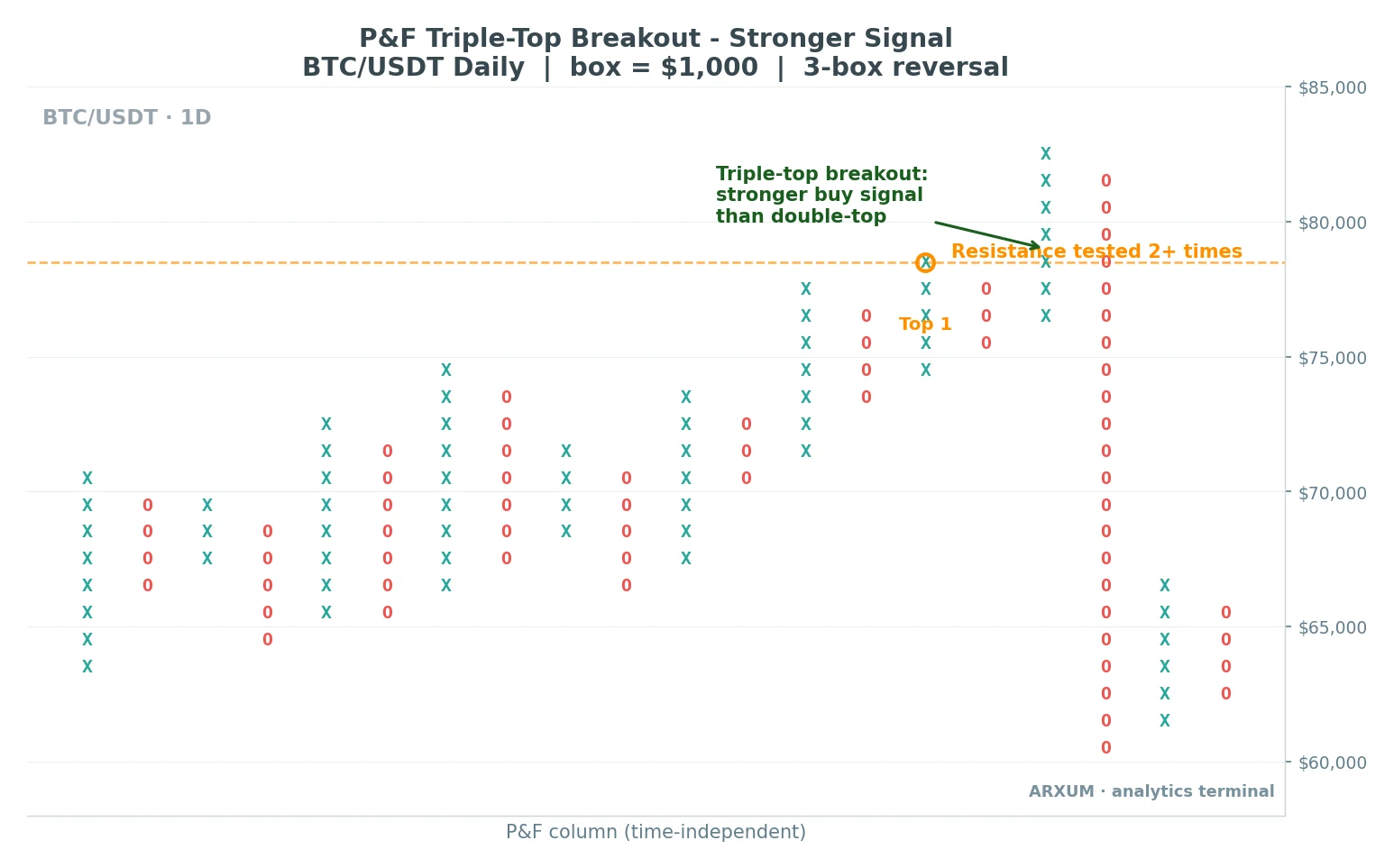
What the Bitcoin chart shows:
- Resistance tested 2+ times: several X columns run into the same dashed ceiling and fail, which is exactly the “resistance tested 2+ times” tag on the chart. Each rejection builds the level’s importance.
- The breakout: the X column that finally prints above the line is the triple-top buy signal.
- Why stronger: more buyers were needed to clear a wall that had held repeatedly, so the follow-through tends to be cleaner than a plain double top.
Takeaway: count the tests. Two touches and a break is a double top, three touches and a break is a triple top, and the market usually respects the one it defended longest.
What each part of a P&F chart is telling you
The real value of P&F is not just spotting a break. Each element plays a role, and reading them together is where the method earns its keep.
| Role | What to read | How you use it |
| Trend direction | The current column (X = up, O = down) | Trade with the live column, not against it |
| Entry trigger | One box past a prior X high or O low | Act on the break, no candle confirmation needed |
| Support / resistance | Levels where columns stalled before | Watch old tops as ceilings, old bottoms as floors |
| Trend line | 45-degree lines drawn from a key top or bottom | Stay long above the up line, short below the down line |
| Exit / stop cue | A reversal into the opposite column | A fresh opposite column against your trade is your out |
A note on those 45-degree trend lines, since they are unique to P&F:
- Because columns are evenly spaced, you can draw a clean 45-degree line up from a major low or down from a major high.
- Price above the rising 45-degree line is a bullish market. Below the falling line, bearish.
- It is the same idea as ordinary trendline trading, just made mechanical by the even spacing.
Price targets from a P&F chart
P&F is one of the few methods that hands you a price target straight off the chart. There are two counts, and both use the box size and reversal you already set.
Vertical count measures the thrust out of a base:
- Count the number of boxes in the first X column after a bottom (or O column after a top).
- Multiply that box count by the box size, then by the reversal amount.
- Add the result to the base for an upside target, or subtract from the top for a downside target.
Horizontal count measures the width of a congestion zone:
- Count the number of columns across a sideways base.
- Multiply that width by the box size and the reversal amount.
- Project it up from the breakout for a target.
| Method | What it measures | Best for |
| Vertical count | Height of the first thrust off a base | Fast, strong breakouts |
| Horizontal count | Width of a sideways congestion base | Long bases before a break |
Treat both as a guide, not a promise. A target tells you roughly how far the move might carry, which helps you judge the reward against the risk before you commit.
It does not guarantee price gets there.
Choosing a box size for gold, Bitcoin and Forex
Box size is the one setting you have to match to the market, because $1 means something different on EUR/USD than it does on Bitcoin. Too small and the chart gets noisy again, defeating the point.
Too big and you miss every move.
| Market | Longer-term read (D1) | Faster read (H4) |
| Gold (XAU/USD) | $10 to $20 | $5 to $10 |
| Bitcoin (BTC) | $500 to $1,000 | $250 to $500 |
| EUR/USD | 20 to 30 pips | 10 to 15 pips |
| GBP/USD | 25 to 40 pips | 15 to 20 pips |
Those are starting points, not laws. Two easy ways to size it automatically:
- Percentage boxes: set the box to a small percent of price, so it scales as the market moves. Useful on Bitcoin, where a fixed dollar box gets stale as price climbs.
- ATR boxes: tie the box to the Average True Range, a common volatility gauge your charting platform works out for you, so the box tracks how jumpy the market is right now. Calmer market, smaller box, and the other way round.
Rule of thumb: pick a box big enough that a normal day’s chop does not print a new column, but small enough that a real trend still builds a tall one. If your chart is a mess of one-box columns, the box is too small.
Point and figure vs Renko
P&F and Renko get lumped together because both drop time and both filter noise. They are cousins, not twins, and the differences change how you read them.
| Feature | Point and figure | Renko |
| Marks used | Columns of X's and O's | Bricks, up or down |
| Reversal | Needs several boxes (usually 3) | Needs one brick against the trend |
| Column / brick width | Variable, a column can be tall or short | Fixed, every brick is the same size |
| Built-in targets | Yes, vertical and horizontal counts | No native target method |
| Best at | Support, resistance and breakout patterns | Clean trend visuals, easy stops |
How to choose between them:
- Reach for P&F when you care about horizontal levels, breakout patterns and price targets. The column structure makes old tops and bottoms jump out.
- Reach for Renko when you want the smoothest possible trend picture and a simple one-brick reversal rule. Full write-up in the Renko charts guide.
- They agree more than they disagree. Both hide small moves, so a signal that shows on both is worth more than one that shows on either alone.
Which chart to use, and when
P&F is not a replacement for candles. It is a second lens, and it shines in specific jobs.
| Job | Why P&F fits |
| Finding clean support / resistance | Old column tops and bottoms line up as sharp levels |
| Trading breakouts | A break has an exact rule, one box past the prior column |
| Filtering a choppy market | Small wiggles never print, so you stop overtrading noise |
| Position and swing trading | The slow, noise-free read suits longer holds |
| Setting a first target | The count methods give a number off the chart |
Where it is the wrong tool:
- Fast scalping. By design P&F hides the small moves a scalper lives on.
- Anything time-sensitive, like trading a news release to the minute. P&F has no clock, so it cannot tell you when.
- As your only chart. Most traders read P&F next to candles, using the P&F for levels and the candles for timing and context. Pair it with a wider chart pattern read and a plan for the breakout itself.
What works: the three things to remember
If you keep only three points from this guide, keep these:
- Box size plus reversal is the whole setup. Match the box to the market, keep the 3-box reversal, and the chart filters noise for you.
- A signal is one box past a prior column. Double top for a buy, double bottom for a sell, triple versions for more weight. No candle confirmation needed.
- P&F is a levels-and-targets tool, not a timing tool. Use it for support, resistance and breakouts, read it beside candles, and treat the vertical and horizontal counts as a guide.
Glossary
- Box size: the fixed price move each X or O represents. The main setting you match to the market.
- Reversal amount: how many boxes price must move against the current column before a new column starts. Classic setting is three.
- X column: a vertical run of X’s showing rising price.
- O column: a vertical run of O’s showing falling price.
- Double top / bottom: the basic P&F breakout and breakdown signal, one box past a single prior column.
- Triple top / bottom: the same signal after price tested the level three times, read as stronger.
- Vertical count: a price target from the height of the first thrust off a base.
- Horizontal count: a price target from the width of a sideways base.
- Fulcrum: a long base of mixed X’s and O’s that ends in a major reversal.
- ATR (Average True Range): a volatility gauge your platform calculates for you, sometimes used to set the box size so it scales with the market.
- Pip: the standard small price unit on a Forex pair, used here as the box size on charts like EUR/USD.
FAQ
What is a point and figure chart, in plain terms?
It is a chart that plots only meaningful price moves and ignores time. Rising price stacks up as a column of X's, falling price stacks down as a column of O's, and small wiggles are hidden. What you are left with is a clean read of direction, with the day-to-day noise stripped out.
How do I read a point and figure chart?
Read the current column first. An X column means price is rising, an O column means it is falling. A buy signal is an X printing one box above a prior X high, and a sell signal is an O printing one box below a prior O low. Old column tops act as resistance and old bottoms act as support.
What is the box size and reversal amount?
The box size is the price step each X or O stands for, like $15 on gold or 15 pips on EUR/USD. The reversal amount is how far price must turn before a new column starts, usually three boxes. Together they decide how sensitive the chart is.
What are the main point and figure patterns?
The core ones are the double top (buy) and double bottom (sell), where a column breaks one box past a single prior column. Triple tops and bottoms are the same idea after three tests of a level, read as stronger. There are also ascending and descending triples and the fulcrum, which marks a major reversal.
How do you calculate a price target on a P&F chart?
Two ways. The vertical count multiplies the height of the first thrust off a base (in boxes) by the box size and the reversal amount, then adds it to the base. The horizontal count uses the width of a sideways base instead. Both are guides to how far a move might carry, not guarantees.
Point and figure vs Renko, which is better?
Neither is better outright. P&F is stronger for horizontal support, resistance and breakout patterns, and it gives you built-in price targets. Renko draws the smoothest trend picture with a simple one-brick reversal. Many traders keep both and act on signals that show up on each.
Does P&F work for Forex and crypto?
Yes. The method is market-agnostic, so the same X, O and reversal rules apply to gold, Bitcoin and Forex pairs. You just change the box size to fit the market. Bigger boxes for a fast market like Bitcoin, smaller for a calmer one, or use percentage or ATR boxes so it scales on its own.
What is the best box size to start with?
Match it to the market and your timeframe. Rough daily starting points are $10 to $20 on gold, $500 to $1,000 on Bitcoin, and 20 to 30 pips on EUR/USD, with smaller boxes for faster reads. If your chart fills with tiny one-box columns, the box is too small.
Why does time not matter on a P&F chart?
Because nothing is drawn until price moves a full box. A quiet week that would fill a candlestick chart with flat bars adds little or nothing to a P&F chart. The bottom axis counts columns of price action, not days, so the chart shows what price did, not how long it took.
Real-time trade setups with entry, stop loss and take profit. Daily market analysis. No subscription, no complicated theory.
🌍 Our recommended brokers


Reader Reviews
Be the first to review this — tell other traders what actually helped, or where it fell short.
Leave a Review

Momentum Trader & Technical Analyst
Trades momentum across crypto and forex since 2019, built around RSI, MACD, and volume. Turns discretionary setups into rule-based, systematic entries and validates them on data before they go live.