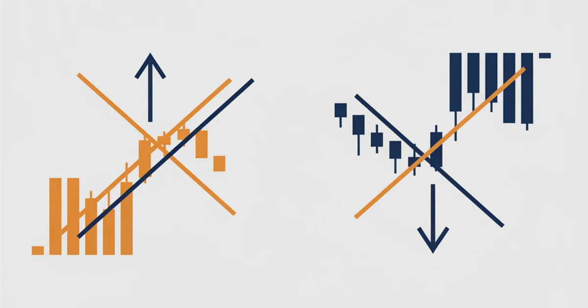

What the Death Cross and Golden Cross Actually Are
The death cross and the golden cross are the two halves of one signal: the 50-period moving average crossing the 200-period moving average.
A moving average is just the average closing price over the last N candles, redrawn each bar, so it smooths the noise into one line. The 50-day line reacts to the last couple of months. The 200-day line tracks the last year.
When the fast 50 line crosses above the slow 200 line, that is the golden cross, read as a shift into an uptrend. When the 50 crosses below the 200, that is the death cross, read as a shift into a downtrend.
Here is the whole thing on a real chart: gold’s daily candles through its recent bull run, with both crosses that actually printed.
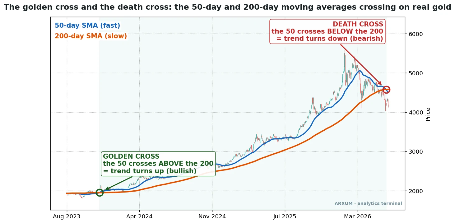
Notice what the cross does NOT do. It does not call the bottom or the top. The 200-day line needs a lot of history to turn, so the cross always lands well after price has changed direction. That lag is the whole story, and it is why the two sides behave so differently once you test them with real money on the line.
The plan for this article: you have just seen the signal on a real chart. Next comes the one number that tells you which side to trust, then the single filter that makes it reliable, and then the real annotated trades, gold and a recent EUR/USD, so you see it play out entry to exit. The catch comes first, the working setup right after.
The Numbers, Up Front
We tested the classic 50/200 crossover on eight years of daily candles across gold, EUR/USD, silver, oil and Bitcoin, long and short, after fees. One result frames everything that follows.
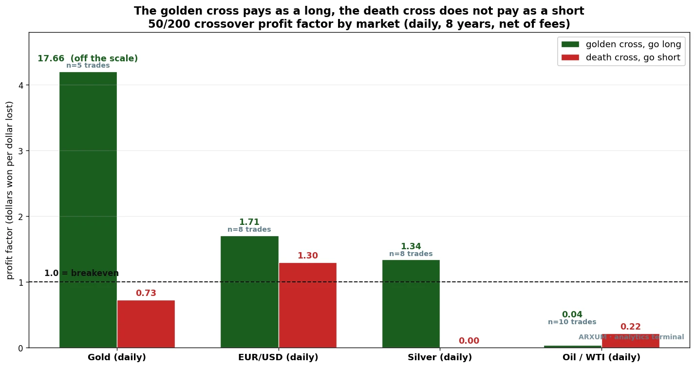
The bars measure profit factor: the dollars the strategy won for every dollar it lost. Above 1.0 it made money, below 1.0 it lost. A profit factor of 1.5 means it made $1.50 for every $1.00 it gave back.
Read the green bars first. Buying the golden cross cleared breakeven on gold, EUR/USD and silver. Now the red bars: shorting the death cross lost on gold, lost badly on silver, and lost on oil. It is the same crossover, just the other direction, and one side works while the other does not.
The takeaway in one line: trade the golden cross as a long, and do not short the death cross. The rest of this piece is why, and how.
Why One Side Works and the Other Fails
The asymmetry comes straight from the lag.
A golden cross fires part way into a new uptrend, so you are buying a move that already has momentum behind it. If the trend keeps running, and trends often do, you ride the rest of it. You are late, but you are late in the right direction.
A death cross fires part way into a decline, which sounds symmetric, but it is not. By the time the 50 drops under the 200, the sharp selling is usually done. Price is often near a low, or about to bounce.
So you sell into weakness that is already fading, and you get squeezed when it turns. Every market we tested confirmed it: the death cross lands too late to short.
Rule of thumb: the golden cross is a “join the trend” signal. The death cross is best read as an EXIT for your longs, not an entry for shorts.
That covers direction. The next problem is quality, because plenty of crosses fire in flat markets and go nowhere.
The Filter That Fixes It: Trend Strength
The golden cross has one weakness beyond the lag. In a sideways market, the two moving averages drift into each other and cross back and forth, firing signal after signal that leads nowhere. These are whipsaws, and they are where the crossover bleeds money.
We swept the full menu of filters against the signal, one at a time: volume, momentum, volatility, RSI, trend strength. Volume did nothing useful here. The one that consistently separated the real trend flips from the chop was ADX.
ADX, the Average Directional Index, is a free indicator on TradingView that measures how STRONG a trend is, on a scale from roughly 0 to 100. It says nothing about direction, only about whether price is actually trending or just chopping. A reading above 25 is a firm trend; below 20 is a flat, directionless market.
We use 22 as the line, because that is where the edge showed up in testing, between the common 20 and 25 defaults. For the full breakdown, see the ADX indicator guide.
The rule is simple. When the golden cross fires, check ADX. Above 22, the cross is a real trend flip worth taking. Below 22, the market is flat and the cross is likely a whipsaw, so skip it.
On EUR/USD, adding that one filter lifted the golden cross from a profit factor of 1.71 to 2.0, and turned the sub-22 signals into net losers. You read it right off the chart: when the ADX line is above its 22 mark at the cross bar, you have a trade.
That is the entire method. The golden cross for direction, ADX above 22 for quality, long only. Now let me show it working on real trades.
The Method on Gold
Spot gold (XAU/USD) is where the golden cross shone, for a simple reason: gold spent most of the test window in a historic bull run, and the golden cross is built to ride exactly that kind of sustained trend.
Over eight years of daily data, the 50/200 golden cross fired just five times on gold. Five trades in eight years. That is the honest frequency of a slow daily crossover, and it is a feature, not a bug: the signal only speaks when the trend genuinely turns. Three of those five were winners, and one of them was enormous.
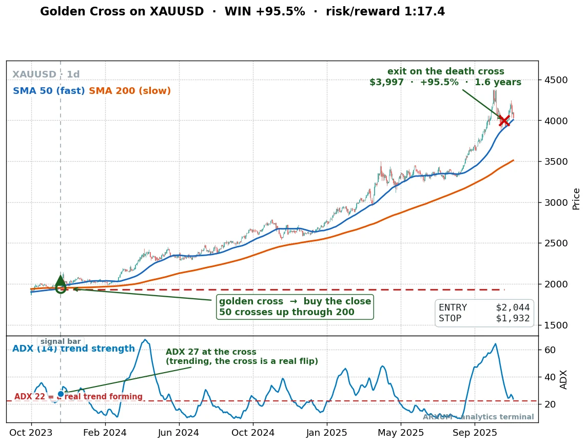
Look at the entry. The 50-day line (blue) crosses up through the 200-day line (orange), marked with the green ring, and you buy on the close of that candle at $2,044. The ADX panel below reads 27 at the cross, above our 22 line, so this is a real trend forming, not chop.
You then simply hold, letting the trend run, until the opposite signal, the death cross, tells you to leave. That exit came a long way up, near $3,997.
One trade, held about a year and a half, and it turned a $2,044 entry into a $3,997 exit. In risk-to-reward terms that is roughly 1:17: for every dollar risked between the entry and the stop, the trade returned about seventeen. A stop, in plain terms, is an automatic exit that closes the trade if price goes against you, so the entry-to-stop distance is all you actually put at risk.
That 1:17 is not typical, and I would not promise it. It came from just 5 trades in 8 years, essentially this one 1.6-year bull-run ride, so treat it as a rare catch, not a repeatable monthly return.
The reward-to-risk ratio, written 1:X, is the standard way to size up a trade. The 1 is your risk, the distance from entry to your stop. The X is the reward, how many times that risk the trade made back.
We cover it fully in the risk-reward ratio guide. It is a per-trade figure, different from profit factor, which measures the whole strategy.
Here is the honest part of the same record. Not every gold cross was that trade.
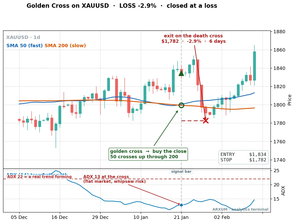
Same signal, same market, different context. The 50 crosses the 200, but look at the ADX panel: it reads 13, well below 22. That is a flat, directionless market, and the cross was a whipsaw.
Price rolled straight back over, the death cross printed six days later, and the trade closed down about 3%. This is precisely the signal the ADX filter tells you to skip.
Below is the full eight-year record for the gold golden-cross long, $1,000 compounded across all five trades.
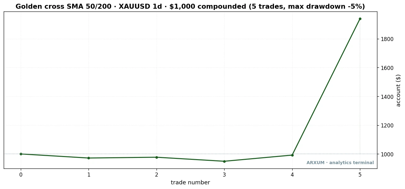
This is what the method really looks like, and it is worth sitting with. For the first four trades the account goes nowhere, drifting slightly under water. Then the one big bull-run trade carries the whole thing from $1,000 to about $1,939. The deepest the account ever dug was around 5%.
| Trades | 5 |
| Win rate | 60% |
| Reward-to-risk | average around 1:5 |
| Profit factor | 17.7 |
| Max drawdown | −5% |
| Net return on $1,000 | +94% |
A quick note so three numbers here do not blur together: the per-trade 1:17 (that one big winner’s reward-to-risk), the average trade near 1:5, and the strategy’s 17.7 profit factor are three different measures. The 1:X figures describe single trades; the profit factor describes the whole 5-trade history.
That profit factor of 17.7 is flattering because it rests on one giant winner, one of only 5 trades. Strip that single trade out and the edge shrinks toward breakeven. So the honest read is not “this makes 17 dollars per dollar.” It is “this stays quiet, protects your capital with a tiny drawdown, and is built to catch the one big trend when it comes.” A win rate above 50% with a few large winners is a comfortable way to trade, but it demands patience through the flat stretches.
The Method on Forex
Most readers here trade Forex, so gold’s once-a-cycle bull run is not the whole answer. The good news: the same golden-cross-plus-ADX method works on EUR/USD, in a more everyday, tradeable form.
Over the eight-year window the euro golden cross was profitable on its own, and the ADX filter improved it further (the full numbers are in the table below). What matters most is the context: EUR/USD itself went nowhere over those years, roughly flat on a buy-and-hold basis.
So the method pulled a real gain out of a flat market. That is genuine edge, not just riding a rising tide.
And it is not ancient history. Here is the most recent full cycle, the golden cross that fired on EUR/USD just over a year ago and ran until its death cross recently, so you can see the method working in today’s market, not only in an old backtest.
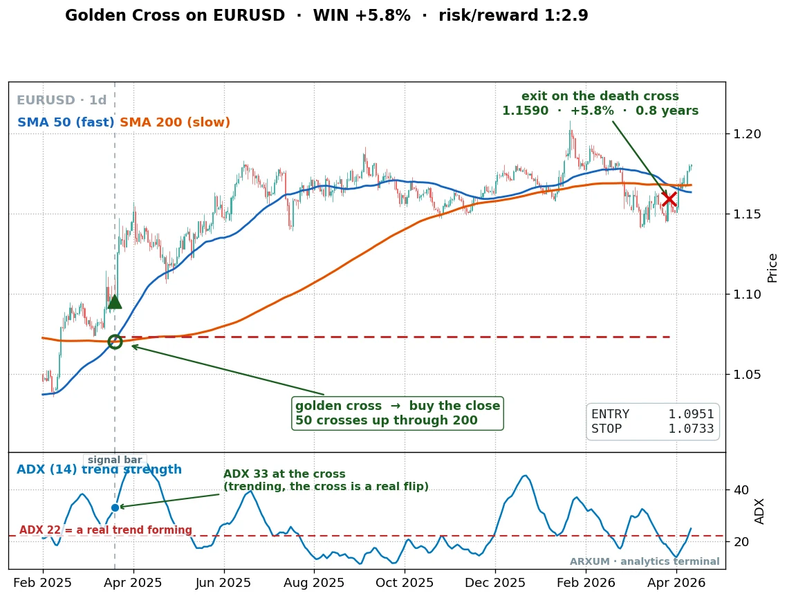
This is the cleaner, more repeatable shape, and it is current. The 50 crosses up through the 200 at 1.0951. The ADX panel reads 33, comfortably above 22, so the trend is real.
Price grinds higher for months, and the trade closes on the eventual death cross at 1.1590, up about 5.8%, a reward-to-risk near 1:2.9. No fireworks, just a clean trend caught and held.
And the failure that teaches the filter:
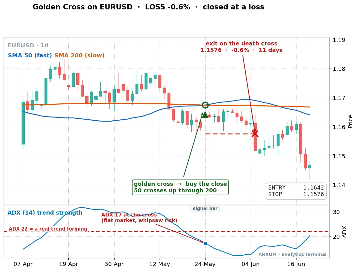
The most recent euro cross in the sample. The 50 crosses the 200, but ADX reads 17, below the line. Flat market, whipsaw risk, exactly the setup to pass on.
Price turned within days and the death cross closed it for a small loss inside two weeks. The ADX filter would have kept you out.
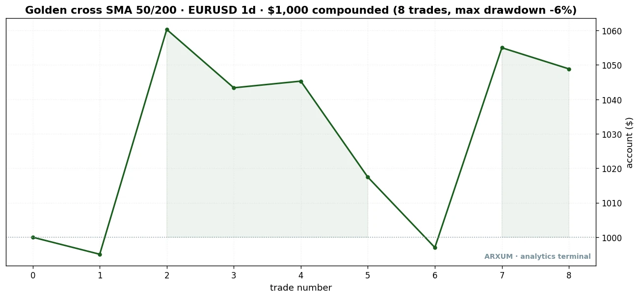
The euro curve is a more honest picture of everyday trading than gold’s. Eight trades, a jagged path, some winners and some small losers, ending near $1,049 with a worst drawdown around 6%. A modest, steady edge on a market that itself went flat.
| Trades | 8 |
| Win rate | 38% |
| Reward-to-risk | 1:2.9 average |
| Profit factor | 1.7 (2.0 with the ADX filter) |
| Max drawdown | −6% |
| Net return on $1,000 | +5% |
Note the win rate: only 38%. Fewer than half the trades won, and the method still made money, because the winners ran far longer than the losers, which got cut at the stop. That is the reward-to-risk doing the work, and it is the core of why a trend-following signal can pay with more losers than winners.
Where the Golden Cross Fails
A working method is worth more when you also know where it breaks. The golden cross broke on oil.
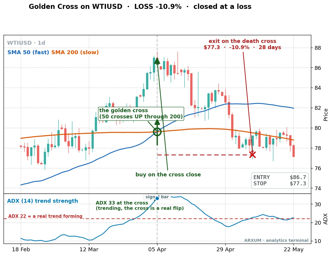
Look closely, because this one is instructive. The golden cross fires, and ADX reads 33, a strong trend by our own rule. It should have been a valid signal.
Instead price topped almost at once, rolled over, and the death cross exit came in about 11% lower. Across the full window the oil golden cross lost badly, a profit factor of 0.04, deep in the red on both halves of the test.
This is not a contradiction of the ADX rule, but the edge of it. ADX told you a real trend existed at the cross, and it did, but ADX only measures that a move is under way, it cannot promise the move will last. On a market that reverses as violently as oil, a genuine trend can flip inside a week, and no trend-strength reading can save a signal from that. So read it as the method’s limit, not a broken filter: ADX keeps you out of flat chop, but it cannot fix a market whose trends do not hold.
Why does oil behave this way? Oil is cyclical and news-driven. It stages sharp trends that reverse just as sharply on a supply headline, so a slow crossover is forever late to both the top and the bottom.
The lesson: the market, not the signal, decides. The golden cross is a trend-following tool, and it only pays where trends actually persist, gold and, more mildly, the euro. On a whippy, mean-reverting market like oil, no crossover filter saves it.
Bitcoin is the other side of that coin. The golden cross posted its biggest raw numbers there, but Bitcoin rose so much over the window that simply holding beat most strategies. Much of that “edge” was just the rising market, not the signal.
And on the faster 4-hour chart the crossover looked good in the first year, then failed completely in the second, the classic sign of a setup fit to the past rather than a durable edge. Treat the crossover on crypto with caution, and lean on the daily gold and euro versions instead.
Silver sits between the two. Its golden-cross long was the mildest winner of the metals, because silver trends like gold but in choppier, more violent bursts that shake you out more often. Its death-cross short was the worst of the lot, losing on every trade, for the same reason the others fail as shorts: the cross arrives after the drop.
SMA or EMA, and Which Pair
Two settings questions come up constantly, so we tested both rather than guess.
SMA or EMA? A simple moving average (SMA) weights every candle equally. An exponential moving average (EMA) weights recent candles more, so it reacts a touch faster. The classic golden cross uses SMAs.
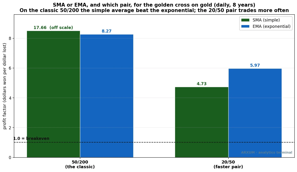
On the classic 50/200 pair, the simple average won clearly on gold. The EMA’s speed just added a few extra false crosses without improving the good ones. So for the standard golden cross, stick with the SMA. If you want the difference between the two lines explained in full, see the EMA versus SMA comparison and the dedicated EMA guide.
Which pair? The 50/200 is the famous one and the slowest, five to ten signals per market over years. If that is too quiet, the faster 20/50 pair fires far more often, around four times as many trades, and it still cleared breakeven on gold. It is noisier and gives back more in whipsaws, which is the price of trading more.
On that faster pair, the EMA had a small edge over the SMA. If you are just starting out, do not agonise over this: begin with the classic 50/200 SMA pair, the one every chart already knows and the one the rest of this article is built around. It fires rarely and keeps you out of most of the chop, which is exactly what a beginner wants. Once you have traded it for a while and know how active you want to be, you can reach for the faster 20/50 pair: 50/200 for a slow position signal, 20/50 for something closer to swing trading.
The edge also held across a range of settings around 200, from a 150-day slow line up to 220, so this is not a single magic number that happens to fit the past. It survives its own neighbourhood, which is what you want to see before you trust a backtest.
How to Place the Trade
Here is the whole method as a checklist, using the euro example so a small account can actually place it.
- Add the tools. On a free TradingView chart, add a 50-period SMA and a 200-period SMA. Add ADX (default length 14). Use the daily timeframe.
- Wait for the golden cross. The 50 line crosses up through the 200. That is your signal candle.
- Check ADX at the cross. It must read above 22. Below 22, skip the trade, the market is flat.
- Buy on the close of the cross candle. In our euro example, that was an entry at 1.0951.
- Set the stop below the recent swing low, near 1.0733 in the example. A pip is the smallest standard move on a currency pair, the fourth decimal place on EUR/USD. So the stop distance is 1.0951 − 1.0733 = 0.0218, which is 218 pips.
- Set the exit to the death cross. You hold until the 50 crosses back below the 200. There is no fixed take-profit; the opposite cross is your exit.
Now the sizing, worked from a small account down. Say you have $500 and you risk 2% per trade, which is $10. Your stop is 218 pips away.
You size the trade in lots. A standard lot is 100,000 units of the pair; a micro lot is one-hundredth of that, 1,000 units, and on EUR/USD one pip on a micro lot is worth about $0.10. Here is the math from the account down:
- Risk budget: $500 × 2% = $10.
- Risk per pip you can afford: $10 ÷ 218 pips = about $0.046 per pip.
- At roughly $0.10 per pip for a micro lot, that is about half a micro lot (0.005 of a standard lot), which a micro or cent account fills without trouble.
On EUR/USD that trade is placeable on $500. On gold it usually is not: gold’s dollar stops are so wide that a 2% risk on a small account comes out below the minimum lot size, so you either trade the euro version or use a broker with cent-lot sizing. Whatever you pick, size to the 2% rule, not to what feels affordable in the moment.
Keeping Yourself Out of Trouble
This is a slow method, and slow methods test your patience more than your analysis. A few things worth holding onto.
Expect long quiet stretches. The gold run made almost all its money in one trade out of five. You will sit through flat periods where the signal says nothing, and that is normal. The edge shows up over many trades, not on any single one, so do not force a cross that is not there.
Do not short the death cross because a headline told you to. Every time markets sell off, the financial press announces a death cross like it is a forecast. The data says it is a lagging exit signal, not a short entry. Use it to step out of longs, not to bet on a crash.
Watch the losing streak, calmly. If you take several golden-cross trades in a row that all whipsaw out, that is often the market telling you it has gone sideways, exactly what the ADX filter is meant to catch. As a rule, three to six losing trades in a row is a sign the regime may have changed, so pause and check whether the market is still trending before you take the next signal. One rough patch is variance; a sustained run of whipsaws is information.
Only risk money you can afford to lose, and keep the 2% rule even when a trade looks obvious. The one big gold winner in our test came from staying in a trend, not from betting large. Position sizing, not prediction, is what kept the drawdown near 5%.
None of this is a machine that prints money. It is a disciplined way to join strong trends and stay out of flat ones, tested honestly and shown with its losers. Your own eye for whether a market is trending gets sharper with reps, and the crossover becomes one confluence among several as you gain experience.
Bottom Line
The death cross and the golden cross are the same 50/200 crossover, and they are not equal. The golden cross is a real, if slow, trend-following long that paid on gold and pulled a gain out of a flat euro. The death cross is a lagging exit, not a short: fading it lost on every market we tested.
Add ADX above 22 to skip the flat-market whipsaws, use SMAs on the classic pair, hold until the opposite cross, and size to 2%. That is a method you can run tomorrow, and it fits on a matchbox: buy the golden cross when ADX is above 22, ride it, exit on the death cross, never short it.
FAQ
What is a death cross in trading?
What is a golden cross and does it work?
Is the death cross always followed by a crash?
What moving averages are used for the golden cross and death cross?
Should I use SMA or EMA for the golden cross?
What timeframe is best for the golden cross?
How do I avoid false golden cross signals?
How much money do I need to trade the golden cross?
What is the difference between the golden cross and a moving average crossover strategy?
What does profit factor mean, in plain terms?
Real-time trade setups with entry, stop loss and take profit. Daily market analysis. No subscription, no complicated theory.
🌍 Our recommended brokers


Reader Reviews
The point about the death cross appearing near market lows, not at the beginning of the decline, saved me from a bad gold short in February. I was about to enter based on the signal and read this first. Held off, and gold recovered 8% from that level over the following month.
What clicked for me is treating the 50/200 relationship as a state rather than an event. The cross happens once but the trend state persists. I used to reset my bias every time price dipped near the 200 MA, thinking the trend was ending. Now I hold the directional bias until the 50 actually crosses the 200 in the other direction. On BTC, keeping that consistent over the last four months added about 6.8% to my monthly results compared to when I was flipping sides on every large pullback.
The volume confirmation point is the piece most trading content skips. I have been tracking it manually on EUR/USD for six months. Golden crosses accompanied by above-average volume held for at least 15 trading days before reversing in 8 out of 10 cases. Crosses on thin volume reversed within 7 days about half the time. I now pull up volume alongside the 50/200 overlay before every swing entry. Win rate on volume-confirmed setups runs around 8.2% monthly on average over the past five months, versus 5.1% on unconfirmed setups. It's the single biggest improvement I've made to my crossover approach.
The EUR/USD example - bottoming in September 2022 with the golden cross printing in February 2023 - made the lag concrete for me in a way I hadn't seen before. I went back and overlaid the 50 and 200 on my XAU/USD charts for the past 18 months. The average lag between price low and golden cross was 47 days. Now I use this as a calibration tool. If price has already moved more than six weeks from the low, the cross itself is probably a late entry. My win rate on EUR/USD and USD/JPY setups improved by 18 percentage points after adjusting entry timing with this in mind.
Good explanation of why timeframe matters so much. I was getting frustrated with 15-minute crossovers generating noise on USD/JPY - switching to 4H reduced false signals by roughly half right away. The one thing I wish was covered in more depth is how to handle ranging markets where the 50 keeps crossing the 200 back and forth. That scenario still trips me up and I haven't found a clean filter for it.
The 71% win rate across 11 EUR/USD trades using 4H pullbacks to the 20 EMA as entries is the kind of specific benchmark I can actually use for comparison. I ran the same approach on GBP/USD over the past 90 days and got 68%, which is close enough that the method appears consistent across major pairs.
The RSI filter advice in the combinations section is the most useful addition I made to my setup. I started checking RSI before acting on any golden cross on my crypto watchlist. Crosses printing with RSI already above 70 failed 4 out of 5 times in my last 30 setups. Crosses printing with RSI between 40 and 60 had much cleaner follow-through. One small addition the article could include: how to handle RSI checks on lower timeframes where RSI hits 70 frequently even in trending conditions.
The three-phase breakdown before the golden cross is what I had been missing for over two years. I kept trying to buy the cross itself and getting filled late, sometimes 200 to 300 pips into the EUR/USD move. Understanding that phase 2 consolidation is where the setup builds changed my approach entirely. I now watch for the 50 MA to flatten and begin sloping up while price holds above the 200, then enter before the actual cross. My last four EUR/USD long setups using this approach produced an average gain of +7.4% per position. The cross still matters as confirmation - it just isn't the entry trigger anymore.
Leave a Review

Forex Analyst & Senior Trader
Former FX desk trader with 8 years in institutional forex. Works in multi-timeframe analysis and order flow, turning desk experience into systematic, testable rules across forex and metals.